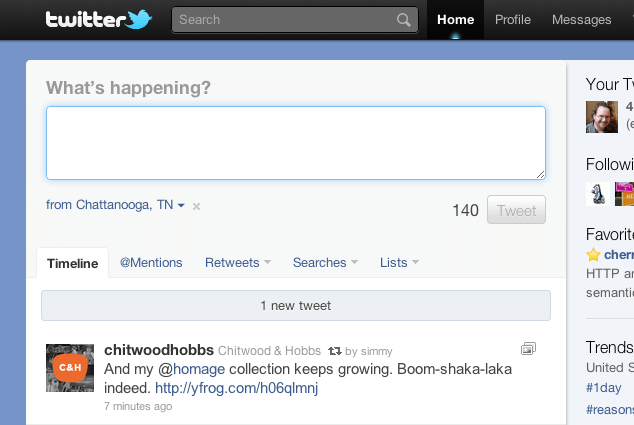
Many have applauded the redesign of Twitter and rightly so. A user’s home screen is now far more useful, with quick access to location information, embedded media, and other niceties; it’s leaps and bounds beyond what many of us have been using for the last four years. That said, there’s always room for improvement. I’m going to sidestep the issue of JavaScript reliance to focus on what is possibly the most commonly used feature of twitter.com: the tweet box. This is one area that could be improved and made more accessible with just a few minor adjustments.
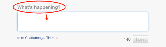
The tweet box interface is beautiful in its simplicity: the question “What’s happening?” followed by a textarea in which to answer that age-old question in just 140 characters, and a button to submit the form. There’s also a helpful indicator showing you how many characters you have left as you compose your tweet.
A few simple tweaks would improve things considerably, but let’s take a look at these pieces in the existing markup before we dig in.
<div class="main-tweet-box"><div class="tweet-box">
  <div class="tweet-box-title">
    <h2>What’s happening?</h2>
  </div>
  <div class="text-area twttr-editor">
    <textarea style="width: 482px; height: 36px;"
              class="twitter-anywhere-tweet-box-editor"></textarea>
  </div>
  <div class="tweet-button-container">
    <input class="tweet-counter" value="140" disabled="disabled">
    <a href="#" class="tweet-button button disabled">Tweet</a>
  </div>
</div></div>
Basic Accessibility
Potentially extraneous divisions aside, the first thing that jumps out at me is the lack of a label for the most important form control on the site. label elements are incredibly useful in that they are read by assistive technologies when a form control is focused and clicking on them will focus (or select) the associated form control. To add the label, they could swap the h2 for a label or simply nest the label inside the h2.
The label is separated from the form control (the textarea), so it should be explicitly associated with it, meaning the textarea needs an id which is then referenced in the label’s for attribute.
label is “for” the textareaThe revised code would look like this:
<div class="tweet-box-title">
  <h2><label for="tweet-editor">What’s happening?</label></h2>
</div>
<div class="text-area twttr-editor">
  <textarea id="tweet-editor" style="width: 482px; height: 36px;" class="twitter-anywhere-tweet-box-editor"></textarea>
  <!-- ... -->
</div>
A submit link? How 1999.
The fact that the submit button for the form is a link (a) is disheartening. Links cannot be used to submit forms without the assistance of JavaScript, which is not guaranteed. A better choice would be an input or button element. With CSS, a true submit button could be easily styled to look like the link version; in fact, assigning the classes already applied to the link makes a button look identical:
<button type="submit" class="tweet-button button disabled">Tweet</button>
button. Can you tell the difference?Countdown to greatness
This leaves us with the character counter.
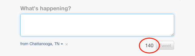
To begin, there is no reason the number “140” should be in a disabled input. That choice does nothing to improve the usefulness of the number, especially as that input has no associated label to explain what it means. You may as well wrap it in a span. Interestingly, that’s what it was wrapped in as recently as a few weeks ago.
Markup aside, the number “140” is pretty vague and meaningless; if you’ve never tweeted before, you probably have no clue what it means. Content should always aim be meaningful for the user, and doing so here is incredibly easy: add some context to the “140”, such as “characters remaining”, and hide it (accessibly) using absolute positioning and an obscenely large negative left offset:
<span class="tweet-counter">140<b class="hidden"> characters remaining</b></span>.hidden {
position: absolute;
left: −999em;
}This way, when the content is read by a screen reader, the number (whether visible or not) is given context. Using a negative left offset is considered preferential to “visibility: hidden” and “display: none” when it comes to hiding content because screen readers will still expose it to users. Of course, the countdown wont work without JavaScript, so you’d probably want to have it read “maximum of 140 characters” by default and then have JavaScript swap that for the countdown when it knows the script can run. You know, basic progressive enhancement.
Going the Extra Mile
While the above changes would be a vast improvement, we can do better. As part of the Accessible Rich Internet Applications spec (ARIA), the W3C’s Web Accessibility Initiative (WAI) introduced a mechanism by which authors could identify areas of the page that would be updated in real-time via JavaScript: Live Regions. Live Regions, by design, allow assistive technologies to be informed of updates to the page and pass along those updates to the user. This helps in two ways: 1) the user does not lose her place in the content when an update is made; and 2) users can be made aware of updates occurring out of their view (such as if they are zoomed in on another section or have scrolled down the page, causing the updated section to be out of view).
Sounds like the tweet box’s character counter is a perfect candidate for becoming a live region, right? Live Regions offer a number of options that are beyond what I have the space to discuss here, but WAI offers a great guide on implementing them. In the case of the character count, the announcement of updates should be made only when the user isn’t typing (we don’t want a live countdown) and should be comprised of the entire element (not just the changed number). Here’s how that’s done:
<span aria-live="polite" aria-atomic="true" class="tweet-counter">140<b class="hidden"> characters remaining</b></span>aria-liveAs a website chock full of rich, JavaScript-driven interactions, ARIA seems like a natural choice for Twitter, but it has yet to be used in any truly meaningful way by the site. With the redesign out the door, perhaps now they can take a look back and refactor the components most likely to benefit from an accessibility overhaul such as the changes to the tweet box I’ve suggested.
Pitfalls to Avoid
- Forgetting to use
labelelements - Thinking about your form presentationally
- Using a link to submit a form
Things to Do
- Explicitly associate your
labelelements with form controls using theforattribute - Make sure helper text is actually helpful
- Use accessible mechanisms for presentationally hiding otherwise useful information
- Consider ARIA Live Regions for notifying users of form errors
Further Reading
- “Accessible HTML/XHTML Forms”, The Web Standards Project, 1 May 2004
- “Learning To Love Forms”, The Ajax Experience East 2007, 25 November 2007
- Implementing Live Regions, The W3C, 2011
- “ARIA and Progressive Enhancement”, A List Apart, 1 February 2011
- “The Accessibility of WAI-ARIA”, A List Apart, 1 February 2011
What do you love or hate about creating forms in HTML?