In November 2012, Apple sold three million iPads in three days. In September, Amazon announced that they’ve sold 3.5 million Kindle Singles since January 2011. In June, the Online Publishers Association (OPA) released a study about huge growth in U.S. tablet usage, with over 94% of tablet owners reading on the web.
People are reading on screens. According to the OPA study, at least a third of tablet owners pay for content from magazines, books and newspapers. Much of this content can be considered “longform,” which is anything over 1,500 words. These pieces are longer than email newsletters and press clips. They’re neither bite-sized nor book-sized, but they deserve the same sort of uninterrupted attention you’d give a reader in a bookstore or library.
Today’s web designers and writers have to accommodate a variety of devices and text formats. So what can we do to embrace this shifting landscape of content and devices? The answer is deceptively simple: make readers comfortable, no matter what they’re reading or what device they use.
What’s This About Longform?
When designing for longform, we have to strike a balance between guiding people through different types of content and protecting their attention. Mandy Brown, co-founder and editor of A Book Apart, explores design choices for reading in her article, In Defense of Readers:
Consider all of the elements that accompany an article and organize those that are most useful for gauging interest at the top. Summaries or pull quotes, as well as illustrations, allow the reader to quickly assess what the article is about. Categories and links to related content provide context. The name and affiliation of the author communicate the authority of a text. All of these elements combine to create an entryway into reading.
As people who make the web, we shape the reading experience. While we take the time to invite people in and guide them to what they need, we should also help them focus by keeping the interface out of the way. Unfortunately, there’s no one right way to make reading longform more comfortable. There are a number of design approaches we can take and they all start with understanding the mindset of our readers.
Think Like a Reader
People read in different ways. “We do longform reading where we read carefully, and we do scanning reading where we read quickly,” says Mary Lou Jepsen, CEO of Pixel Qi, at Books in Browsers 2012. When we find a new article, we skim it to see if it’s important, and if it is, we slow down to read it or save it for later.
People also have different reading habits. As Henrik Berggren, founder and CEO of Readmill, says: “There are as many ways to read as there are readers.”
A longform reader might:
- Follow a specific author, publication, series or topic
- Find articles through friends, social sites, RSS, search and other articles
- Browse through print materials before reading online
- Save or print things for later
- Switch between different apps and devices
- Change font sizes or contrast
- Send articles to Kindle or iPad
- Block ads
This range of patterns and behaviors can make it harder to understand our readers. We can’t look over their shoulders to observe their preferences. Reading is a very personal act. What we can do is be aware of their needs and let research guide us when evaluating and updating our sites, in these areas in particular:
- Design
- Editorial Strategy
- Community
Make It Easy to Read Anywhere
For a good example of designing for longform and different devices, let’s look at 37signals’ corporate blog, Signal vs. Noise. The site often features longform text, which gives 37signals a sandbox for developing books about their blog topics, including Getting Real and Rework.
They recently redesigned the site and detailed their process and intentions with the changes.
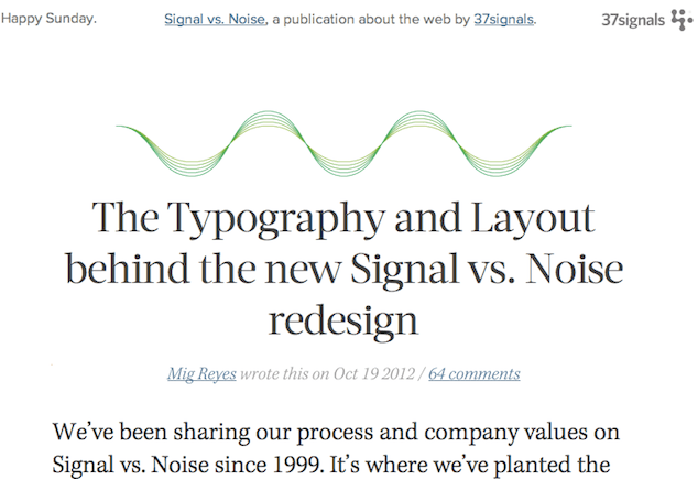
Mig Reyes explained: “I wanted to focus on creating a beautiful, clear, focused reading experience … I’d like you to actually read this.” This redesign reveals several design principles that can be critical to creating a comfortable reading experience.
Typography Matters
Pay attention to typographic details. Make sure to choose fonts that work well on screens of different sizes, which can help you keep the visual hierarchy simple and improve legibility.
Find an ideal line length for your site, with about 12 words per line in a desktop browser.
Don’t Break the Flow
Don’t paginate individual articles. It adds unnecessary interruptions and clicks, making it harder to finish the article.
Test on Different Devices and Apps
To make the content easy to read, be sure to actually read it. Sit down and read full articles on your site with as many devices as you can get your hands on. Are there any weird break points? Is the type size big enough? You’ll probably need to make adjustments once in a while.
Remember, your site design doesn’t need to be identical across devices, but it does need to be readable.
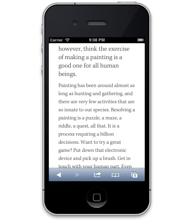
Test a few of your articles in different reading apps too, like Pocket or Readability, to make sure they display correctly.
Make Sure Your Folks Can Read It
Don’t fall into the trap of thinking you’re the target audience. For example, some people rely on larger font sizes. Be sure to test your content with larger and smaller fonts, and consider making your font sizes responsive.
Also, email and print a couple of articles for yourself. Can you read them? Would your parents and grandparents be able to? Whether on screen or on paper, be sure to accomodate tired eyes and low-literacy readers.
Build Connections
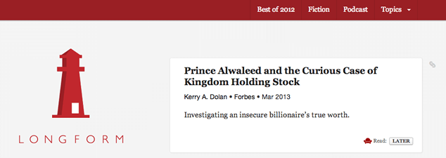
Along with designing the content, we also need to consider editorial strategy to make a great reading experience. Edited by Aaron Lammer and Max Linsky, Longform has a unique editorial approach. The publication collects new and classic pieces over 2000 words, threading them together with tags like writer, topic and original publication. This gives readers a simultaneously focused and interactive experience.
Connect the Dots Between Articles
Longform has an interesting mix of handpicked pieces from large publications, new articles, and works from the dusty archives of print magazines, like this 1985 Playboy Interview with Steve Jobs.
For the insatiable reader, Longform serves as more of a trustworthy reading list than a publication. While most of the content is syndicated from publications like The New York Times or The Atlantic, Longform keeps readers coming back by providing ways to browse around each article and find things connected to it from across the web.
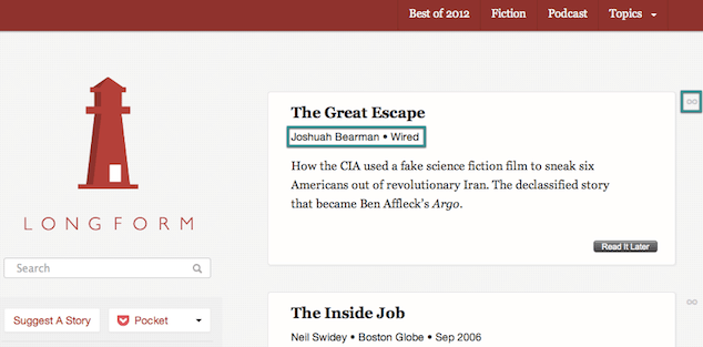
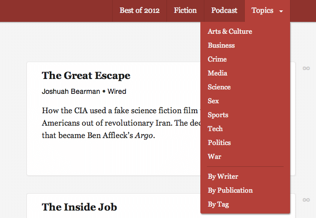
Each piece is treated like a fork in the road. From any point on the map, you can find your way to related content, including:
- Topic
- Writer
- Publication
- Decade
- Story type (e.g., interview, excerpt, essay or poetry)
- Post month
Treat every article as a way for people to find more articles. Some of their related links might not make sense for your site, so here are a few other ideas:
- Keywords or themes
- Idiomatic phrases
- Friend recommendations
- Genre
- Issue or volume
- Setting
The links you decide to make should depend on the content itself, your technical constraints (such as your content management system) and your bandwidth to keep them updated. Consider adjusting these as your site grows.
Remember the Spirit of the Web
Some of you may be wondering why I’m advocating linking to other articles and websites. Won’t this drive traffic away from my content? Yes, it will, but not in the way you might expect.
The more you link to things, the more value you put into your site. If you do the work to make connections for readers, they’ll spend more time on your site, find more things that interest them and share more links with friends. People will leave, but if you send them to genuinely helpful content off of your site, they’ll come back too. Don’t try to trap your readers. Your site is small web in the larger web—and the more open you make it, the more SEO juice and return traffic you’ll get.
In summary, every page on your site is a landing page. People will show up, with or without a sense of where they are, or even how they got there. Thread things together so they get a sense of the care you put into the content, and so they can find alternate paths to navigate through it.
Keep Sharing in Mind
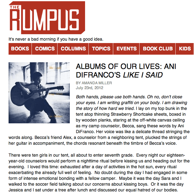
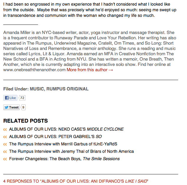
The third part of user experience that can affect readability is how your site approaches community and sharing. The Rumpus publishes reviews, articles, interviews and essays from “authors you’ve never heard of … to make you look deeper.”
Community is at the heart of The Rumpus. The site gives people a safe space to share stories with each other in ways that are only possible on the web:
- Readers are encouraged to comment on articles.
- Writers can continue the conversation with readers and refine what they’ve written.
- Readers are encouraged to contribute new pieces.
By opening up the lines between writers and readers, The Rumpus invites everyone to contribute and share.
Make a Good First Impression
Assume people will get to your site through friends and search engines. The Rumpus makes a good first impression by letting the reader get right to the content, without interruptions from ads, surveys or preambles about the publication.
Another thing you can do for new readers is to introduce longer pieces at the top of the page. This helps someone less familiar with your site by:
- Giving them a sense of place
- Pulling them into the piece if it interests them
- Providing a short excerpt to post to Facebook or Twitter, which also helps with indexing the page
Include Lightweight Sharing Tools
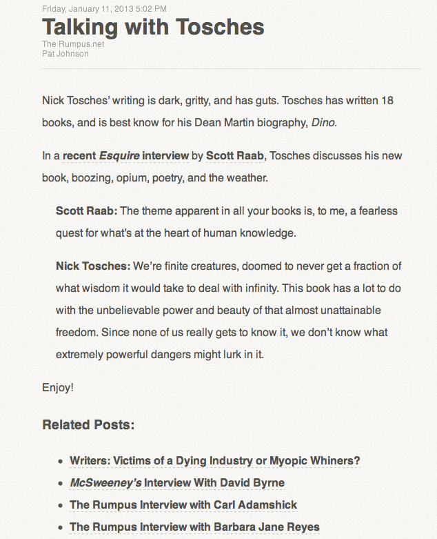
Make it easy to share articles with consistent permalinks. The Rumpus does a nice job of this with simple slugs from WordPress.
Provide the article’s full text in RSS. If a reader takes the time to subscribe to your feed, you can bet that they want full articles.
If your site has popular authors that contribute regularly, like Stephen Elliott and Cheryl Strayed on the The Rumpus, consider adding RSS feeds for their individual columns. WordPress has this built right in.
These seemingly small details can help subscribers keep reading and sharing, right from their RSS readers.
You might also want to think about what the reader should do after reading an article. Here’s a good place to take advantage of those excerpts with sharing buttons from Facebook or Twitter, if you decide to use them.
A Few Comments on Comments
Readers want to talk to each other and respond to what they’re reading. The Rumpus invites people to comment and writers often respond inline.
But does your site need comments? It really depends on your audience, what you’re trying to do, and if you can keep up with moderating the comments so people feel safe and have a good experience on your site.
Whether or not you let people comment, readers will find ways to talk about your publication, like posting to Twitter or Facebook. Be sure to go where your readers are actively discussing your content, so you can keep up with their questions and concerns. Know that these conversations will be scattered, but try to nurture them when you can.
Keep Refining
There are numerous other things we can try to optimize our sites for longform; the charge of protecting our readers is never-ending. The important thing to remember is that people are here to read and to share. As Henrik Berggren says, we have to make it so “you want to read more and connect more without those two things disturbing each other.”
Going the Extra Mile
Pitfalls to Avoid
- Don’t paginate individual articles.
- Don’t break permalinks. Make it easy to share articles from your site by keeping them consistent.
- Don’t truncate article text in RSS.
Things to Do
- Test how pages from your site look on different devices, in different apps, in email and in print. It doesn’t have to match, but make sure you can read it.
- Summarize longer pieces at the top of the page.
- Make it easy to share any piece of content.
Further Reading
- “In Defense of Readers”, A List Apart, 18 February 2009
- “How Magazines Will Be Changed Forever”, CNN, 20 October 2012
- “Dark Social: We Have the Whole History of the Web Wrong”, The Atlantic, 11 October 2012
- “Cross Device Design Patterns”, LukeW, 24 July 2012
- “Optimize the OG:Description Tag for Search and Social”, Josh S. Peters, 5 January 2012
Do you use any of these approaches to longform? What else have you tried? As a reader, what techniques have you found particularly engaging?