Donations are the life-blood of charities. Without funding from kind, giving strangers, these not-for-profit organizations would not be able to carry out their missions. They would not exist.
The web makes it easier than ever to reach out for donations, but that doesn’t always mean it’s easy to give—any roadblock in the process means a higher risk of losing a potential donation due to frustration or confusion.
To help you simplify the giving process for your patrons, let’s compare the donation flow of a few well-known charitable organizations based in the United Kingdom to see which parts of their process we can improve.
These organizations may not experience problems collecting donations via their websites, and my comments are based on observations and experience rather than inside knowledge from within these organizations or results from usability tests. But you’re not likely to find a charity that couldn’t use more donations, nor patrons who wouldn’t appreciate an easier process. In fact, the lessons from these examples will also help you improve any flow where you are asking people to ‘give up’ something—pledges, petitions, surveys, and more can all benefit from removing impediments to progress.
Language: choose and use wisely
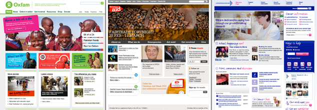
Let’s begin by looking at 3 charities with slightly different missions—Oxfam, Christian Aid, and Cancer Research UK—to see how they approach the issue of language: the words we use in an interface are a larger part of design than many people realize.
What are people looking for when they visit your website? Labels guide them to the information and destinations they want to reach, so it’s important to understand what your audience is most likely looking for as trigger words when browsing your site. Note that this language can be quite different from how people search for your site (see “Search Words Versus Carewords” under Further Reading for more on that subject).
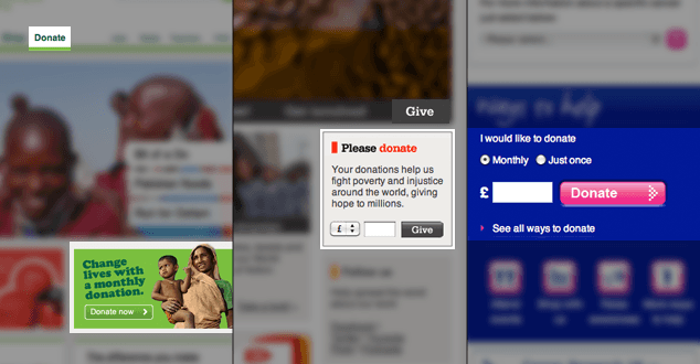
Two of these websites—Oxfam and Cancer Research UK—use ‘donate’ consistently to signal both an action and a request. Christian Aid, however, uses both ‘give’ and ‘donate’, sometimes side by side. As charity websites are often filled to the brim with all manner of content, being consistent with the language you use makes it easier for people to find what they want. For financial donations, ‘donate’ is likely better than ‘give’ as it’s slightly more specific.
Finding out what your organization’s patrons expect—through observing and listening to your visitors’ needs—is the best way to select the most successful labels for each action. Using consistent language throughout the flow makes tasks more straightforward and easier to understand.
Language is often viewed as the responsibility of editors, copywriters, content strategists, or marketing departments—rarely are designers concerned with the intricacies of the terminology used within an interface, though we’ll spend hours, days, and even weeks painstakingly adjusting details of a design’s typography. Yet, strip away all the visual decoration, the affordance, the color and hierarchy, and what’s left is the text—content, labels and actions—the fundamental context for our design.
Degrees of difficulty
Now let’s dig a little deeper and examine the critical first steps in the donation flow, comparing Oxfam and Cancer Research UK with another charity, Mencap, that tries a different approach.
Once a patron has found their way to your donation process (via the homepage, email promotion, or landing page), the number of steps involved—or more often, the perceived number of steps—can work for or against you. Much like any purchasing flow, the user is on your side from the start—they want to give you money, so it’s up to you to design a flow that makes it as painless as possible in return for their generosity.
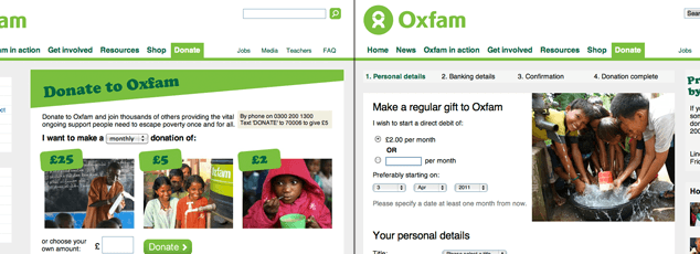
Oxfam has a donations block on the homepage specifically for monthly giving, which leads users down a completely different path than the ‘Donate’ navigation item. Sending people to different destinations with the same title or general purpose is confusing and harder to maintain: don’t do it.
Their main donation screen is fairly straightforward, offering visitors a choice between recurring (‘monthly’) or one-time (‘single’) donations, three predetermined donation amounts (which change based on the monthly or one-time selection) and the option of entering a custom amount. The amount of information on this screen, along with the number of donation-specific options, isn’t daunting but it’s getting close.
The next screen in the process varies depending on which type of donation (recurring or one-time) is selected:
- Patrons wishing to contribute a one-time donation have only a single form to complete before they are done,
- Recurring donations require a further 3 steps (as seen above the form) before completion.
Why the disparity? While these additional steps may not cause a noticeable problem for users, the interface implies that it is more difficult and more time-consuming to set up recurring donations than to give once.
Recurring donations are likely more valuable to the organization, so it is in both the patron’s and the charity’s best interest to make it seem as easy or easier to donate on a regular basis than one-time only.
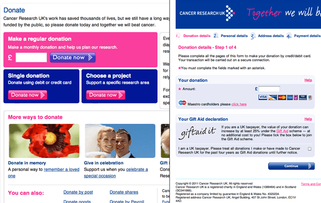
Rather than use a single screen to present all donation options, Cancer Research UK instead offer multiple—yet different—paths:
- a custom donation form on the homepage (with options for recurring or one-time donations),
- a small ‘Donate’ button visible in the right sidebar after following the ‘Support Us’ link in the main navigation (which unfortunately spawns a new browser window/tab containing the first of 3 steps needed to set up recurring donations only, with no one-time donation option in sight),
- and a more detailed ‘Donate’ screen reachable by a number of indirect paths, ultimately residing in the sub-navigation within the ‘Support Us’ main section.
This last screen presents options for recurring, one-time, and—unseen until now—project-based donations, where you can choose to donate to a specific type of cancer research. This project-based option is intriguing as it doesn’t appear on the other example websites or the 5 additional charity websites I examined while preparing this review. I would love to see Cancer Research UK—and other charities—do more with this option, allowing patrons to form a more personal connection with where their money is going.
Having multiple points of entry into the donation flow isn’t a bad thing—it’s often necessary on content-heavy websites where every element on the screen is competing for attention—but having a single destination with consistent options is paramount: what if Amazon.com allowed you to buy the latest Harry Potter boxed set if you started in the “Children’s Books” sub-category but not if you clicked on the main category of “Books”? You can imagine the confusion this might cause.
Also, avoid showing the number of steps in a process unless that information is definitely helpful to your users. Numbering each stage in the process—or even augmenting the numbers with descriptive titles—is generally misleading: there’s no way for me to know how much time steps 1, 2 or 3 will take me, so it only serves to remind me how much unknown work lies ahead. If the flow is correctly designed, users won’t care how many steps are involved, thus removing the need to remind them in the first place.
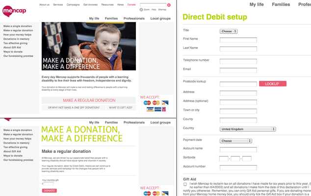
Mencap is the most subtle when it comes to asking for donations—the homepage has no promotional banners or donation form—just a ‘Donate’ link in the main navigation.
This leads to a screen that prioritizes a large photo, heading, and two paragraphs over the almost too-subtle custom buttons below. The donation options are straightforward and familiar: recurring or one-time (judging by the visual hierarchy the priority is recurring payments), yet the copy on each button—especially for one-time donations—is inconsistent.
The intent appears to be a more conversational voice—which is fine, as long as the language is clear. However, it introduces unnecessary text elements into the decision-making process at a point where you want the visitor to be able to choose between two options quickly and move on.
A well-written label will let the user know in an instant what will happen if she chooses that button—when making decisions, we prefer clarity over voice.
Step 1 lacked clarity. In contrast, what follows is markedly simple:
- Step 2, while suffering from the same hierarchal imbalance as the main donation screen before it (two headings, two paragraphs, and then our input form) is almost entirely free of distractions.
- The bold ‘Donate!’ button could have a different label—’Continue’ or ‘One more step!’ for example—but it too is simple and clear by comparison to the buttons on the previous screen.
- After entering a donation amount, we continue to what we know is Step 3 (note the number of steps are not shown to the user in this interface), another simple-looking form requesting our name, contact information, payment details, and contact preferences.
Make the process invisible
None of these websites present any major difficulties to patrons wishing to donate funds, but there is a clear difference in the approach presented by Mencap: it feels like less work, though their language and calls to action could be more consistent. Overall, Mencap’s donation flow has more potential for success because they have reduced the number of choices at each decision point.
While we often believe that displaying the number of steps in a given process is helpful to users, it can easily become a detriment if the process itself is tedious. If your patron is on Step 1 and it’s not downright simple to complete, telling her there are 4 more steps remaining (of potentially equal or higher complexity) is more likely to make her give up than want to continue.
Make it easy enough to complete each step in the process that your visitors don’t even bother to consider about how many steps are left.
Going the Extra Mile
One of the enemies of good design online is our reliance on templates, specifically tied to their use in Content Management Systems (CMSs). In the examples above, many of the shortcomings in each screen’s visual design seem to stem from fitting into a generic template used for many pages—and many types of content—on each website.
Breaking free of templates allows you to design exactly what is needed for each screen, rather than limiting your options with an arbitrary technological constraint. If the templates you are working with are too limiting, work with your developers to improve and customize how they react to your content.
Pitfalls to Avoid
- Don’t send people to different destinations with the same title or purpose.
- Avoid showing users the number of steps in a given process.
- Don’t let your CMS limit the effectiveness of your design.
Things to Do
- Choose your words carefully when designing the text for your interface. Buttons, navigation, links, and other calls to action should be clearly labeled so users know what to expect.
- Rather than worry about how many clicks, steps, or screens are required to complete the process, focus your efforts on designing those steps—whether one or ten—so they are as painless to complete as possible.
- Be consistent in your design choices, such as language, color, positioning, and style.
Further Reading
- “Copywriting is Interface Design”, Getting Real, 4 March 2011
- “Search Words Versus Carewords”, Gerry McGovern, 4 March 2011
- “Design Patterns: An Evolutionary Step to Managing Complex Sites”, UIE, 4 March 2011
What’s your favorite charity, and how easy is it to give to them online?