Every now and then, it’s good to take a critical eye to the work you’ve done and look for ways to improve it, so this review is going to turn the microscope around and focus on the Web Standards Sherpa site. It’s a tough thing to make time for on a largely volunteer project when your team is pretty much flat-out on client work, but we carved out some time in the first few months of this year to revisit this site and make some changes that would help our content go further.
Best Practices Change
We launched Web Standards Sherpa on March 13, 2011. At the time, CSS Media Queries were relatively new and, though we put a lot of thought into how we could use them, we hadn’t really put much collective thought into how we should use them.
As such, our approach for this project ended up tracking Ethan Marcotte’s concept of Responsive Web Design (RWD) — fluid grids, flexible media, and media queries — but it did so from a ”desktop-first“ perspective, using primarily max-width-based media queries:
@media screen {
    /* Desktop Rule Sets (universal) */
}
@media screen and (max-device-width:480px) {
      /* Small Screen Rule Sets */
}
@media screen and (min-device-width:481px) and (max-device-width:1024px) {
    /* The Squishy Middle Rule Sets */
}
At the time, it just made sense to take that approach: We had been designing, prototyping, and building the site for several months before media queries even became a viable option, and we had no interest in maintaining a separate mobile site. So we added RWD into the project in the final month and made it work.
The result was decent. If you used it on mobile, the site worked, but it was clear that the mobile experience was an afterthought. You could use the site in all the then state-of-the-art mobile browsers — Safari, Android, Dolphin, Opera Mini, and Opera Mobile — but interactions were more than a little clunky.
Fast-forward two years and the mobile experience was falling apart. Browsers had gotten a little more savvy — or picky, depending on how you look at it — in how they were handling media queries and viewport-sizing instructions, and Web Standards Sherpa just looked haggard. It needed a makeover.
From “Mobile Friendly” to “Mobile First”
Design-wise, the site is still pretty amazing: Dan Cederholm crafted a timeless look and feel for the site and Steph Troeth’s and Kelly McCarthy’s information architecture was still quite solid. All we needed to do was make mobile a first-rate experience from a styling and interaction perspective.
I wrote on the Easy Designs Blog about making the switch from a “mobile-friendly,” desktop-first site to a “mobile first” one. In it, I discussed how looking at a site from the mobile perspective first is a great way to integrate progressive enhancement:
“[Y]ou optimize your site for use in a mobile context, and then layer on extra styles, JavaScript and content as you find you have more real estate to work with or a more capable device.”
In practice, that lead to quite a few changes:
We Swapped Pixels for Ems
We adjusted our media queries to use em units) instead of pixels to provide the most appropriate reading experience based on the user’s font-size preference. That means if my aunt has her font size increased to 2x, but is on a larger screen, she will get a more linear layout more akin to a tablet view at 1x.
Min-width Instead of Max-width
We migrated most of our media queries to reference min-width rather than max-width so that they would start with the smallest screen first and build up from there:
/* Mobile-first Base Rule Sets */

@media only screen and (min-width:20em) {
    /* 20em and up media query-aware browsers */
}

@media only screen and (min-width:30em) {
    /* 30em and up media query-aware browsers */
}

/* And so on… */
We did not throw out a lot of the original CSS, but instead broke it apart and moved rule sets (or parts of them) into the new queries as appropriate. That saved us a lot of time.
We Have Lots of Breakpoints Now
Whereas the original site only had three breakpoints, the current incarnation has a whopping nine. Some follow somewhat typical conventions (20em, 30em, 48em), but others are pretty site-specific (34.375em, 42.5em, 51.25em, 61.25em). The reason for the change is pretty simple: we wanted to provide a solid reading experience across the board. We tweak the design a fair bit in the squishy middle between small screens and large ones.

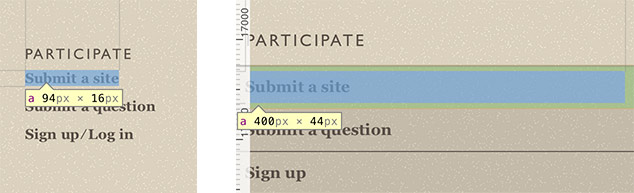
We are More Touch Friendly Now
Dan’s original design had some pretty chunky buttons, so they were quite easy to tap with your finger. Links, however, not so much. We needed to increase the tappable size of the links and the spacing around many of the navigational links to improve tap accuracy. In particular, the links in the footer are quite small and narrowly spaced on desktop. We corrected that on smaller screens where tapping is the more likely interaction model.
We Put CSS and JavaScript on the Same Page
A major headache in most responsive designs is getting CSS and JavaScript to work together. It’s easy to swap styles using media queries, but adjusting JavaScript-based functionality is a little more complicated.
Sure, you could use matchMedia to determine if certain conditions are met before generating or destroying a given JavaScript-based user interface. However, doing that requires that you duplicate your media queries in your JavaScript code, and keep them updated along with any CSS changes you make. To avoid that potential maintenance headache we chose a different solution.
Back in 2012, I had written a little JavaScript called watchResize to track the browser window dimensions (and changes to them) to simplify the authoring of screen-size dependent JavaScript. A few months later, taking a cue from Jeremy Keith’s post about using clever CSS to inform JavaScript of breakpoints, I built a little jQuery-based helper called getActiveMQ to generate a hidden div and then track the font-family CSS property that was set on it. That meant that on the CSS end, all we needed to do was assign each breakpoint a name:
#getActiveMQ-watcher {
      font-family: "break-0";
}
@media only screen and (min-width: 20em) {
      #getActiveMQ-watcher {
            font-family: "break-1";
    }
}
/* And so on… */
And we could get the currently applied value back via JavaScript:
var current_mq = window.getActiveMQ(); // break-XCombining watchResize with getActiveMQ, it became simple to track the current media query in a global variable that any JavaScript in the site could reference:
// Create a global Sherpa JS Object
if ( !( 'WSS' in window ) ) { window.WSS = {}; }
// capture the current breakpoint to WSS.screen_size
window.watchResize(function(){
window.WSS.screen_size = window.getActiveMQ();
});
// Use that value in a lazy-loading images script
window.watchResize(function(){
var $img = $( ' ' ),
$els = $( '[data-image]:not([data-imaged])' ),
curr_break = window.WSS.screen_size.replace( 'break-', '' );
// loop through all elements with a data-image attr
$els.each(function(){
var $el = $(this),
// do they have a min-breakpoint set?
// if not, use break-4
bp = $el.data('image-min-breakpoint') || 'break-4';
bp = bp.replace( 'break-', '' );
// if the current breakpoint is >= the one
// we are testing for, lazy-load the image
if ( curr_break >= bp )
{
$img.clone()
.attr( 'src', $el.data('image') )
.prependTo(
$el.attr( 'data-imaged', '' )
);
}
});
});
' ),
$els = $( '[data-image]:not([data-imaged])' ),
curr_break = window.WSS.screen_size.replace( 'break-', '' );
// loop through all elements with a data-image attr
$els.each(function(){
var $el = $(this),
// do they have a min-breakpoint set?
// if not, use break-4
bp = $el.data('image-min-breakpoint') || 'break-4';
bp = bp.replace( 'break-', '' );
// if the current breakpoint is >= the one
// we are testing for, lazy-load the image
if ( curr_break >= bp )
{
$img.clone()
.attr( 'src', $el.data('image') )
.prependTo(
$el.attr( 'data-imaged', '' )
);
}
});
});Done and done.
Getting Serious About Performance
With our styles working a bit better and our JavaScripts able to follow CSS’ lead on the breakpoints, we focused our attention on download speeds.
As I’m sure you can guess, most of our page weight comes from image content. We optimize every image on the site before it even get onto the server, but each one adds up. We didn’t want to sacrifice the rich visual design of the site or the helpful screenshots in the articles, so we looked for other ways to speed things up.
We Migrated to SASS
In the years since we built this site, our team has moved over to using SASS to speed up our CSS authoring. On smaller, less complicated sites like Sherpa, we’ve found Jake Archibald’s respond-min/respond-max mixin set quite useful.
Jake’s mixin allows us to identify media query blocks but also gives us the ability to strip the rules out of the media queries for older browser that don’t understand media queries (like IE 8 and below). We combined those mixins with a set of variables that defined our breakpoints to ensure consistency across our CSS. Here’s a sample of what that looks like:
$break-1: 20em;
$break-2: 30em;
/* And so on… */

#getActiveMQ-watcher {

    font-family: "break-0";

    @include respond-min($break-1) {
        font-family: "break-1";
    }

    @include respond-min($break-2) {
        font-family: "break-2";
    }

    /* And so on… */

}
We were using a similar technique for concatenating JavaScript files via the CMS, so we opted to abandon that as well. With the move to SASS, we’d become pretty familiar with running build commands via the command line, so we decided to use Uglify to perform the concatenation and minification. And we employed Grunt to orchestrate all of that and to bring our other build step — image optimization — under one roof.
We Moved our CSS and JavaScript into the CDN
With actual static CSS and JavaScript files, we finally had the opportunity to move these files into the CDN (which we were already using for article images). That meant users around the globe would get these files faster.
If you are not familiar with CDNs, they are a great way to skirt browser limits on parallel connections.
We Got Lazier
In the original version of the site, we were using a technique called “lazy loading” to inject the markup for the homepage carousel only when the user was using a large screen and had JavaScript support. We opted to take that route because, while we wanted the carousel to enable a user to move backward and forward in time to see every article, we didn’t think the carousel would provide a good experience on small screens, we knew loading all of that content would not be very bandwidth-friendly, and we also knew that without JavaScript the carousel would not actually work.
In the interest of being more bandwidth friendly throughout the site, we opted to use lazy loading for more pieces of content.
We rolled article comments, which were once in their own section of the site, into the article pages themselves to provide a more integrated experience. As supplementary content, though, they were a great candidate for lazy loading. We did want to keep the comments available to non-Javascript users too though, so we used a slightly customized version of Scott Jehl’s anchor-include pattern to turn a direct link to an actual, separate comments page into a trigger for loading the comments asynchronously:
<a href="/reviews/curing-the-jetblues/comments/#comments"
    data-include-on-tap
    data-replace="/comments/curing-the-jetblues/"
    data-include-size="5">View comments on
    this entry and add your own</a>
The data-* attribute-based instructions here tell JavaScript to replace this link with the HTML retrieved from /comments/curing-the-jetblues/ if the breakpoint is “5” or larger or if the user is on a smaller screen and taps on the link.
We chose a slightly different tactic for managing images. Since article images are fairly useful for illustrating points made in the prose, we felt they were first-rate content important enough to have available to users even if JavaScript was not available. For that reason, we chose to implement Sebastiano Armeli’s jQuery Asynchronous Image Loader (JAIL).
The JAIL markup pattern is pretty simple:
<img class="jail"
    src="data:image/gif;base64…"
    data-src="/r/5-3.png" alt=""/>
<noscript><img src="/r/5-3.png" alt=""/></noscript>
The markup includes the data URI version of a 1x1 alpha-transparent GIF with a data-* attribute indicating the location of the real image. JavaScript will load that image asynchronously when they user scrolls to within a certain (configurable) distance of it in the flow of the document. This means you don’t actually download an image unless we’re pretty sure you’re going to see it.
The noscript is there to provide a non-JavaScript alternative.
We Removed the Share Widgets
Well, that’s not totally accurate. We didn’t remove links to share our content on your favorite social and professional networks, but we did jettison the JavaScript code provided by these networks and went with good old fashioned links instead. We did so for a two primary reasons:
- Using third party widgets allows those third parties to track your users and regardless of whether they admit to doing anything with the knowledge that you are viewing our content, we don’t like the fact that they could.
- Even though CDNs deliver these widgets, they are an additional resource to download and, moreover, an additional JavaScript to execute. Numerous sites have seen third party widgets drastically slow page rendering and we wouldn’t want that.
The Numbers
You’re probably wondering the overall impact of these changes. The table below has the details, but the changes generally dropped the page size by a third or more.
| Page | Screen Size | JavaScript? | Original Size | New Size | Savings |
|---|---|---|---|---|---|
| Homepage | Small | No | 313 kb | 181 kb | 42% |
| Yes | 376 kb | 259 kb | 31% | ||
| Large | No | 313 kb | 189 kb | 40% | |
| Yes | 810 kb | 470 kb | 41% | ||
| Curing the Jet Blues | Small | No | 532 kb | 258 kb | 52% |
| Yes | 720 kb | 515 kb | 28% | ||
| Large | No | 532 kb | 189 kb | 50% | |
| Yes | 756 kb | 263 kb | 28% |
And then there’s the added benefits of fewer asset requests overall and better use of the CDN and caching. So in addition to better serving mobile users from a visual design standpoint, we are also improving things when it comes to experience design. And we’re making it cheaper to read our content for those of you on a metered internet connection.
Author’s Note: Credit where credit is due, Jeff Bridgforth implemented the vast majority of these changes. Thanks for all your hard work Jeff!
Going the Extra Mile
As with any project, there’s always more ways to improve the experience. We can (and probably should) do more to decrease our overall page weight through use of sprites and SVG. Additionally, I’m sure there is more content we could inject asynchronously. And, on the server side, we could be far more aggressive with caching to improve the speed of server responses.
The truth is that no matter how good you get at optimizing performance, there’s always more you can do.
Pitfalls to Avoid
- Don’t wait until the end of a project to consider the experience of users on small screens and devices on mobile networks.
- Don’t structure your media queries desktop-first. If you go mobile-first, you can greatly reduce the download for small screen devices since most browsers will not download any background images that reside in media queries they aren’t applying
- Don’t use
display: noneto hide images on small screens; they will still load the images, the user just won’t be able to see them. - If you’re using multiple style sheets or JavaScript files, consider concatenating the crucial bits into single files and then lazy-load the rest.
Things to Do
- Follow the philosophy of progressive enhancement: star with a solid, universally usable experience and layer on usability and design improvements for larger screens and more capable devices.
- Use lazy loading to asynchronously inject any supplementary content (including images).
- Minify everything!
- Banish 3rd party widget code.
Further Reading
- “From “Mobile Friendly” to “Mobile First””, Easy Designs, 12 October 2011
- “How content delivery networks (CDNs) work”, Nicholas Zakas, 29 November 2011
- “Roundup on Parallel Connections”, Steve Souders, 20 March 2008
- “Conditional CSS”, Jeremy Keith, 27 May 2012
- “Don’t Sell Out Your Users”, Easy Designs, 24 May 2012
- “Improving Smashing Magazine’s Performance: A Case Study”, Smashing Magazine, 8 September 2014
- “How we make RWD sites load fast as heck”, Filament Group, 30 July 2014
What mistakes have you made in support of mobile? What have you learned from them?