Every design process starts with “discovery” or something to that effect. For web builders, discovery allows us to dive into the waters of our client’s new world to observe, study and understand as much as we can before proceeding with solutions.
How do we decide where and how to explore, set our course, and move forward? And how does a new responsive web, without constraints of device widths, affect that exploration? These are the tricky questions that need to be answered at the beginning of a project.
Before You Weigh Anchor, Consider Your Charter
The first task is to discuss the true problem your client is trying to solve. Of course, this may or may not be the problem they originally state. Essentially, “what you want to discover” is one of the earliest — and most critical — activities of the project. At Sparkbox, we prefer to do this with initial engagements. We offer clients small, introductory projects to establish our charter. The entire goal is to explore the problem, identify limits and opportunities, and map out a course.
Discovering the true problem together shows a client how powerful a collaborative relationship can be for the project moving forward. The path to truly meaningful work requires the voice and perspective of all relevant project players and relies on collaboration to guide a team through project twists and turns.
Set Your Course
Once we know the overarching problem we are trying to solve, we can begin to explore the space and factors around the problem.
Below are tools we use to set course on projects, but keep in mind that this is not a one-size-fits-all list. You have to pick and choose what makes sense for a project. Client size, budget, timeline, experience and personality all must be considered. Choose tools that will allow you and the client to dig directly into the core problem and take informed steps toward a solution. It doesn’t have to all come from one activity, and it doesn’t have to be super formal. It all comes back to improving it as you go.
Tool #1: Content Audits
This is nothing more than an exhaustive look at all of the information that exists on a site today. You then evaluate that content and propose what content should exist on the site going forward. There are a million types of content audits out there. Just look at this “content audit” Google image search which shows just some of the approaches you could take:
- You can include the Audience(s)
- You can rank it based on Voice & Tone, Usefulness, Clarity, Engagement, and Findability
- Say whether you should Keep, Edit or Delete
The best approach is to start with the basics and add when you see something relevant to track for a particular client.
Tool #2: Discovering the Brand
Kate Kiefer Lee came up with the idea for a brand voice and tone guide, and shared MailChimp’s Voice & Tone Guide publicly. The guide is intended for all the people who are talking and writing on behalf of your brand to keep things consistent, but it’s great for even more than that. A simple voice and tone guide is a great way to not only help your client write copy later, but also to make sure you and your client are on the same page about who they are. FORGE also offers a free brand workbook that is a great discovery tool for understanding your client’s brand. This step is often most useful for smaller clients who don’t already have very detailed brand documents.
Tool #3: Design Comparisons
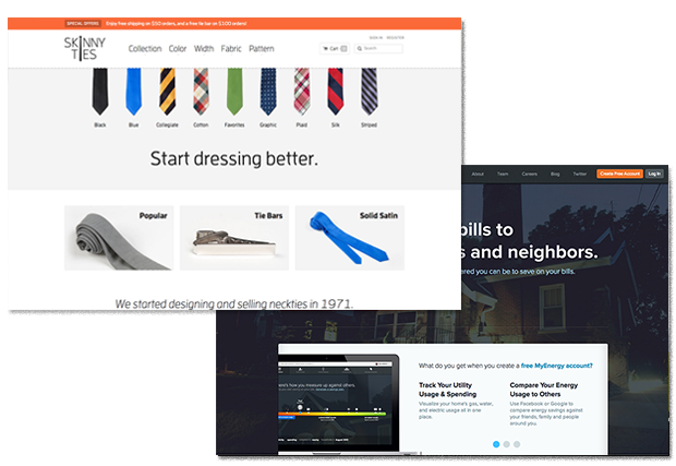
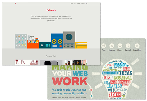
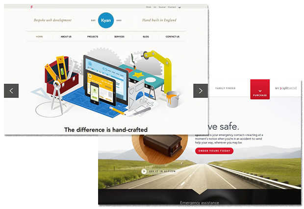
Dan Mall came up with a great exercise to help capture the essence of what a site should look like. Design Comparisons are a presentation of opposite design options (light or dark, modern or traditional, etc.) that you show your clients, and have them pick which style is more appropriate and share why that choice is more appropriate.


Tool #4: Style Prototypes
Samantha Warren created Style Tiles, which she describes as:
A design deliverable consisting of fonts, colors and interface elements that communicate the essence of a visual brand for the web.
While Style Tiles are a static design tool, we’ve adapted the idea to create Style Prototypes, which have all the same elements as Style Tiles, but live in the browser. Moving these early design elements into the browser means your client can review in multiple devices and browsers, which allows you to remind them (early and often) of the realities of responsive web design: There is no one site experience.
Ben Callahan has a detailed post that covers how we work through design in more detail.
Tool #5: Content Priority Guides
Working through a full content audit helps you identify what pages will need to exist on a new site and which of those require unique templates. Our Content Priority Guide takes the unique pages of a site and breaks them down into what content will need to appear on those pages in priority order. This step gives us a really good understanding of the content on the site and how it all lives together (awesome for both design and development). And it gives whoever is writing copy a great guide to get moving early. It can even get you most of what you need to plan the content management system, as well.
Tool #6: Visual Priority Guides and Wireframes
Our Visual Priority Guide is a single deliverable that provides direction for content-focused design and mobile-first development in something resembling a wireframe. It is similar to the content priorities mentioned previously but a bit more visual. For content-heavy pages without much functionality, a content priority guide can typically replace the need for a visual priority guide/wireframe. However, these are a great enhancement of the content priorities when you start to get into interactions, such as special filtering and searching.
Be Willing to Adjust Course and Revisit Scope
Remember to be humble and adjust as you need to. Budget, timeline and personalities might force you to change course or tools during discovery. That’s okay — it’s honestly the point of this project stage. Having a toolkit and project plan to pull from is great, but you will still have to make it up as you go in order to serve your client well. And don’t be afraid when you spot something that needs to change as you navigate the project. New discoveries are not bad things.
Corrections should be a welcomed sign that you are visiting the right places, and getting honest feedback and details to improve the project. Don’t hide them out of embarrassment that you weren’t able to predict the future (or read the collective mind of your client’s organization). State the facts and make your case for a project shift. Good clients crave partners who legitimately have their best interest in mind — not just “yes men.”
Being rigid to an initial plan will hurt you. Because even a successfully executed project can become a business failure if it only achieves the goals of an out-of-date and less-informed hypothesis.
Get Moving
The goal in discovery is to get a project moving, not to outline the entirety of the project. Instead, discovery should establish a cadence that echoes throughout every client meeting and line of code. Real discovery reveals itself throughout each step of the process, so move forward as soon as possible — and keep moving.
Pitfalls to Avoid
- Don’t expect to get it all right on the first try. You will understand the project needs better each day.
- You can research and strategize your budget right down the toilet if you let it get out of hand. Make sure you keep yourself in check. Establishing guideposts of how long you think a step will take is helpful, especially if you find you have trouble moving forward.
- As people who often love beautiful, polished work, it can be very difficult to not want to pretty-ify each and every thing you put in front of a client. But be warned that giving a client something that looks amazingly polished usually locks them up from feeling like they have room to interject and play an important part. Well thought out, but somewhat visually unpolished work that is easy to change sends the message that nothing is right without the client’s input… and nothing is ever final.
Things to Do
- Determine who the real decision-makers are. Discovery is as much about the people in the project as it is the scope.
- Smaller, iterative deliverables tend to be more effective and elicit collaboration more than big, shiny, appear-to-be-set-in-stone deliverables.
- Be okay being uncomfortable. Your client is being forced to be uncomfortable, and you should be pushing yourself enough that you are too.
Further Reading
- “The Sum of the Parts”, Sparkbox, 1 December 2013
- “Client Relationships and the Multi-Device Web”, A List Apart, 23 July 2013
- “Managing Client Expectations”, Sparkbox, 29 May 2013
- Just Enough Research, A Book Apart, 2013
How do you approach discovery in your projects? Have responsive needs changed your tools and/or approach?