Writing CSS for a giant, expanding, ever-evolving website is hard. Writing maintainable CSS that is consistent, easy to understand, simple to reuse and hard to break is even harder! At Behance, our website reaches over 130 pages, many of which exist in multiple states (e.g. logged in or out) and in a wide range of ages (some pages are brand new, some are over a year old, and one or two persist from over 3 years ago!). We’re continuously adding, changing or even slimming down features. And with the constant evolution of the site — and the team that builds it — we face many challenges in keeping the site and its codebase organized. Over the years, our process has changed and grown, and Sass has made a tremendous impact on our workflow, how we write code, and how we tackle all of the challenges of maintaining a huge codebase.
Keepers of Consistency
As front-end developers, I like to say that we are the “keepers of consistency” — the ones responsible for making sure shared UI elements and components are consistent across the entire site for a cohesive look and feel. Sass aids us in ensuring consistency in several ways:
- We maintain a list of variables for global values, mixins, and functions that are reusable across the site.
- We use partials for file management and code organization.
- We use some extra techniques for boosting our responsive code
Defaults and Overrides
All popular CSS pre-processors today let you use variables out of the box, something CSS developers dreamed of for years! For this, we keep a _variables.scss file in our root /sass folder which gets imported into every Sass file (along with a _mixins.scss and a _functions.scss).
Additionally, sometimes we create smaller _variables.scss files inside page-specific folders if a section of the site needs to share a set of variables that the other parts of the site don’t care about. For example, our root _variables.scss contains stuff like this:
// colors
$brand-color: #005cff;
$base-color: #3d3d3d;
$alt-color: #ededed;

// input dimensions
$input-height-small: 25px;
$input-height-normal: 31px;
$input-height-large: 34px;

// general-use breakpoints
$medium-upper-limit: 1024px !default;
$small-upper-limit: 603px !default;

$break-large: ($medium-upper-limit + 1);
$break-medium: ($small-upper-limit + 1) $medium-upper-limit;
$break-small: 0 $small-upper-limit;
$break-small-and-medium: 0 $medium-upper-limit;
The !default flag on some of our variables lets us define default values. That is, if the variable has already been assigned, it won’t be reassigned. But if it doesn’t have a value yet, it will be given one. We sometimes use this to override global values that we want to modify for specific situations.
Many of our reusable components calculate dimensions based on these global variables. For example, one of our reusable components is a grouping of project covers that can appear 1, 2 or 3 images wide depending on our breakpoint values. The reusable component’s partial, _gallery_projects.scss automatically outputs the styles needed for the breakpoints defined above.

Any time we want to change the breakpoints for this component, we need to override the global values that the mixin is using like so:
$medium-upper-limit 1200px;
$small-upper-limit: 0 699px;
@include '_variables.scss';
@include '_gallery_projects.scss';
Since the $medium-upper-limit and $small-upper-limit variables are defined with the !default flag, the $break-medium and $break-small variables are calculated using the new values. and the Sass will compile using the newly defined variables.
Managing Files
The first major impact Sass has for us is in terms of the structure and management of our CSS (Sass, that is) files and folders. There are two components to this:
- How we structure top-level files
- How we structure and use smaller reusable chunks of code
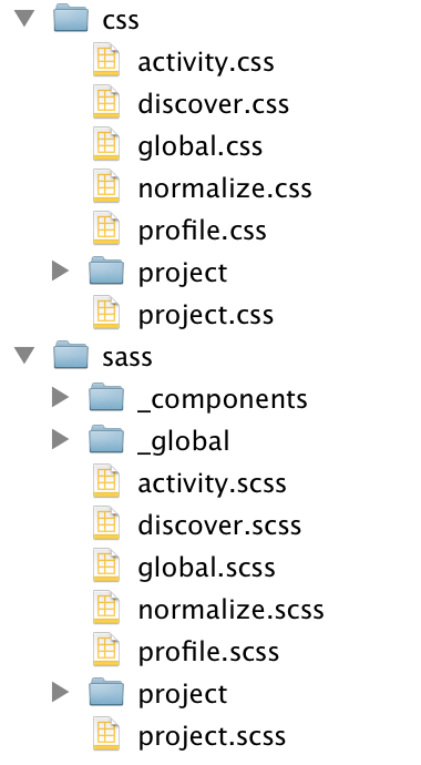
Our top-level Sass files compile directly into CSS and are loaded on the page via a normal link element, and our modular code lives within partials. Here’s an abbreviated look at what our folder structure looks like:
Top-level Files
Our top-level files all sit in the /sass folder root. Every page loads our base files, normalize.css and global.css, and then each individual page additionally loads its own CSS file(s). Here’s an example snippet of what the head of a user’s profile page:
<link rel="stylesheet" href="/normalize.css" />
<link rel="stylesheet" href="/global.css" />
<link rel="stylesheet" href="/profile.css" />
In production, we minify and concatenate our CSS files so they are as small and as few as possible. Our build scripts and PHP framework handles this for us.
Smaller Chunks of Code
The second way we use Sass for file management deals with smaller chunks of code. We use Sass partials, files that do not compile directly to a CSS file on their own, in two ways:
- Reusable components
- General code organization
We often split up particularly large page-specific Sass files into into smaller partials, even if they will not be re-used, to help clearly delineate where code is. Here’s our abbreviated view of our file structure, with the folders from the previous example expanded:
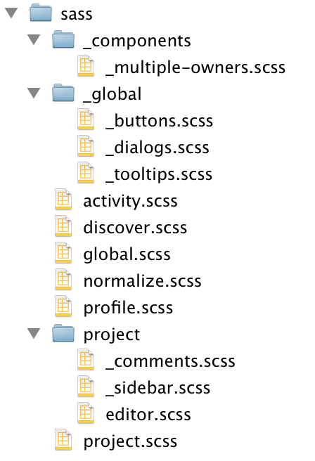
Global and Reusable Components
Our global.scss file contains Sass for standard things like the site background color, font stacks, etc. We use partials to compartmentalize the code for global elements such as buttons, dialogs, tooltips, icons and much more, which are in a folder called /_global. Then, in our global.scss file, we use the sass-globbing extension to import them all at once:
@import '_global/*.scss';The sass-globbing extension lets us import everything in our /_global folder in one line, and the contents of each partial end up in the compiled global.css file. Using this technique, we are free from having to manage a long list of imports, avoiding something like:
@import '_global/_buttons.scss';
@import '_global/_dialogs.scss';
@import '_global/_icons.scss';
@import '_global/_tooltip.scss';
@import '_global/_warnings.scss';
...
In addition to the /_global folder, we keep a top-level /_components folder for components that can be used on any page, but that are not used on every page. The difference here is that the partials in the /_global folder are automatically included in our global.scss file, and the files in the /_components folder can be imported by any individual file that needs it. Having two separate folders make it easy to know at a glance which ones are okay to cherry-pick and which ones are already available on every page. The underscore in the folder name makes it clear that those folders only contain partials.
Partials for Code Organization
For page-specific partials (things that will not be re-used and are only for code organization), they live within a folder named for that page. For example, the imports in our project.scss file look like so:
@import '_components/_multiple-owners.scss';
@import 'project/_comments.scss';
@import 'project/_sidebar.scss';
The _comments.scss and _sidebar.scss partials style specific parts of the project page, so they live inside the /project folder. Though they are not re-used on other pages, the code is complex or lengthy enough to warrant a separation from the main project.scss file to make the code is easier to navigate. (Our project.scss file would be over 600 lines long if we didn’t split it into smaller pieces!)
Overall, we have over 40 general-use partials in our /_components folder, each one used in two or more places around the site. We also have at least 15 global partials in our /_global folder. Sass partials and the sass-globbing extension help us structure our code in a way that makes managing and using it infinitely easier and more clear than if we tried to attempt this in vanilla CSS. In fact, I can hardly even imagine a vanilla CSS solution to this! Without partials, our giant CSS code base would be much bulkier and incredibly difficult to manage.
Responsive Breakpoints
In the same way that our CSS is responsive, our JavaScript must be as well. Some interfaces and interactions change depending on browser size, so both sides of the code must use the same breakpoint values in order for the user experience to be seamless. To prevent having to hard-code values in two separate parts of the code, we use a technique that allows us to store our breakpoints in a JSON file and retrieve them from both the Sass and the JavaScript side.
For example, we can define our breakpoints in a JSON file:
{
  "phone"  : "all and (max-width: 603px)",
  "desktop": "all and (min-width: 1025px)",
  "tablet" : "all and (min-width: 604px) and (max-width: 1024px)"
}
Then, using a custom Ruby function to load and parse the JSON file, we can access those values in our Sass:
$break-desktop: get_breakpoint(desktop);
$break-tablet: get_breakpoint(tablet);
$break-phone: get_breakpoint(phone);

@media #{$break-desktop} {
  body {
    background: red;
  }
}
Since the breakpoints are stored in JSON, you can use something like require.js to load the JSON file into your JavaScript and use those values there as well.
Similarly, Viget Labs created a simple JSON importer to @import a .json file directly into your Sass, translating JSON objects into variables. When Sass 3.3 was released, a new data type called maps was introduced, which has a structure similar to JSON objects.
The Sass JSON Vars plugin will translate your JSON object into a Sass map if your version of Sass is high enough, or just standard variables if not. This technique can be useful for any number of other things in addition to responsive breakpoints!
Special Sass Peripherals
In addition to built-in Sass features, we also use some external libraries to supercharge our code. We’ve already mentioned sass-globbing, but one that has made the biggest impact on us is Compass. It’s popular for its utility mixins that generate verbose code like gradients or remove the need for you to type vendor prefixes, which we often make use of. Compass also has very powerful sprite generation tools that have made a huge impact on how we create and use sprites on our website.
Sprites
Behance makes use of many icons throughout the site, and although we recently converted many to use an icon font, there are still a large number that come from a sprite sheet. In the past, these sprite sheets were built manually by organizing many small images into one big image by a designer. Then, a developer would closely inspect the image to determine coordinates and dimensions for every image, and then manually type all that information into a CSS file … a process very time consuming for everyone involved.
But Compass sprite generation makes the process about a billion times easier. Just drop your individual images into a folder, write a few specific lines of Sass, and Compass will stitch your images together into one sprite file and generate all the CSS for you: classes, dimensions, coordinates and all. You can even choose to take a more hands-on approach and use Compass’ sprite helpers for more fine-grained control over how your sprite CSS is generated.
In just a few short lines you can make a sprite with CSS for each icon’s class, background position and dimension:
$icons-layout: horizontal;
$icons-sprite-dimensions: true;

@import "compass/utilities/sprites/base";
@import "../images/icons/*.png";
@include all-icons-sprites;“Magic” variables exist to set various options for the sprite. They’re called “magic” because they exist based on the name of the folder holding your individual images, which in this example is /icons. The last three lines of code generate the sprite and CSS based on a combination of default options and the ones defined above.
These tools also make it very easy to create and use high pixels-per-inch, or high pixel density, sprites. By separating your 1x and 2x sprites into separate folders and setting the orientation of both sprites to be the same, only a few lines of Sass are needed to define high PPI sprite:
$icons: "icons/*.png";
$icons-2x: "icons-2x/*.png";

$icons-sprite-dimensions: true;

$icons-sprite: sprite-map($icons, $layout: horizontal);
$icons-2x-sprite: sprite-map($icons-2x, $layout: horizontal);

.icon {
  background: sprite-url($icons-sprite);
}

@include pixel-ratio {
  .icon {
    background-image: sprite-url($icons-2x-sprite);
    background-size: image-width(sprite-path($icons-sprite)) image-height(sprite-path($icons-sprite));
  }
}
In this example, our 1x icons are in the folder /icons and the 2x icons are in /icons-2x. We set our 1x sprite as the background image for the .icon class. The pixel-ratio mixin prints out a pixel-ratio media query that overrides the .icon class’ background with the 2x image. The use of background-size shrinks the 2x image down to the dimensions of the 1x sprite, giving it a higher pixel density.
As an added bonus, the Photoshop plugin Slicy quickly exports assets from a single PSD into individual images, simplfying the initial process of saving images out of mockups too. If you are using the latest version of Photoshop CC, the built-in export assets feature can help with this, too.
Overall, Compass sprite generation has been invaluable in its ease of use and the amount of time it has saved us.
Coming Next
In part 2, we’ll explore the knowledge sharing aspect of writing Sass for a huge website. We’ll go over living style guides, documentation and tools to keep all your developers on the same page and make onboarding new team members to your codebase easy.
Going the Extra Mile
Compass, aside from being a great resource for useful mixins and functions, is also a meta-framework: a framework for creating frameworks. You can use it to create your own custom CSS framework to make variables, mixins, functions and more reusable across projects.
Pitfalls to Avoid
- Don’t use extra tools, frameworks or techniques unless they provide a clear, tangible benefit. They can easily add bloat and unnecessarily complicate your code.
- Avoid using
@extendon classes, as the behavior can be unexpected when the extended classes are used throughout your code. Use placeholder selectors instead. - Don’t hard-code vendor prefixes, use a mixin or other tool to handle them for you.
- Don’t use filename shorthand for importing partials, as this can make it harder to search for all the places that a generically-named partial is being included.
Things to Do
- Keep it simple! The more straightforward your code, the easier it is to understand.
- Organize your code in a clear, consistent way that makes it easy to read.
- Familiarize yourself with Sass’ built-in functions. There are tons of them and they can be very useful!
- Use Sass source maps so that your browser’s web inspector shows the line numbers and file locations for the Sass files rather than the compiled CSS.
Further Reading
- The Sass Way, RIZN Media
- HugoGiraudel.com, Hugo Giraudel
What are some techniques you use to make your Sass scalable?