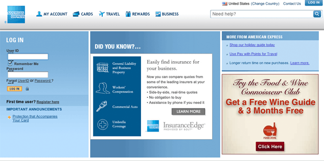
A few months ago, I logged out of my account the American Express website before remembering another task I needed to do, so I clicked the “Log Back In” button they so conveniently displayed. Strangely, the login form I was presented didn’t look the same as the one I was used to seeing on the American Express homepage. This new form had some strange black squiggles above each field.
What the heck are those squiggles? I wondered. A Control-click later, I had inspected one of the squiggles and discovered that it was actually tiny text, the contents of a not-quite-hidden legend element. I wasn’t surprised with my discovery, after all, most accessibility-aware coders have been using legends (and their necessary parent fieldsets) to organize form controls for years. What was different about this implementation was that every field in the form was wrapped in its own fieldset with its own legend. And, as if that wasn’t bizarre enough, each legend contained the same text: “Log In to American Express Online Services”.
Normally, I applaud the use of rich semantics like legend and fieldset as they provide excellent means by which to organize complex forms. But looking at this form, I surmised that the author knew enough to understand the importance of these elements, but wasn’t really sure how to go about implementing them. It’s the classic well-meaning but misguided markup trap we’ve all fallen into at one time or another. Either that, or American Express’ CMS was suffering from some form of markup-based Tourette’s.
Getting organized
Before we dive into alternative markup approaches, let’s take a quick look at the HTML behind this form. Here’s a brief excerpt:
<div><font class="smalltext"><strong>User ID</strong></font></div>
<div>
  <fieldset class="fieldSetStyle">
    <legend class="hideLegend hideLegendIE7">Log In to American Express Online Services</legend>
    <input maxlength="32" name="UserID" size="20" title="Enter the User Id" value="" onchange="uncheckRememberMe()" height="1">
  </fieldset>
</div>
<div>
  <fieldset class="fieldSetStyle">
    <legend class="hideLegend hideLegendIE7">Log In to American Express Online Services</legend>
    <input title="Remember My User ID" name="REMEMBERME"  type="checkbox" class="checkBox" checked>
    <font class="smalltext"><strong>Remember Me</strong></font>
  </fieldset>
</div>
Yeah, I know, the author is using a font element, but let’s table that discussion as I want to focus on fieldset and legend.
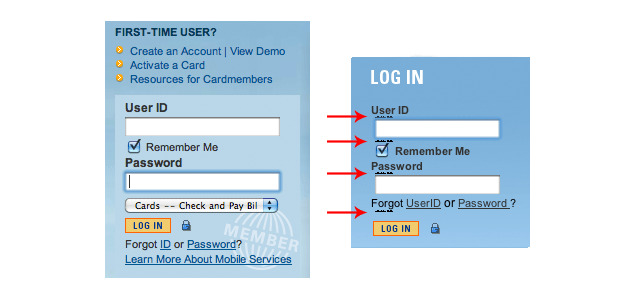
Despite looking quite similar, the version of the login form that appears on the American Express homepage uses no fieldsets at all and, apart from the names used for each of the form fields, bears little resemblance to the over-fieldset-ed form. Here’s a brief excerpt of these same fields in that form:
<div class="labelsfont "><strong>User ID</strong></div>
<!-- skipping some hidden fields -->
<input tabindex="41" class="txtSize" type="text" id="UserID" title="This is the User ID text field where you enter your User ID to login" name="UserID" size="20" onkeypress="return submitenter(this,event)"/>
<div>
  <input tabindex="51" type="checkbox" title="Check this box to have the American Express website securely remember and store your User ID on the computer you are currently using" name="REMEMBERME" onclick="javascript:RmbrChkBox();"/>
  <span class="blkcolorClass ">Remember Me</span>
</div>
The differences between the two forms lead me to believe the forms were either built by two separate departments or built at two very different times by the same department. The fact that one is written as HTML and the other is serialized as XHTML only reinforces that hypothesis. The inconsistencies between the two are problematic for many reasons, but I’ll get to that discussion in a moment.
Obviously, this form is much more condensed, but it suffers from similarly poor markup practices. However, before we jump in and start refactoring the markup of these two forms, let’s quickly review the raison d’être of fieldset and legend elements:
The
FIELDSETelement allows authors to group thematically related controls and labels. Grouping controls makes it easier for users to understand their purpose while simultaneously facilitating tabbing navigation for visual user agents and speech navigation for speech-oriented user agents. The proper use of this element makes documents more accessible.The
LEGENDelement allows authors to assign a caption to aFIELDSET. The legend improves accessibility when theFIELDSETis rendered non-visually.
Looking at the markup of the fieldset-ed form, I think the author was on the right track, just a bit overzealous. If we took his fieldset and legend and, instead of using it to wrap the individual fields, used it to wrap the contents of the form as a whole, I think that’d be a win for everyone:
<fieldset class="fieldSetStyle">
  <legend class="hideLegend hideLegendIE7">Log In to American Express Online Services</legend>
  <!-- form contents will go here -->
</fieldset>
Of course some might argue, as Derek does, that this form is a too basic for a fieldset and legend to be all that helpful, despite being semantically correct. It’s a matter of preference, but if you decide to use the fieldset/legend construct, I would suggest a shorter legend; perhaps, simply, “Log In.”
With the fieldset wrapper in place, the individual form controls and other associated content can be flowed in. Personally, my preference is to use an ordered list (ol) to contain each form control in a collection of several (as we see in this login form), but if you have a penchant for p or div elements, that’s cool too; as long as your content is organized and makes sense both visually and aurally, the choice is yours:
<fieldset class=“fieldSetStyle”>
  <legend class="hideLegend hideLegendIE7">Log In to American Express Online Services</legend>
  <ol>
    <li>
      <font class="smalltext"><strong>User ID</strong></font>
      <input maxlength="32" name="UserID" size="20" title="Enter the User Id" value="" onchange="uncheckRememberMe()" height="1">
    </li>
    <li>
      <input title="Remember My User ID" name="REMEMBERME"  type="checkbox" class="checkBox" checked>
      <font class="smalltext"><strong>Remember Me</strong></font>
    </li>
    <!-- more form content goes here -->
  </ol>
</fieldset>
To label or not to label
If you’re like me, another aspect of the markup that isn’t sitting quite right with you is the lack of label elements surrounding the visual labels for the form (e.g. “User ID”). Surely the label element is more meaningful than font and strong? Of course it is, but it’s worth explaining the approach the authors are using here: they have opted to use title attributes on the form controls rather than label elements. As you probably know, the title attribute provides advisory information about the element it is applied to, which certainly makes it a valid choice for form controls.
When a screen reader encounters a form control, it looks to see if the document contains a label associated with that control. If it finds one, the contents of that label are read aloud; if it does not find one, it will look to see if the control has a title attribute. If it finds a title, that text is read aloud in lieu of a label. This may very well be the reason the author of these forms chose not to use label elements.
It’s certainly a valid method that lines up with the recommendations of WCAG2, but, from my perspective, the label element would be preferable because labels benefit both sighted and non-sighted users alike. They are not only visible and clickable by sighted users, but are made available to non-sighted users when the related form control is focused. The title attribute, in contrast, is only exposed to sighted users as a tooltip when the form control is moused over, meaning that if you want to ensure a sighted user can read that content, you have to include it via a secondary method—as the authors of this form have within the font > strong combo. That sort of redundancy doesn’t sit well with me because I don’t feel that “Enter the User Id” (the contents of the title attribute) provides any more context to non-sighted users than “User ID” would if it were a label. For that reason, I’d simplify the markup and drop the title attributes:
<fieldset class="fieldSetStyle">
  <legend class="hideLegend hideLegendIE7">Log In to American Express Online Services</legend>
  <ol>
    <li>
      <label class="smalltext" for="UserID">User ID</label>
      <input maxlength="32" id="UserID" name="UserID" size="20" value="" onchange="uncheckRememberMe()" height="1">
    </li>
    <li>
      <label class="smalltext">
        <input name="REMEMBERME"  type="checkbox" class="checkBox" checked>
        Remember Me
      </label>
    </li>
    <!-- more form content goes here -->
  </ol>
</fieldset>
As you can see, each form control has its own label element. In the case of the “User ID” field, the label is explicitly associated with the form control using the for attribute (which references the id of the associated form control). In the case of the “Remember Me” checkbox, the label is implicitly associated because it contains that input, demonstrating the alternate method of label-control association. It’s worth noting that explicit association is generally preferred if you need to support legacy browsers like IE6, but you can always assign the for attribute to a label that is using implicit association as a back-up.
Going the Extra Mile
In a large enterprise like American Express, I can’t say I’m surprised to find two different login forms using entirely different markup and style rules, but that doesn’t mean it’s a good thing. Consistency is important and offers clear benefits in terms of maintainability, usability, and security.
On the development side of things, no one likes having to maintain the two separate sets of markup. And it’s never that simple either; with different markup comes different style rules and, generally, different JavaScript. When something has to change, it requires updates in multiple locations. Not only is that inefficient, it makes it more likely the interfaces will diverge even further and provides even more opportunities for bugs to creep into the system. Unifying your codebase makes maintenance far easier.
From a user’s perspective, encountering two or more treatments of the same form or interface can be jarring. And when you are dealing with something as important as a person’s finances, it is even more crucial that they feel comfortable and confident that their personal information is secure. Inconsistencies in something as critical as a login form undermine that, making users uneasy or even suspicious that one of the versions might be part of a phishing scheme.
By refactoring the markup and bringing these two login forms (and any others) in line with one another, American Express would reduce their maintenance overhead, increase users’ confidence in their brand, and make users feel more secure using their service. That’s a lot of “bang” for very little “buck.”
Pitfalls to Avoid
- Avoid using an HTML element when you aren’t clear on its purpose.
- Don’t make two elements or attributes do the work one could do (as seen in the
labelelement vs.titleattribute example). - Don’t repeat yourself by creating more than one codebase (HTML, CSS, etc.) for a reusable component (such as a login form).
Things to Do
- Provide clear labels for your form controls.
- Use
fieldsetandlegendto group related form controls. - Keep reused and often-accessed components consistent in look and feel.
Alternate View
A perfect use for legend and fieldset is when users are asked to provide both a shipping and a billing address for an online purchase. The fieldset and legend for “Shipping Address” and “Billing Address” will help to disambiguate between two identically labeled “City” or “Postal/Zip Code” fields.
How would this work with assistive technology such as a screen reader? It depends on the screen reader and its settings, but by default, the JAWS screen reader will read out the text of the legend before it reads out the name of the field that takes the focus.
What does this mean for the much simpler login form?
<fieldset>
  <legend>Log In to American Express Online Services</legend>
  <label for="UserID">User ID</label>
  <input id="UserID" name="UserID">
  <label for="pass">Password</label>
  <input type=”password” id="pass" name="pass">
</fieldset>
When the user tabs into the User ID field with JAWS active, they will hear something like: “Log In to American Express Online Services, User ID, type in text”
And when they tab into the password field, they will hear: “Log in to American Express Online Services, Password, password, type in text”
And if there were another field? It would read the contents of the legend before that label too.
For most simple forms, it’s likely that you don’t need a fieldset and legend even though they are semantically correct. In this case, a particularly wordy legend makes it downright unwieldy; for best effect, make sure the legend text is concise and to the point.
![]() Derek Featherstone is an internationally-known authority on accessibility and web development, a highly-sought speaker and published author.
Derek Featherstone is an internationally-known authority on accessibility and web development, a highly-sought speaker and published author.
Further Reading
- HTML 4.01 Forms Recommendation, W3C, 1999
- HTML5 Forms Working Draft, W3C, 2011
- “Using titles on form fields”, Accessibility Tips, 25 March 2008
- “Fancy Form Design Using CSS”, Sitepoint, 26 June 2008
How do you use fieldset and legend?
Discussion
, davidrapson said:
said:
, Aaron Gustafson said:
said:
, albert.shala said:
said:
, davidrapson said:
said:
, planet71 said:
said:
, Paul Bedwell said:
said:
, panoramica said:
said:
, www.towerofjade.com said:
said:
, Aaron Gustafson said:
said:
, Anna Nowak said:
said:
, elylennon said:
said:
Share Your Thoughts
Please Log in or Sign up to share your thoughts.