Let’s say you’re a designer or developer who has decided to be your own boss. Entering the world of freelance or starting your own company can be daunting, but you determine what you need to earn to survive, identify your niche skill set, and then set out to find clients.
You might begin by creating a marketing website for yourself—one that attempts to capture the values and goals of the potential clients who might be reading it.
This is where content prioritization and user experience design are vital. They’re two important tools you’ll need to use well to ensure that your website communicates to your potential clients in a way that meets their needs and yours as a business.
Goals first!
“I want to reach Irish businesses and increase the number of requests for quotes that I receive,” said Alexandre L’homme, the man behind IrishWebsiteBuilder.ie. who kindly submitted his site to the Sherpas and asked us to review his site’s content.
Alexandre’s goals are very common for most businesses: reach a particular audience, and get that audience to engage and/or convert into customers. With these objectives in mind, we can write or evaluate our content and user experience design using these core assumptions:
- Understanding what our audiences value will enable us to write targeted content that captures key messages effectively.
- Conveying these key messages consistently will increase the likelihood of our audiences to effectively engage and convert.
So let’s dig a bit deeper into each of these assumptions to determine what actionable paths we can explore to better accomplish our goals.
The right language in the right place
Many websites include a tagline, which attempts to capture—in just a few words—the most important aspect of that business, its greatest differentiators, and what makes it unique. If a user comes to the site only to read a tagline and then bolts, what must she take away about that business?
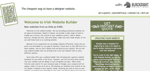
Based on the IrishWebsiteBuilder.ie tagline alone, it’s clear that the website is targeting the budget conscious audience. And I suspect a user who reads “The cheapest way to have a designer website” will undoubtedly get the economic underpinnings of this message.
True, most audiences are sensitive to budgets. But by using terminology like “cheapest,” “from as little as,” and “so affordable,” this website is clearly positioning itself as a web design solution for the thriftiest of businesses.
Often, in addition to a tagline, we create callouts meant to attract the eye and encourage someone to “click.” Sure, we want to lead the user forward (remember the whole don’t make me think goal of great UX design), but we also want to reinforce the primary messaging that pervades our content.
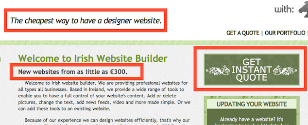
Let’s check out how the tagline of our case study website relates to sub-messages and the call-out itself (as highlighted in the red boxes).

In the context of this example, further emphasizing the tagline is the top right call-out: “Get Instant Quote.” These are words expected of a transaction that doesn’t require much back-and-forth. “Cheap” solutions typically don’t require much negotiation—-they’re quick, and they get the job done.
Note that our conversion goal for this page is for the visitor to click on “Get Instant Quote”; whether the potential customer completes the request for a quote should be addressed separately.
Anticipating elements that can prevent engagement
Messages and callouts that tout “affordability” and “get a quote” (as a self-service model) have natural connotations. They constrain the reader to self-identify himself as the kind of client who is most interested in getting a bottom line estimate immediately—just by answering a few questions—more than taking several weeks or months to define a particular business goal, user experience, or technology solution to meet his needs.
If it’s important to your business, then one way to mitigate the negative connotation that sometimes comes from being “cheap” is to ensure your content and user experience are pristine. This extra attention to detail doesn’t raise questions of quality that are otherwise raised when the audience sees typing errors like “profesional” in the first line of the homepage or “costumize” instead of “customize” in the header of the Quote page.
A potential customer or client who values details like spelling would be less likely to convert if these preventable errors were immediate disqualifiers. However, a customer more concerned with being frugal than seeing perfect spelling might consider easily-fixable issues like this to be an expected downside to an otherwise bargain deal.
The key questions to answer here: What does my target decision-maker value, and do my content and user experience fully reinforce those values?
Identifying your target audience’s values
Taking it a step further, let’s say that you know your product or service is tailored to a very specific, niche audience. It’s common that we have a target audience in mind, but we might feel nervous about being too specific—that is, potentially alienating other readers who could be interested in our services.
So let’s investigate how well our example site reaches its desired audience of “Irish businesses”. Nowhere, currently, does the content of the website speak directly to Irish businesses, even though that’s an aforementioned goal named by Alexandre. Instead, it speaks to all business owners—only the designer himself is identified geographically—and ambiguously refers to the country in the site title.
In other words, “Irish Website Builder” may be describing the builder, not just the websites he builds.
This is problematic if Alexandre only wants to reach Irish businesses, but can be remedied easily through more specific content and targeting of the messages to Ireland-based communication channels, which we will discuss a little later. However, this is not problematic, if Alexandre believes that speaking to all budget-sensitive businesses, regardless of location, better encourages more requests for quotes to be submitted.
The key question to answer: Do we want to tailor our content and user experience to a very clearly defined audience?
Prioritizing key messages
The most consistent message being conveyed on the IrishWebsiteBuilder.ie website is one associated with budgets, as described above. Indeed, a succinct site chock full of the 3-5 key messages will communicate clarity about your business to your target audience.
However, what’s particularly problematic is how much additional content is complicating the conversion for those with whom this message resonates.
On the homepage of our case-study site alone, a user sees content on all the following topics:
- Services offered by Irish Website Builder
- Interactions expected of today’s website technology
- Reasons why prices start at 300 Euro
- An overview of the landscape of other website design companies
- How to use the Get a Quote tool
- A few sentences on why templates can be a poor substitute to website control
- An overview of why Google doesn’t display your website in its search results
- How Irish Website Builder develops its websites
- An option to get an update, rather than redesign, of your website
- An option to receive domain and web hosting free for the first year
- An option to get 100 Euro voucher for “Google adWorks”
This is all in the introductory area of the homepage — more content also exists in the sidebar, not to mention a full list of services provided and features for websites that rounds out this extraordinarily wordy page.
Why would we have all this content? What purpose does it serve?
Choosing conversions over traffic
An obvious conclusion is all this content is primarily working for SEO clout. In fact, as many of us are, Alexandre is concerned that great rankings are standing in his way of reaching Irish businesses. As he said shortly after the site launched, “the SEO is ranking very bad on Google.”
But here’s the rub: Adding more keywords to a website — all in an attempt to increase organic traffic from the search engines — can actually work against clarity of messages.
On the contrary, by communicating consistent, key messages to targeted audiences, IrishWebsiteBuilder.ie will more likely to be viewed by the right business owners who find his key messages valuable to their specific needs.
After all, a prime lead is one most likely to convert — not just a random visitor.
Ultimately, what’s more important to our goals is not the traffic but the conversion; we need to clearly communicate a sub-set of primary messages that will enable our target audience (of qualified leads) to make a decision.
The key question to answer: What are the 3-5 most essential messages necessary to give our target audience the information it needs to engage and convert?
Removing the distraction: The KISS Principle
Increasing the number of estimate requests doesn’t necessarily increase the number of actual sales (i.e. new clients). But what it does accomplish is a foot in the door that is essential to starting a conversation with a potential client.
In order to make the jump, the website visitor has to clearly read messages that resonate with her values, such as budget, speed of delivery, transparency of communication, or the personality of consultants. Then, she has to have easy access to information necessary for her to act, without distraction that may hamper her path to conversion rather than facilitate it.
Indeed, almost every page of a website meant primarily for marketing should clearly convey:
- What this product service is/does
- Why the audience should care
- How that audience will benefit, specifically, by taking advantage of 1.
Knowing your audience’s values, prioritizing the messages she must read in order to make a decision, and dropping any extraneous content (or subjugating it to a newsletter or some other secondary channel) are three actionable ways to ensuring your website speaks to your audiences and supports your success, too.
Going the Extra Mile
Although SEO is an important issue, a more important effort is using electronic elbow grease, so to speak: being proactive in outbound communication. We do this by defining which key messages should be regularly communicated through channels used by those folks we’re trying to reach.
Once those applicable channels and key messages are defined — e.g., writing “Need a custom website without the hefty pricetag?” via Twitter to targeted business owners in Ireland — then we can rely on more than just /a website/ to reach our target audience.
Pitfalls to Avoid
- Avoid overloading any page with content. Prioritize your key content.
- Don’t fear repetition. Seeing the same messages in text or button form can bolster clarity.
- Don’t edit endlessly! Pick the most important messages, push them out, and then watch how they perform.
Things to Do
- To start, just take one page of a website at a time. Write only what’s essential to that page.
- Layer in additional content after the first 3-5 pages are finalized.
- Take into account how a visitor will experience the content as they move between pages.
- Do A/B testing to determine which messages are converting the most users.
Further Reading
- “When Words Fail”, Brain Traffic, 2 June 2011
- Don’t Make Me Think, New Riders, 2005
- Letting Go of the Words: Writing Web Content that Works, Morgan Kaufmann, 2007
How can Twitter, Facebook, blogs, email, LinkedIn, or industry trade magazines be leveraged to help us find our way onto the browsers of our target audience decision-makers?