In Part 1 of this series, I introduced you to Sass, a CSS pre-processor. I showed you how to set up a project using Codekit to compile Sass files, and got started on the basics of the Sass syntax with partials, variables, comments and errors.
In this, Part 2, I’m going to take a deeper look at variables and using maths with variable operations to achieve vertical rhythm. I’ll also discuss Sass nesting syntax to make CSS easier to read and maintain.
Vertical Rhythm with Variables
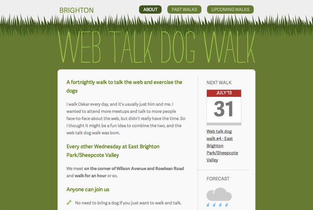
The text and layout elements in my design align to a 10px base grid that I’ve set in Sketch. Ideally, I want to replicate the grid alignment in my CSS to establish a vertical rhythm that creates a consistent pattern down the page.
I can achieve this type of consistency with Sass variables, which can contain numbers, not just the text-based values detailed in Part 1. By creating a variable base unit of 10px, I can align all elements to a 10px grid:
$unit: 10px;Then I can apply this in my paragraph selector to give all paragraphs a bottom margin of 10px:
p {
  margin-bottom: $unit;
}
Which compiles to the CSS:
p {
  margin-bottom: 10px;
}
Math Operators
To make the most of my new base $unit variable, I can use math operators to specify all sizes I may need. For example, the body text font size on Web Talk Dog Walk is 15px, which is the 10px base unit multiplied by 1.5.
The syntax includes the variable, the multiplication symbol * and the value to multiply the unit by:
font-size: $unit*1.5;
Which compiles to the CSS:
body {
  font-size: 15px;
}
Addition (+), subtraction (-), division (/) and percentage (%) operators can also be used on variables to convert units in Sass.
This base $unit variable with math operators can then be applied to a whole load of selector rules. Any rule with a measurement can take a variable, including margins, padding, font-size and line-height:
body {
  background: $grey-mid-light;
  color: $grey-dark;
  font-family: "Adelle Sans", Helvetica, Arial, sans-serif;
  font-size: $unit*1.5;
  line-height: $unit*2.5;
}

h1,
h1 a {
  color: $green-bright;
  font-size: $unit*2.4;
  line-height: $unit*3;
  margin: $unit 0 $unit*2 0;
}

…
Which compiles to the CSS:
body {
  background: #eee;
  color: #474747;
  font-family: "Adelle Sans", Helvetica, Arial, sans-serif;
  font-size: 15px;
  line-height: 25px;
}

h1,
h1 a {
  color: #97C459;
  font-size: 24px;
  line-height: 30px;
  margin: 10px 0 20px 0;
}

…
In these examples, the font-size and the line-height are being defined together. Many web developers prefer to use a unitless line-height on the body, ensuring the line-height scales proportionally to the font-sizes declared throughout the style sheet. Eric Meyer explains the benefits in his post on Unitless line-heights. I want to keep tight control over the vertical rhythm, so I’m defining both the font-size and the line-height wherever I change the font-size. When declaring line-heights with a fixed unit like px, you’ll need to adjust the line-height every time you change the font-size. Otherwise there’s a risk of ending up with a dispropotionately large or small line-height compared to the font-size.
Changing Many Rules Across the Stylesheet
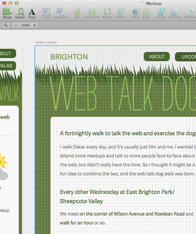
Though my mockup used a 10px grid, text inevitably renders slightly different in browsers than in mockups:
I want to increase the font-size globally while retaining the vertical rhythm and consistency I’ve already established. This is where my base unit variable is magic.
By simply changing the $unit variable to 11px, every instance of $unit will be updated across the Sass files. Where math operators are used, it will be compiled again using 11px as the variable unit:
$unit: 11px;When the Sass is recompiled, we get:
body {
  background: #eee;
  color: #474747;
  font-family: "Adelle Sans", Helvetica, Arial, sans-serif;
  font-size: 16.5px;
  line-height: 27.5px;
}

h1,
h1 a {
  color: #97C459;
  font-size: 26.4px;
  line-height: 33px;
  margin: 11px 0 22px 0;
}

…
With just a single variable change, everything updates and scales together, not just the font-size. This keeps the relative proportions of the design intact.
Nesting Syntax
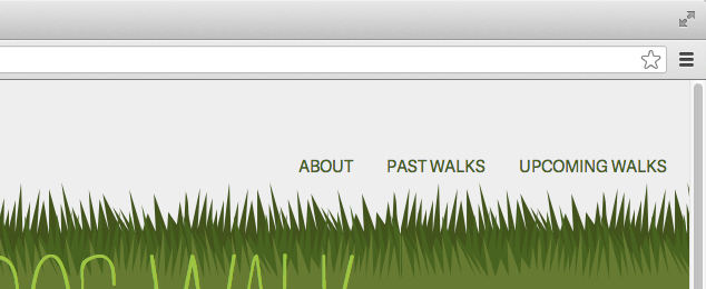
Sass offers a number of ways to keep your CSS organized, including nesting. Web Talk Dog Walk’s navigation:
With ordinary CSS, the rules for this navigation might look something like this, with the rules in order of specificity:
.site-navigation {
  …
}

.site-navigation ul {
  …
}

.site-navigation ul li {
  …
}

.site-navigation ul li a {
  …
}
You might indent your CSS to make it easier to understand the parent-child hierarchy at a glance:
.site-navigation {
  …
}

  .site-navigation ul {
    …
  }

    .site-navigation ul li {
      …
    }

      .site-navigation ul li a {
        …
      }
But Sass takes this even further. Rules can be nested inside the parent selector. This means the .site-navigation class doesn’t have to be repeated for every selector:
.site-navigation {
  …

  ul {
    …

    li {
      …

      a {
        …
      }
    }
  }
}
Sass knows .site-navigation is the parent because the ul rule is nested inside .site-navigation’s curly brackets. It’s much easier to read, less repetitive and outputs exactly the same CSS:
.site-navigation {
  …
}
.site-navigation ul {
  …
}
.site-navigation ul li {
  …
}
.site-navigation ul li a {
  …
}
The CSS output from the Sass in this example makes the Sass easier to read, but has exactly the same results as the ordinary CSS. It unnecessarily repeats the <ul> and <li> selectors, even though it’s unlikely there’ll be different <ul>s and <li>s in the site navigation that requires different rules. This results in overly specific descendent selectors that can be harder to override with more CSS in the future. When nesting selectors in this way, try to avoid unnecessarily nesting selectors. The ideal Sass and CSS for this example would look something like:
.site-navigation {
…
  ul {
    …
  }
  li {
    …
  }
  a {
    …
  }
}
Which would result in the CSS:
.site-navigation {
  …
}
.site-navigation ul {
  …
}
.site-navigation li {
  …
}
.site-navigation a {
  …
}
Nesting with Parent Selectors
For this navigation, I want the selected link to stand out from the other links, to help the user understand where they are on the site:
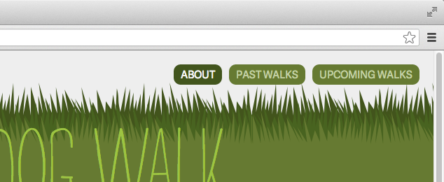
Fortunately, the nesting syntax allows you to specify a combined selector within the hierarchy by prefixing the nested selector with an ampersand (&). The ampersand represents the nested rule’s immediate parent, so this nested rule generates a selector combined with its parent rule rather than descending from it.
On Web Talk Dog Walk, the .selected class is added to the li element. So in the Sass, the &.selected rule is nested inside the li selector:
.site-navigation {
  …

  ul {
    …

    li {
      …

      &.selected {
        a {
          background: $green-dark;
          color: $grey-light;
        }
      }

      a {
        …
      }
    }
  }
}
Which compiles to:
.site-navigation {
  …
}

.site-navigation ul {
  …
}

.site-navigation li {
  …
}

.site-navigation li.selected a {
  background: #3F5526;
  color: #f9f9f9;
}

.site-navigation li a {
  …
}
Nesting with Pseudo Selectors
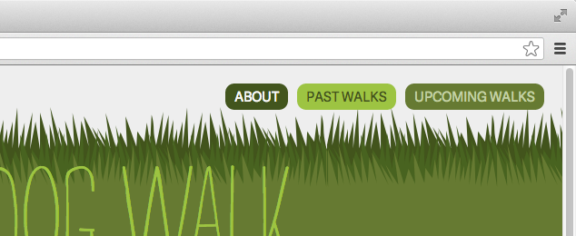
You can also use & to include pseudo classes and elements in nested Sass:
&:hover&:active&:focus&:before&:after
I used this approach for the hover and active states of the Web Talk Dog Walk navigation:
a {
  …

  &:hover, &:active {
    background: $green-bright;
    color: $green-dark;
  }
}
Which compiles to the CSS:
a {
  …
}

a:hover, a:active {
  background: #97C459;
  color: #3F5526;
}
Nesting and Media Queries
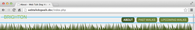
In a narrow viewport, Web Talk Dog Walk’s “Brighton” header text and navigation sit neatly one above the other. But when the viewport is about 530px wide, the navigation doesn’t line up with the “Brighton” header text:
Media queries can change the layout depending on the width of the viewport, and Sass nesting makes writing (and reading) media queries so much easier than traditional CSS. In ordinary CSS, the media query would need to go after the base styling with a new rule for the modified styling, repeating the entire selector:
.site-header h2 {
  margin: 0 11px;
}

@media only screen and (min-width: 530px) {
  .site-header h2 {
    margin-top: 16.5px;
  }
}
With Sass media query nesting, the media query can be nested inside the selector without duplicating the entire rule, simply adding the new property and value (once again using our $unit variable):
.site-header {
  h2 {
    margin: 0 $unit;

    @media only screen and (min-width: 530px) {
      margin-top: $unit*1.5;
    }
  }
}
This compiles to:
.site-header h2 {
  margin: 0 11px;
}

@media only screen and (min-width: 530px) {
  .site-header h2 {
    margin-top: 16.5px;
  }
}
Sass writes out the repetative CSS we’ve avoided in our source file. Nesting media queries makes it much easier to make little breakpoint tweaks to different selectors. It can be less repetitive and takes up less room, too, making it far more readable.
Coming in Part 3!
In Part 3, we’re going to look at mixins, including using variables in mixins. To become power users of Sass, we’ll understand the difference between mixins and placeholders, and how to use other people’s frameworks to import useful mixins that make our development faster.
Going the Extra Mile
Unit variables can also be used on media queries, keeping the breakpoints relative to the text and margin sizes:
@media only screen and (min-width: $unit*53) {
  …
}
Compiles to the CSS:
@media only screen and (min-width: 583px) {
  …
}
Pitfalls to Avoid
- Give your variables meaningful names so they’re easy to read, and use comments to explain what the variable does.
- Don’t nest parent and child selectors where you could use a class instead.
Things to Do
- Nest your media queries to make your stylesheets easier to read.
- Use color functions to tweak your colors slightly.
Further Reading
- A Visual Guide to Sass & Compass Color Functions, Jackie Balzer
- Sassmeister: a playground for Sass, Compass and LibSass, SassMeister
How do you use math operators in your Sass?