There is no doubt that everyone is talking about HTML5 these days. What isn’t as clear is who is actually using it and how it’s being used. Not surprising, really, when you think about all HTML5 entails. Native media, SVG, geolocation, advanced JavaScript APIs and web storage barely scratch the surface.
In speaking with fellow designers and developers, I’ve discovered that many people feel overwhelmed by HTML5 and don’t really know where to start or even if it is relevant to their projects. Fortunately, HTML5 is not an all or nothing proposition. You can pick and choose what works best for your needs.
Nothing But DOCTYPE
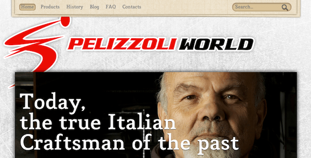
Consider Pelizzoli World, a reader-submitted site that uses the simplified HTML5 doctype:
<!DOCTYPE html>Beyond the doctype, though, that’s just about it for HTML5 on Pelizzoli World’s home page. And that’s perfectly fine.
HTML5 aims to be developer-friendly and backwards-compatible, with a simpler and more flexible syntax than the XHTML style you may have been writing. A single change to the DOCTYPE and developers can take advantage of a less strict style, including:
- Uppercase tag names
- Optional quotes for most attribute values (see the Mothereffing unquoted attribute value validator)
- Optional values for attributes
- Optional closed empty elements
Using the HTML5 doctype can be a perfect first step for legacy sites or those with add-ons from different developers with different coding styles. Existing markup doesn’t necessarily have to be adjusted, while future development can take advantage of more HTML5.
After the doctype, though, what’s next?
Semantic Structure
HTML5 brings us designers and developers several new elements that are used to define the structure of page content:
header- Contains the headline(s) for a page and/or section of content, which means there can be multiple instances on a page. Can also contain supplemental information such as logos and navigational aids.
section- Is the most generic of the new structural elements, containing content that can be grouped thematically or is related.
article- For self-contained content that could be consumed independent of the page as a whole, such as a blog entry or something that could be syndicated.
aside- Contains information that is related to the surrounding content but also exists independently, such as a sidebar or pull-quotes.
nav- Contains the major navigation links for a page and, while not a requirement, is often contained by
header. footer- Contains information about a page and/or section of content, such as who wrote it, links to related information and copyright statements. Like
header, there can be multiple instances on a page
All of these new elements are semantic, which means they provide meaning about their content. It also means you don’t use these elements simply to have a parent container for styling purposes—what non-semantic divs are meant for.
HTML5 Support
All of today’s modern browsers have some level of HTML5 support or another. In fact, all browsers (including IE6 and its earlier brethren) recognize the shortened doctype and will render pages in strict standards mode.
As for the new structural elements, all modern browsers recognize the elements and will render what they contain. Older browsers that don’t recognize the structural elements treat them as inline objects, which can cause visual rendering problems. Fortunately, the solution is simple: tell those browsers to render the new elements as blocks:
header, section, article, aside, nav, footer {
  display: block;
}
Unfortunately, the solution isn’t entirely that simple if you are dealing with Internet Explorer before version 9. For those browsers, you also have to add a bit of JavaScript:
<script>
  document.createElement('header');
  document.createElement('section');
  document.createElement('article');
  document.createElement('aside');
  document.createElement('nav');
  document.createElement('footer');
</script>
You can also take advantage of a polyfill to force older browsers to render the new HTML5 structural elements correctly. These are basically plugins of code to help older browsers mimic current, native functionality. For my HTML5 sites, I use Remy Sharp’s HTML5 Shim, and it takes care of both the CSS and JS I need for backwards-compatibility with a single script:
<!--[if lt IE 9]>
  <script src="http://html5shim.googlecode.com/svn/trunk/html5.js"></script>
<![endif]-->
Structuring Pelizzoli World
Let’s take a look at how the Pelizzoli World home page could be more semantically structured with HTML5. First, we have to evaluate the content, because it will dictate the structure and semantics of the markup.
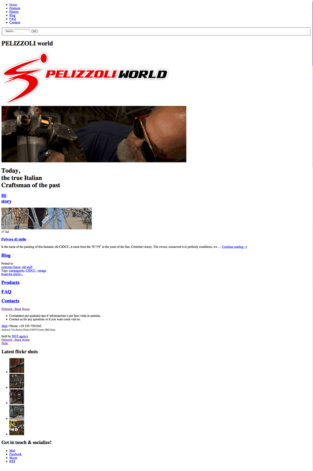
Let’s start by turning off the CSS so we can focus on the content, which includes:
- Primary navigation
- Search form
- Logo and site name
- Hero photos with caption
- Repeated navigation links
- Latest blog post
- Contact information
- Social media links
- Flickr photo gallery

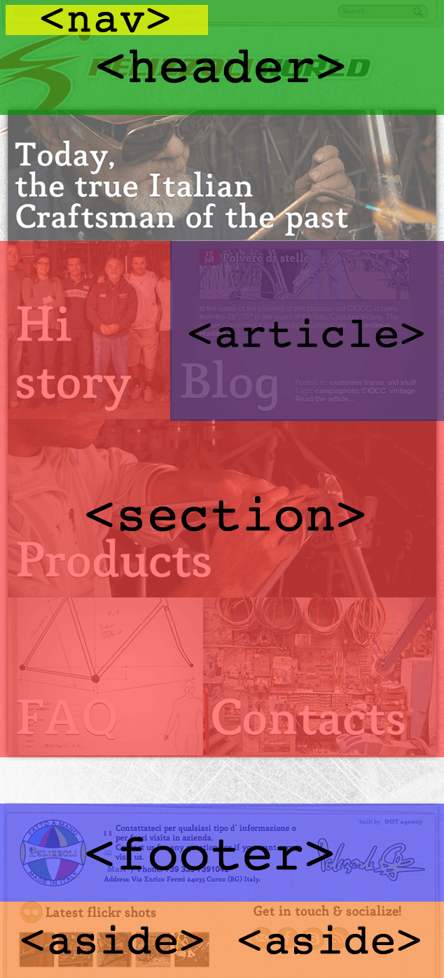
From that list alone, I can already envision some of the new HTML5 structural elements that would be useful:
- A page-level
headercan contain the primary navigation, search form, logo and site name. navmakes sense for at least the primary navigation and perhaps even the navigation links within the main body of content.- As “syndicatable” content, the latest blog post would be appropriate for
article. - A page-level
footerwould be a good fit for the contact information, and maybe even the social media links. - Both the Flickr gallery and social media links can exist on their own, though, so
asidemay the better option for those. sectionmay also be an option for containing the repeated navigation links since they could be considered related.

header & nav
Starting at the top of the page, let’s begin converting some of the markup to these HTML5 elements. Here’s the core markup (edited for brevity) for the Pelizzoli site primary navigation, search, logo and headline:
<div id="access" role="navigation">
  <div class="menu-header clearfix">
    <ul id="menu-top-bar" class="menu clearfix">
      <li id="menu-item-17"><a href="/">Home</a></li>
      <li id="menu-item-23"><a href="/products/">Products</a></li>
      <!-- … -->
    </ul>
  </div>

  <form id="searchform" method="get" action="/">
    <!-- … -->
  </form>
</div>

<h1 style="display:none;">PELIZZOLI world</h1>

<a id="logo" href="/" title="PELIZZOLI world" rel="home"><img src="IMG_logo.png" alt="PELIZZOLI world" height="274" width="855" /></a>
And here’s the same content modified to use HTML5’s header element:
<header id="access" role="navigation">
  <div class="menu-header clearfix">
    <ul id="menu-top-bar" class="menu clearfix">
      <li id="menu-item-17"><a href="/">Home</a></li>
	  <li id="menu-item-23"><a href="/products/">Products</a></li>
	  <!-- … -->
    </ul>
  </div>

  <form id="searchform" method="get" action="/">
    <!-- … -->
  </form>

  <h1 style="display:none;">PELIZZOLI world</h1>

  <a id="logo" href="/" title="PELIZZOLI world" rel="home"><img src="IMG_logo.png" alt="PELIZZOLI world" height="274" width="855" /></a>
</header>
Next, let’s replace div.menu-header with the nav element:
<header id="access" role="navigation">
  <nav class="menu-header clearfix">
    <ul id="menu-top-bar" class="menu clearfix">
      <li id="menu-item-17"><a href="/">Home</a></li>
      <li id="menu-item-23"><a href="/products/">Products</a></li>
      <!-- … -->
    </ul>
  </nav>

  <form id="searchform" method="get" action="/">
    <!-- … -->
  </form>

  <h1 style="display:none;">PELIZZOLI world</h1>

  <a id="logo" href="/" title="PELIZZOLI world" rel="home"><img src="IMG_logo.png" alt="PELIZZOLI world" height="274" width="855" /></a>
</header>
Strictly speaking, header is not required to contain nav, as in the last example, although it is common. An alternative approach could also be used, separating nav and header:
<nav>
    <ul id="menu-top-bar" class="menu clearfix">
      <li id="menu-item-17"><a href="/">Home</a></li>
      <li id="menu-item-23"><a href="/products/">Products</a></li>
      <!-- … -->
    </ul>
</nav>

<header>
  <form id="searchform" method="get" action="/">
    <!-- … -->
  </form>

  <h1 style="display:none;">PELIZZOLI world</h1>

  <a id="logo" href="/" title="PELIZZOLI world" rel="home"><img src="IMG_logo.png" alt="PELIZZOLI world" height="274" width="855" /></a>
</header>
section & article
Next, let’s consider the original HTML for main content of the page, which is really just the primary navigation links repeated and the latest blog post:
<div id="home" class="clearfix">
  <a href="history" class="history"><h2>Hi<br />story</h2></a>

  <div class="blog">
  	<!-- … -->
  	<a href="blog" class="blog_title"><h2>Blog</h2></a>
  	<!-- … -->
  </div>

  <a href="products" class="products"><h2>Products</h2></a>

  <a href="faq" class="faq"><h2>FAQ</h2></a>

  <a href="contacts" class="contacts">&tl;h2>Contacts</h2></a>
</div>
Because the main content in this part of the page is navigation links, I toyed with the idea of using nav as the parent container instead of the existing div#home. However, since this content also contains the latest blog post, I believe nav is too narrow for this scenario and instead recommend section:
<section id="home" class="clearfix">
  <a href="history" class="history"><h2>Hi<br />story</h2>

  <div class="blog">
    <!-- … -->
    <a href="blog" class="blog_title"><h2>Blog</h2></a>
    <!-- … -->
  </div>

  <a href="products" class="products"><h2>Products</h2></a>

  <a href="faq" class="faq"><h2>FAQ</h2></a>

  <a href="contacts" class="contacts">&tl;h2>Contacts</h2></a>
</section>
Next I can replace the non-semantic div.blog for the latest blog post with article:
<section id="home" class="clearfix">
  <a href="history" class="history"><h2>Hi<br />story</h2>

  <article class="blog">
    <!-- … -->
    <a href="blog" class="blog_title"><h2>Blog</h2></a>
    <!-- … -->
  </article>

  <a href="products" class="products"><h2>Products</h2></a>

  <a href="faq" class="faq"><h2>FAQ</h2></a>

  <a href="contacts" class="contacts">&tl;h2>Contacts</h2></a>
</section>
Remember, section is the most generic of the structural elements, requiring only that the content is thematically grouped or related. For some, it may be a stretch that the navigation links and latest blog post are thematically grouped. An alternative approach would be to separate these two sections of content, which would then support use of nav rather than section in the first example:
<nav>
  <a href="history" class="history"><h2>Hi<br />story</h2>

  <a href="products" class="products"><h2>Products</h2></a>

  <a href="faq" class="faq"><h2>FAQ</h2></a>

  <a href="contacts" class="contacts">&tl;h2>Contacts</h2></a>
</nav>

<article>
  <!-- … -->
  <a href="blog" class="blog_title"><h2>Blog</h2></a>
</article>
footer & aside
Finally, we come to the last bit of original markup, which is the contact information, social media links and Flickr gallery:
<div id="footer">
  <div class="wrap">
    <a id="logotondo" href="/">Pelizzoli - Back Home</a>
    <!-- … -->
    <a href="…">Mail</a> /
      Phone: <span class="phone">+39 335 7391042</span><br />
    <small>Address: Via Enrico Fermi 24035 Curno (BG) Italy.</small>
    <!-- … -->
    <div id="flickr_box">
      <a class="icn" href="…">flickr</a><h2>Latest flickr shots</h2>
      <ul id="flickr" class="clearfix">
        <li><a href="…"><img src="…" alt="Completely original" height="75" width="75" /></a></li>
        <!-- … -->
      </ul>
    </div>

    <div id="social_box">
      <h2>Get in touch & socialize!</h2>
      <ul class="clearfix">
        <li><a id="mail" href="…">Mail</a></li>
        <li><a id="facebook" href="…">Facebook</a></li>
        <!-- … -->
      </ul>
    </div>
  </div>
</div>
Upon first glance, I wanted to simply replace div#footer with the more semantic footer element and drop the id to reduce redundancy. Then I thought to contain both the Flickr gallery and social media links with asides:
<footer>
  <div class="wrap">
    <a id="logotondo" href="/">Pelizzoli - Back Home</a>
    <!-- … -->
    <a href="…">Mail</a> /
      Phone: <span class="phone">+39 335 7391042</span><br />
    <small>Address: Via Enrico Fermi 24035 Curno (BG) Italy.</small>
    <!-- … -->
    <aside id="flickr_box>
      <a class="icn" href="…">flickr</a><h2>Latest flickr shots</h2>
      <ul id="flickr" class="clearfix">
        <li><a href="…"><img src="…" alt="Completely original" height="75" width="75" /></a></li>
        <!-- … -->
      </ul>
    </aside>

    <aside id="social_box">
      <h2>Get in touch & socialize!</h2>
      <ul class="clearfix">
        <li><a id="mail" href="…">Mail</a></li>
        <li><a id="facebook" href="…">Facebook</a></li>
        <!-- … -->
      </ul>
    </aside>
</div>
</footer>
This would certainly be acceptable. But focusing on the content further, the new asides are related to the entire document, not just the footer. As such, a more semantic approach would have the asides as siblings of footer, rather than children:
<div class="wrap">
  <footer>
    <a id="logotondo" href="/">Pelizzoli - Back Home</a>
    <!-- … -->
    <a href="…">Mail</a> /
      Phone: <span class="phone">+39 335 7391042</span><br />
    <small>Address: Via Enrico Fermi 24035 Curno (BG) Italy.</small>
    <!-- … -->
  </footer>

  <aside id="flickr_box>
  	<a class="icn" href="http://www.flickr.com">flickr</a><h2>Latest flickr shots</h2>
  	<ul id="flickr" class="clearfix">
      <li><a href="…"><img src="…" alt="Completely original" height="75" width="75" /></a></li>
  	  <!-- … -->
  	</ul>
  </aside>

  <aside id="social_box">
  	<h2>Get in touch & socialize!</h2>
  	<ul class="clearfix">
  	  <li><a id="mail" href="…">Mail</a></li>
  	  <li><a id="facebook" href="…">Facebook</a></li>
  	  <!-- … -->
  	</ul>
  </aside>
</div>
In this example, the footer is semantically true, simply containing the contact information. The asides, meanwhile, contain their independent, related information without being part of footer.
The point of these different examples show how nuanced semantic markup can be. Ultimately, it requires that you think about your content differently. I, personally, love HTML5 Doctor’s series of simple quizzes to challenge how I think about content and marking up that content.
The Final Structure
A complete glance at the final HTML5 structure of the Pelizzoli home page:
<nav>
  <!-- … -->
</nav>

<header>
  <!-- … -->
<header>

<nav>
  <!-- … -->
</nav>

<article>
  <!-- … -->
</article>

<footer>
  <!-- … -->
</footer>

<aside>
  <!-- … -->
</aside>

<aside>
  <!-- … -->
</aside>
These types of markup changes to an existing design will likely require changes to CSS. It may even behoove the author to reconsider some of the id and class values, since it may be more efficient or performant to target CSS selectors based on an element rather than an id and class.
From my own experiences, though, the changes to CSS usually result in my markup and styles being more efficient and optimized.
Going the Extra Mile
Beyond semantics, the new HTML5 structural elements have the potential to aid accessible navigation by indicating content landmarks. You can further enhance content navigation with ARIA Document Landmark Roles which are added to markup through the role attribute. Different values indicate different landmarks:
role="banner"- site-orientated content, such as the name of the site, title and/or logo.role="navigation"- main navigation linksrole="main"- main contentrole="search"- site searchrole="article"- stand-alone contentrole="complementary"- supplemental contentrole="contentinfo"- meta child content, such as footnotes and copyrights.role="application"- application content and functionality.
On the Pelizzoli home page, the author is already trying to aid accessibility with ARIA roles:
<div id="access" role="navigation">However, when using the HTML5 elements, there is some redundancy you can avoid. For example, if you use nav for primary navigation, you don’t need to assign role="navigation". Similarly, aside inherently means tangential content, so role="complementary" isn’t needed on those.
Where the Pelizzoli home page could use some ARIA love is on some of the other elements:
<header role="banner"><form id="searchform" method="get" action="/" role="search"><footer role="contentinfo">
Pitfalls to Avoid
- Don’t misuse the new structural elements just because you need a container for grouping or styling. The non-semantic
divcan still be used when a more specific element isn’t appropriate. - Not all groups of links on your site need
nav. Remember,navis for major navigation, such a primary navigation and site search. - Don’t wait for an entire redesign of your site to start using these new elements. Remember, HTML5 is backwards compatible. You can change the doctype and make incremental changes.
Things to Do
- Before writing markup, focus on your content. Identify the types of content you have and consider which of the HTML5 structural elements are most appropriate.
- Get your structure in place before adding any markup for presentation. Extra
divs for styling hooks or scripting convenience should be the last markup that hits your page. And you may even find you don’t need them, because enough structure is already in place thanks to the new HTML5 elements.. - Read the WHATWG HTML5 specification for both new elements and the old elements you think you know. It includes markup samples and guidance on the semantics of elements.
Further Reading
- “The section Element”, HTML5 Doctor, 11 September 2009
- “How ARIA landmark roles help screen reader users”, Nomensa, 29 June 2010
- “HTML5 Accessibility”, The Paciello Group, 1 July 2011
- “Dive Into HTML5: Semantics”, Mark Pilgrim, 9 August 2011
- HTML5 for Designers, A Book Apart, 2010
- HTML5: Up and Running, O'Reilly, 2010
Have you experimented with the new structural elements? What was your greatest challenge?