Content strategy is the practice of planning for, designing, and managing content in the long term. It can help you avoid all sorts of trouble, even if you’re not a big company with thousands of employees. Small organizations need smart content structure, rules, and governance plans too, to make sure they’re using their limited resources in the best possible ways.
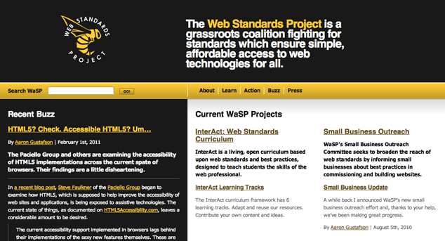
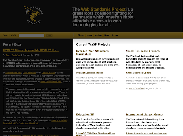
In the spirit of taking one for the team, the friendly folks at WaSP have offered up their own site for dissection in this column, and I’ll be focusing primarily on the WaSP homepage for this critique.
Meet the homepage
The largest section of content on the homepage is devoted to “Current WaSP Projects,” which makes sense—showing site visitors what you’re working on is a great way to increase participation in group efforts, and to highlight your organization’s successes. This section contains four content chunks of content:
- InterAct: Web Standards Curriculum
- Small Business Outreach
- Education TF
- International Liaison Group

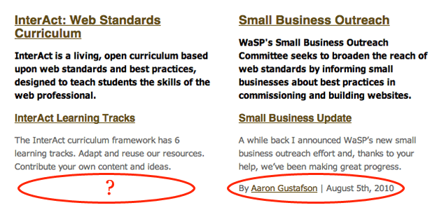
Each of these content chunks includes a linked heading, a blurb about the project, a linked subhead, and a blurb that appears to deal with a particular aspect of the project. Three of these smaller blurbs also include an author attribution and posting date.
So far, so good. Now let’s take it apart.
Easy fix: consistency
The most obvious content-related problem in this area of the page is one of inconsistency. Although the presentation of the four project sections is consistent, a quick reading of the content reveals several irregularities in the content of the topical blurbs:
- “InterAct” is also spelled “InterACT”—and more importantly, it seems to be part of two different projects in ways that are a bit confusing.
- The four topical blurbs use three different points of view (first person plural, first person singular, and third person).
- Some topical blurbs lack author attributions and dates.

These minor inconsistencies are easy to miss—especially when a site grows organically and without formal structural oversight. But even these small shifts in style and point of view can be confusing to readers, and they detract from the visitor’s sense of a unified, organized brand.
The implementation-level fix for this problem is to go in and make these pieces consistent by adding or removing information, and standardizing editorial style in the blurbs. But although that’s useful, it’s a one-time repair that won’t do anything to help keep the site consistent in the future. So after they fix up the specifics, it would be smart for WaSP to:
- document the structure of each site section,
- create an editorial style guide that all content creators can use, and
- make sure someone is assigned to do regular quality checks on the homepage and other major site sections.
Trickier: timeliness
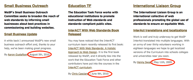
The next thing I notice about the homepage content is that the dates on these blurbs tell a troubling but familiar story about long-term content planning.
Of the four projects showcased on the homepage, one was updated in August of 2010, one in June of 2010, and another in May of 2009. The fourth has no date listed for a recent update. Prominently featuring blog-post-style dates in these blurbs encourages readers to expect currency—and to look askance at content that seems to be nearly two years old.

In either case, the presence of these dated posts suggests that WaSP has experienced one of the commonest editorial strategy problems: underestimating the amount of time and planning required to maintain an aggressive update schedule.
Let’s be honest. It’s really hard hard to keep a website or blog updated over time, especially when you’re overworked and understaffed. (And I don’t know anyone who’s overstaffed.) But if you can’t maintain a strict blogging/update schedule, there are things you can do to ease the tension between your plans to update weekly and the reality of updating a few times a year.
The current method of display risks giving the impression that WaSP is mostly dormant, or that the featured projects have trailed off into oblivion. But there’s hope, even if no one has time to update more frequently.
- If the content on this section of the homepage isn’t time-sensitive, the dates need not be featured so prominently.
- If this content does rely on timeliness for relevance, then it doesn’t belong on the WaSP homepage once it’s more than a few months old.
- And if someone does have time to create an editorial calendar, coax updates out of participants, and post them on the site, that’s the best plan of all.
Challenge: relevance to target audiences
There’s a much more important problem with these otherwise innocuous chunks of content, which is that they’re not especially user-friendly in several ways. For one, the projects are presented in ways that rely heavily on WaSP’s internal language. We have:
- an “open curriculum” (reasonable!)
- an “Outreach Committee” (not so welcoming, but not bad)
- a “TF” that turns out to be a “Task Force” (how is that different from a committee?), and
- an “International Liaison Group” (neither committee nor task force)
All these pieces of internal language are too much for non-insiders to try to understand, especially when they don’t already have a solid grasp of what WaSP does.
More fundamentally, there isn’t an obvious “way in” for an interested site visitor who wants to find out how to contribute to one of these projects. The projects aren’t clearly arranged according to interest area—in any obvious way, at least—and the intended audience is all over the map. For example, the topical blurb under “InterAct” seems to be addressed to college professors:
The InterAct curriculum framework has 6 learning tracks. Adapt and reuse our resources. Contribute your own content and ideas.
…but there are no cues that directly invite academic attention except for the word “curriculum” in the section heading.
The other three topical blurbs appear to be progress reports from WaSP’s various active task forces/committees/groups—and while there’s nothing wrong with a progress report, these blurbs are only meaningful to visitors who have decided which projects interest them. And without more contextual information, it’s hard to do that.
Targetting content for audiences effectively is a little trickier than the earlier problems I mentioned, but solving this well will produce real rewards. WaSP needs to be clear about who these chunks of content are for, and what they’re supposed to accomplish. Only then can the content creators write and publish content that includes appropriate contextual cues and useful suggestions on what to do next. This means if the intended audience includes non-insiders, the site should make stronger attempts to contextualize WaSP’s projects in inviting ways.
Going the Extra Mile
If you’re working with more than one or two content creators, you may want to establish a style guide to serve as a reference for consistent language use, and give it to all content creators and editors. While you’re at it, consider creating an editorial calendar that shows what content will be published when, along with interim check-ins and reviews as needed. It won’t force you (or your writers) to write, but it can really help keep things organized—which can, in turn spur actual content creation.
Finally, if you’re working with lots of content creators—or if you have dozens or more pages of content—consider making content templates to help define and maintain the substance of your content, as well as its style.
Pitfalls to Avoid
- Avoid creating public-facing content that focuses on internal goings-on without first inviting site visitors to understand why this information matters.
- Skip internal jargon and special titles for things and ideas that can be explained using simpler terms.
- Don’t ignore minor inconsistencies in style and presentation—they add up to create an impression of a fragmented organization or brand.
Things to Do
- Define a clear audience (or audiences) for the content of the site, and of the front page: who is the content for?
- Define the purpose of each page and major chunk of content: what is the audience meant to learn or do?
- Convey information in terms that are helpful to these audiences, whether those terms match internal language or not.
- Make realistic plans for updating your content, and design your site to embrace these plans, instead of fighting with them.
- Standardize presentation of like content—including information architecture, visual design as well as editorial style.
Further Reading
- “Content Strategy for the Web Professional”, Lucid Plot, 9 September 2009
- “The Discipline of Content Strategy”, A List Apart, 16 December 2008
- “Audit, Plan, Build, Grow: A Methodology for Content Strategy”, Web Content 2010, 16 April 2010
How do you handle content challenges beyond initial creation?