Chattarati is a site serving local news and opinion to people who live in and around Chattanooga, Tennessee. The kind folks who run the site were curious about our take on the “asides”, also known as “sidebars”, in their content, and how they might be improved to make the site stickier and increase pageviews. So, for this review, we looked at an article that deals with standardized test scores in local schools as it includes a variety of sidebar information. It’s worth noting that I will be using terms like “aside” and “sidebar” throughout this article in their editorial and layout senses, not those found in the HTML5 specification.
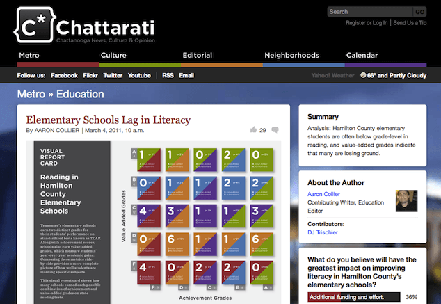
Because we’re looking at the asides and their relationship to the main content, I did not focus on the article itself nor the infographic it features. However, it is interesting to note that the main editorial difficulty in such an article is to transform complex, often jargon-heavy data and analysis into content that the intended non-specialist readers can understand and use. That’s a hefty challenge all by itself, and it influences the content of the asides, as we’ll see in a moment.
Even when we limit ourselves to just the sidebar content, there are several kinds of work that might help the site owners meet their goals of increased stickiness and pageviews: copywriting, visual design, and the creation of new supplementary features, to name just three. In this case, though, I’ll focus exclusively on the organization and positioning (literal and metaphorical) of existing content within the sidebar. This narrow focus will give us the opportunity to look very closely at the purpose and presentation of those little pieces of content that are most likely to be forgotten during the rush to launch a new site.
What do we have?
On the Chattarati article I looked at, there were six visually separate chunks of content in the sidebar on the right, where one of these chunks contained three distinct pieces of information, each with its own headline. That gives us a total of eight pieces of content in the sidebar:
Divide and conquer
Readers of Chattarati may want to look at each of these pieces of information, but they’re unlikely to read or use such a disparate group of content in the same way or at the same time. Let’s examine each piece of information and consider its potential uses—and what these would mean in terms of content presentation.
In this exercise, I’ll be making some assumptions about reader behavior; if this were a real project, I’d base my assumptions on user research and proxies.
| Section | Description |
|---|---|
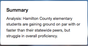 |
1. This is a quick précis of the article itself. Readers are likely to glance at it to decide whether or not to read the article. The summary should be near the top of the article, which is where this summary is now, so it can stay. |
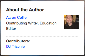 |
2. The “about the author” section features the writer and the contributor of the article’s infographic. While it’s a wonderful idea to feature content creators, this article already has a byline and a credit for the infographic. The space is tight, so it’s best to avoid repeating the same information. Instead, I’d beef up the existing byline within the main content area and delete this piece entirely. |
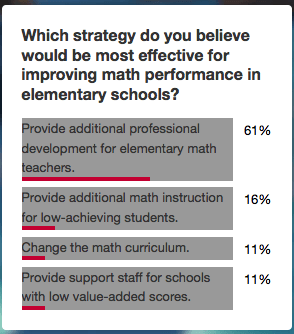 |
3. Site readers probably won’t take this poll until they’ve read at least part of the article, so it doesn’t need to be at the very top of the page. |
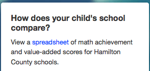 |
4. Like the poll, the spreadsheet is a genuine aside—it’s something you might download right after beginning to read, after completing the article, or anywhere in between. We’ll leave it where it is for now. As a side note, it would be a good idea to revise the copy to better appeal to the data geek or Excel fanatic, as they are the most likely readers to be interested in the information the spreadsheet contains. |
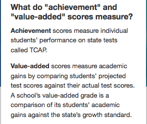 |
5. Not every article is likely to require a set of definitions, but this one needs to explain the specialized definitions of two relatively common terms—“achievement” and “value-added”—used by the local school system. These terms are used throughout the article, so their definitions are vital to the reader who doesn’t have have special expertise in educational jargon. Given their importance, the definitions would be more useful to readers if they were prominently featured within the article itself instead of hidden in a crowded sidebar. |
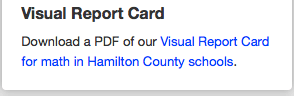 |
6. The infographic text in the main article is very small and difficult to read within the main content, so readers may need to see a larger file, therefore we have a reason to offer this link to a PDF version. Clicking on the infographic within the main text brings up a larger version in an overlay, but it’s still too small to be readable. Left in the sidebar, this piece of content is likely to be missed. I’d bring this link into the main column content as a link under the infographic, and I also recommend offering both a much larger graphic file that can be viewed with no need to download nor additional reading software. |
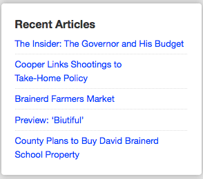 |
7. This selection of articles doesn’t relate to the content of the article itself, so presumably it’s included to give readers a suggestion about what they might like to read next. As such, it’s probably better off at the bottom of the article under the main content column itself, where it can smoothly direct readers to another related piece on the Chattarati site. |
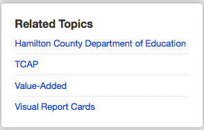 |
8. As with “Related articles,” it would make more sense to place this content at the bottom of the article as a way of luring readers into exploring further. Pairing this content with the recent articles list (#7) and visually emphasizing them via graphic design tweaks would give readers an attractive set of options in the moment right after they’ve finished reading, but before they move on to another task entirely. It’s also worth noting that the format of the content could be made friendlier as a series of article titles rather than the way it’s presented now—as a list of blog topics/categories. Since this makes the content of the links unclear (are they to other Chattarati articles? will they link to external sites?), I’d replace these topics with a list of actual articles that are topically related. |
Putting it back together
Now that we’ve broken down the purpose of each piece of content in the sidebar—from the perspective of our imaginary reader—we can group them into clusters based on their similarities. Here are the guiding principles I’ll be using to do so:
- The content most important to the reader should be in the most prominent position.
- Content that the reader will use in similar ways should be grouped together.
- If two pieces of content will be used in a predictable sequence, they should be positioned in that sequence on the page.
What does that mean in practice? Here’s an example: both the poll and the spreadsheet are nice extensions of the article itself, but neither is essential to the process of reading the article. These two pieces of content are a natural fit for the sidebar where they’re easily accessible throughout the reading process, but don’t interrupt the main flow of the article.
The summary doesn’t work in quite the same way, but it too is an “extra”—it’s not required for the reading process—and it could easily sit either in the sidebar or near the top of the article in another space. Since the page’s current visual design doesn’t have a good spot at the top of the article for a summary, I’d keep it at the top of the sidebar.
These three pieces of content form our first cluster, and I would recommend that all three remain in the sidebar:
Cluster: “Extras” not required to understand article
- summary (1)
- poll (3)
- downloadable spreadsheet containing raw data (4)
Recommended action: Leave in the right-hand sidebar
Another group of information really is central to the reading experience, and these pieces of content should probably be moved into the main column itself:
Cluster: Information intrinsic to reading/using the content
- about the author info (2)
- PDF version of the infographic (6)
- definitions of two of the article’s most unintuitive pieces of educational jargon (5)
Recommended action: Move into main content column
Finally, two pieces of content are intended to entice readers into exploring other content on the site. This content will probably work best if it’s presented at or near the end of the article itself:
Cluster: Content designed to encourage further reading
- recent articles (7)
- related topics (8)
Recommended action: Move to bottom of article
Clustering in Your Own Work
These content clusters are based on the specific characteristics and functions of the sidebar content on this page. They may be useful in other situations, but aren’t generic categories. If you would like to conduct a similar exercise on your own content, you’ll probably want to start from scratch and develop your own clusters.
There’s a lot more to web writing and content presentation than this simple exercise might suggest, but analyzing content functions and placement is a good start. For a site like Chattarati, other simple tweaks that might help increase reader engagement would include a careful copywriting pass through of all the asides to give them a bit more character, and a series of visual design tweaks to make the newly moved content stand out in the right ways.
Going the Extra Mile
Several tricky decisions fall in the space between wireframes, and the final visual design and content for a website. On many projects, the details of content presentation can easily get pushed off to the side and eventually forgotten.
How can we make sure to give the details of content presentation the same consideration as the other elements of the project? If you work on projects with ample information architecture resources, these details may be worked out in very detailed wireframes or page description diagrams. A content strategist might provide page tables or content templates that include presentation recommendations. A visual designer who is especially content savvy might be willing to make those calls alone.
If you’re working with a team and you want to make optimal decisions about the details of content presentation, build in a checkpoint in your design process to bring people with those skills together to weigh in on decisions.
If you’re by yourself or working within only a few people, take time during the design process to ensure that the person who makes final presentation decisions is thinking about the purpose and nature of all the content on a page—not just the big chunks.
Pitfalls to Avoid
- Don’t lump all “related content” into the same part of the page without further examination.
- Avoid duplicating information on a page (like author information and a byline) or separating two pieces of content that are very closely related (like an image and its larger counterpart).
- Don’t forget that after you handle high-level site structure, wireframes, and overall content planning, you still need to deal with content details.
Things to Do
- Consider the likely reading patterns of your readers when you’re making page-level content decisions.
- If you’re not sure where to begin, try dividing up content according to its function.
- Ensure that everything the site user requires needs to complete the main task on a page (reading an article, selecting an item to purchase, etc.) is available in the main block of content/functionality—not tucked away in a sidebar or other aside.
Further Reading
- “Meticulous Design: Information Architecture”, inspiriationbit, 28 May 2008
- “Banned Terms for Information Architects”, LouisRosenfeld.com, 13 October 2010
- “Announcing the Content Strategy Design Pattern Library”, Contentini, 17 January 2011
How do you make content presentation decisions?