
What Is Retrofitting?
Responsive web design has changed the way standards-loving-web-makers across the internet think about building the web. Embracing the fluid nature of our medium is really about creating sites that give more access to more people, regardless of device or screen size. Those of us who believe in these underlying tenants — web standards, accessibility and content priority — tend to be idealists. But the reality is we work in a not-so-ideal world.
Responsive retrofitting, at it’s core, is about compromise for this reality. It’s about finding a way to use responsive techniques on legacy sites to create a better experience for more users. While most of us probably agree that the web is never really done, we often choose “File > New” over a steady evolution of our sites. The truth is, we don’t always get to start over. This article is about putting our users first, taking small steps toward a more universal experience and understanding when doing so is the right approach.
Welcome to responsive retrofitting.
Retrofitting Projects
I’ve had the opportunity to work on some very interesting retrofitting projects. Unfortunately, pretty much all of the clients I’ve been involved with in this capacity have requested that I not share details about their specific engagement. So, for the sake of this writing, I’ll make one up.
Let’s say that you get a call from an organization that relies heavily on sign-ups from their public-facing website. They state that their competition has just launched a “mobile-friendly” version of the same offering, and they are feeling behind because they know they have a fairly poor experience for small screens:
To start over with something like this would be a year long project costing hundreds of thousands of dollars. Is there anything you can do with just CSS to make the existing experience a bit better for smaller screens?
This is generally how the story goes. Sometimes the organization redesigned their site a year ago and didn’t have the foresight to consider mobile. Sometimes they just don’t have the budget. In the end though, they’re all paying attention to the crazy increase in mobile browsing, their competitor’s strides in this space and recognizing they may be caught in the crossfire.
Let’s spend some time discussing techniques you can use to apply responsive thinking to these types of sites. You’ll be surprised at what a little CSS can do.
Simple Retrofit Linking
The first thing you need to do in a retrofit is figure out how to apply new styles. The most common approach to linking CSS in retrofitting is to use “max-width” media queries to apply a set of styles to viewport widths less than a specific resolution.
<link rel="stylesheet" href="original.css">
<link rel="stylesheet" href="rwd-lte-60em.css" media="(max-width: 60em)">
<link rel="stylesheet" href="rwd-lte-30em.css" media="(max-width: 30em)">
These links allow you to scope your CSS changes to any viewports that are less than or equal to 60em in width, and then any that are less than or equal to 30em.
Alternatively, you could add media query blocks to the bottom of your existing CSS file:
/* original styles */

@media (max-width: 60em) {
  /* styles for 60em or lower */
}

@media (max-width: 30em) {
  /* styles for 30em or lower */
}
This will give the same effect, but with only a single CSS file. If you can’t modify your original CSS file(s) (which is sometimes the case in a retrofitting project), you can also combine these two techniques to limit the maximum number of requests to two for CSS:
/* CSS */
/* styles for 60em or lower */

@media (max-width 30em) {
  /* styles for 30em or lower */
}
With responsive retrofitting, it is critical to consider the number of requests — especially on mobile devices. One of the most important things you can do for performance is to reduce the number of requests. It also can be very helpful to use something like Mobitest from Akamai to help evaluate the performance of your site on mobile.
Complex Retrofit Linking
I’ve also run into cases where using the above “large-resolution first CSS structure” is challenging because of the complexity of the original styles. Undoing CSS styling can be pretty difficult sometimes, especially if the site you’re working with is large and maintained by a large team. In those cases, a “small resolution first, capped” approach may be the best solution. Here’s how it works:
<!-- HTML -->
<head>
  <script src="/js/modernizr.js"></script>
  <script> yepnope({
    test : Modernizr.mq('(min-width: 0px)'),
	yep : '/css/rwd.css',
	nope : '/css/original.css'
  });
  </script>
  <noscript> <link rel="stylesheet" href="/css/original.css"> </noscript>
</head>

/* rwd.css File */
@media (max-width: 959px) {
  /* styles for smallest viewport widths */
}

@media (min-width: 600px) and (max-width: 959px) {
  /* styles for mid-tier viewport widths */
}

@media (min-width: 960px) {
  /* original CSS styles */
}
In this scenario, yepnope and Modernizr’s media query tests check if the UA supports media queries (and has JS enabled). In the cases where it does, the responsive CSS is served. In the cases where it doesn’t, or when JS is disabled, the original CSS is served.
The result is that you can take a “small-screen first” approach to the CSS structure (typically using min-width media queries) up to a certain viewport width. Then, in cases where the viewport width is greater, the original styles are served.
Source Order Stacking
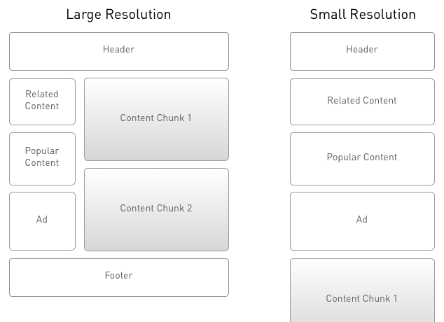
Once styles are linked and firing at the appropriate times, the next step is to adjust the layout for smaller viewport widths. The simplest approach is to rely on source order to determine the priority of the content as the viewport shrinks. All that’s needed is to set the widths of containing elements to 100% and allow them to stack. Honestly, most responsive sites work this way whether they’ve been retrofitted or not.
While this can work well in retrofitting, it can also create problems. As Trent Walton identified, sometimes there is need for a more “choreographed” approach to handling layout. Imagine that you have a simple two-column layout with your content in the primary column to the left and some extra information in a sidebar to the right. However, the top element in the sidebar is a search component for the site. You may consider the ability to search quite critical to the usability of the site. Depending on how the code is structured, allowing the source order to dictate the priority could mean that the entire sidebar is going to be below the primary content.
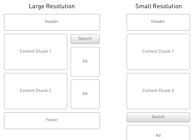
Users on small devices would then have to scroll past the entire column of primary content to get to the site search. Not good.
Another common problem with the source order stacking approach is when the primary content comes after less critical content in source order. In this case, the highest priority content is pushed below less important content at small viewport widths, and can require pages of scrolling before the user gets to the most important stuff!
Off-Canvas Layouts
One technique I’ve found helpful in retrofitting layout is using emerging off-canvas patterns to create cross-width consistency. If you’re not familiar with these ideas, check out Jason Weaver’s example and read Luke’s write-up.
Recently, David Bushell did a great write-up on Smashing Magazine describing how to implement an off-canvas navigation. Instead of attempting to teach you how to do it, let’s discuss when it’s appropriate to do so in the context of a retrofit.
One commonality in off-canvas layouts is having HTML elements to group the items you’re moving outside of the viewport. While it isn’t always necessary, it certainly makes things easier. If you don’t have these grouping elements in place, using an off-canvas approach can be very challenging.
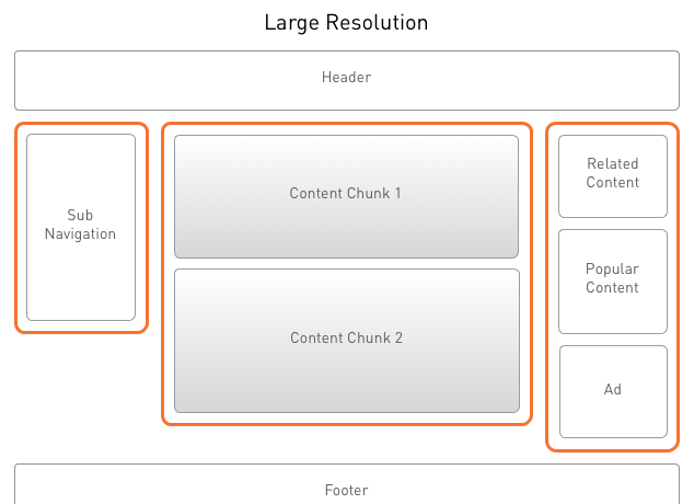
Another factor to consider is what kind of content resides in the columns you’re moving around. Since retrofitting often means you can’t modify the HTML, if the existing content/column structure doesn’t lend itself to this approach, you may not be able to use it.
One last consideration is the interactivity required to show and hide the off-canvas elements.
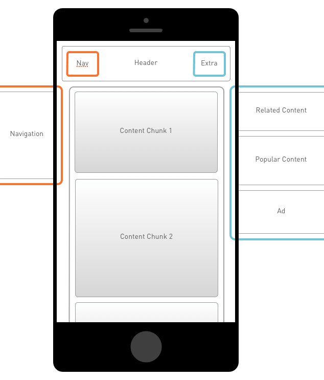
Chances are, in a retrofit you’ll have to add new navigation elements to allow users to access the hidden content. I’ve done this with JavaScript, but if you don’t have a way to create the needed elements, this technique may not be an option.
Vertical Conservation
When you find that source order stacking doesn’t work and you don’t have the ability to use an off-canvas layout, there is a compromise with an approach I call “Vertical Conservation.” This approach allows the source order to define content priority, but folds less critical content underneath a section heading. Then, you can allow the user to reveal that content (think accordion-like behavior) with a single click or touch event.
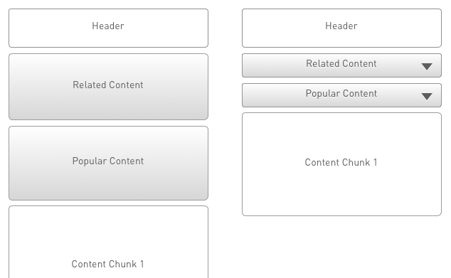
I call this “Vertical Conservation” because we’re doing our best to “conserve” vertical space, striving to bring the primary content into view as early in the experience as possible.
Touch Target Size
An additional consideration we can easily address in retrofitting is to increase the target size of touchable elements for touch-capable devices. The shift in interaction model (from mouse/pointer to touch) means our users have less precision on touch devices. This can be as easy as adding a little padding to our anchor tags (instead of margin, which does not grow the target area). If needed, we can even hide these increased target size styles behind some feature detection such as Modernizr, and only serve them when the user agent supports touch.
This is, of course, more complicated by the release of devices like the iPad Mini and the Windows Surface. Apple’s iPad Mini redefines the physical size of a pixel by cramming more pixels into less space. Some smart folks are thinking about these issues, but we all need to start finding solutions. Microsoft’s Surface allows you to use a mouse/pointer and touch. In cases like this, it’s best to err on the side of larger target areas.
If we’re honest with ourselves, it’s impossible to assume interaction model details solely from the width of the viewport. This is why feature detection is a much better approach. Modernizr is just one way to do this. If you’re looking for a “getting started” guide to feature detection, check out the HTML5 Doctors write up.
Readability
Contrast and font size are also critical in retrofitting. Small screens do not mean small type. Make sure you can read the type when you hold the device at a normal distance from your eyes. And, remember that these devices can and will be used in a wide variety of lighting conditions. Check out Lea Verou’s write up and tool for determining appropriate color contrast ratios.
Performance
There’s a lot more to good responsive web design than cramming a large-resolution layout onto a small screen. As I mentioned, performance is critical to consider because users are going to try and access your content from whatever small screen devices they have. But if your existing large-resolution site is slow, the results of your retrofit won’t be any faster. With this understanding, we may come to the same conclusion that Kristofer Layon does when he says, “Mobile later is better than mobile never.”
The performance focus in retrofitting is ensuring that you’re not degrading the user’s perceived performance experience. This requires testing with real devices in real world environments. There’s no way around it.
Testing
Which leads us to the next point. Responsive web design, whether in retrofitting or not, requires substantially more testing than fixed-width web design. You must do this on real devices — emulators or narrow desktop browsers are not enough. Pick up a cross-section of used devices and start using a tool like Adobe Edge Inspect to drive them. This is the only way to know how your site is really responding.
A Step in the Right Direction
There are very valid cases where retrofitting creates a much better experience for users on smaller or larger devices, without a site overhaul. But you really must evaluate your projects first to determine when retrofitting is a good idea. Then you need to determine which retrofitting approach is best for your specific project. As long as you keep the focus on the user, you’ll make good decisions, both for your client and their site visitors!
Going the Extra Mile
By spending some time capturing analytics for the retrofit, you’ll be able to demonstrate the value added with these simple techniques. That value is what organizations need to see in order to take the next step, which is a full implementation.
Along these same lines, it can be tempting to use analytics as a deciding factor on what breakpoints you use. Remember, your goal in using responsive techniques is to provide a level of flexibility beyond what the current landscape of devices requires. We need to use the combination of content placed in design to make forward thinking decisions regarding breakpoints.
Pitfalls to Avoid
- Remember that performance is a critical factor in retrofitting. It’s difficult to do things to improve performance with this approach, so we must make sure we’re not worsening the perceived speed.
- Attempting to create a better experience for users on small viewports is very difficult when the UX of the site you’re retrofitting is poor to begin with.
- Avoid doing retrofit work when the site doesn’t have a solid foundation of clean, semantic HTML.
Things to Do
- Determine if the project requires retrofitting, or if you can start over.
- Experiment. Get into the browser and use the inspector to mock up how you might approach retrofitting the site.
- Determine the best way to link your styles.
- Play with the different layout techniques that your HTML will allow.
- Test with real devices, there is no substitute for holding the site in your hand.
Further Reading
- Mobilizing Web Sites: Strategies for Mobile Web Implementation (Develop and Design), Peachpit Press, 2011
- “Responsive Retrofitting”, .net magazine, 30 November 2012
- “Responsively Retrofitting An Existing Site With RWD Retrofit”, Smashing Magazine, 2 April 2013
What other responsive techniques for older sites have you tried successfully? Unsuccessfully?