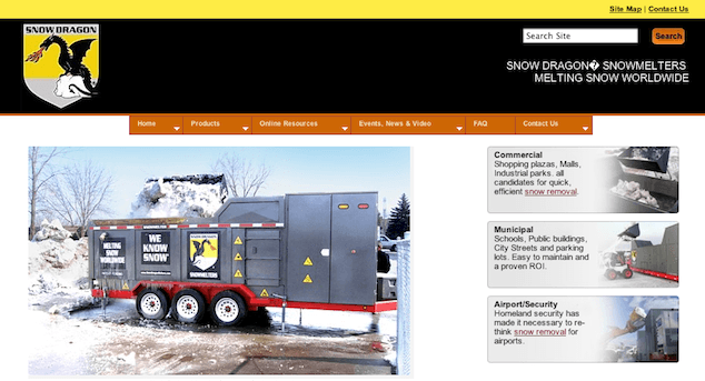
Back in January of 2011, the New York Times ran a great piece about the problem of snow piling up in Boston and just where the city public works folks are putting it. While many readers found it interesting, I’m guessing it was a very exciting article for the team at the Cleveland-based equipment manufacturers, Snow Dragon, whose industry-leading snow melting equipment was strongly featured. I’m betting many public works commissioners and facilities managers visited their web site on that glorious day.
And that’s the problem. Coming to that web site, these folks, who are probably very interested in the industrial-strength snow melters the company proudly builds, would discover the only way to get details about the products is through their navigation bar, which has only one word to help: Products. (There are other things on the bar, like Online Resources and Events, News, & Video, but that’s not why these guys were there. They were there to see the products.)

The trouble with code words
You’d think a word like Products is exactly what the visitors would be looking for, since they were interested in the products the company sells. However, if you asked these folks why they were coming to the site, “products” isn’t likely to be a word they’d use. They’d be more likely to use something like “snow melter”, since that’s what they want.

The thing is Snow Dragon doesn’t sell anything other than snow melters, with clever names like SND580 and, my personal favorite, the SND-RM90. That’s their entire product line. Why use the code word of Products?
Given the lack of anything else that smelled like products on the page, it’s likely the visitors wouldn’t feel the pain too much. They are smart people (after all, they read the New York Times) and they’d figure it out. Yet, all that thinking is getting in the way of something that could be much easier: delivering the user to the snow melter of their dreams.
The wrong terms
Years back, we at User Interface Engineering did a little experiment. We asked folks to search for information and items on sites they’d never been to. In advance of showing them the site, we asked them what terms they thought described what they were seeking, then we asked them to go to the site and find what the items. After they either completed the task or gave up, we went back to the site’s home page and counted the number of times the users terms were on that page.
On the sites where the users’ terms were present in the navigation, those users succeeded about 72% of the time at finding what they were seeking. Yet, on the sites that didn’t mention the users’ terms at all, those users only succeeded 6% of the time.
Unfortunately, it’s unlikely that a city works commissioner is thinking Products when they are dealing with a major snow disposal crisis. Yet, that’s what the Snow Dragon site offers them.
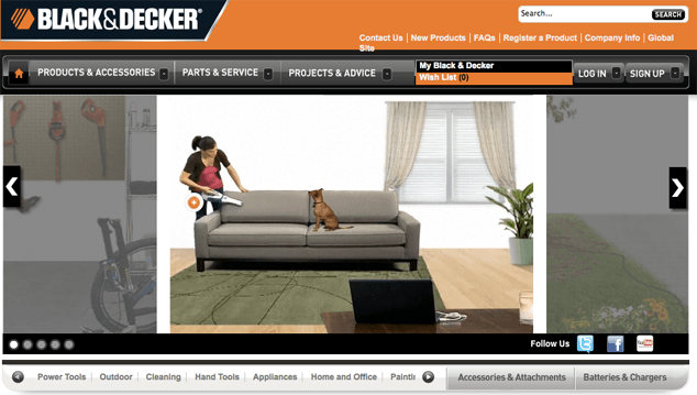
Snow Dragon isn’t the only site that does this. GE.com has a link that is just called Products & Services, as does Oracle.com. Black & Decker has Products & Accessories. (I guess because they don’t see themselves in the service business.)

Intel divides up their site’s main navigation into For Business, For Home, and Products. Under For Home, there’s a subcategory of Products. Under Products, there are three categories of products — Intel Products, Products with Intel Inside, and Product Lookup. (Interestingly, in the subcategories under For Business, there’s no mention of products. I guess they don’t have any products for business.)

The right terms
Products has become so overused that it’s almost meaningless these days. It’s a catchall category that doesn’t really help the user find what they want. It’s a step away. Some companies are smart enough to avoid this trap.
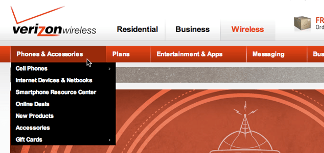
VerizonWireless.com uses Phones & Accessories. Sony.com uses Electronics, Playstation, Online Games, and Music & Movies — a nice selection of what they offer.


Weber.com, the grill manufacturer (small-scale snow melters?) has an ambiguous pair of links Explore and Grill Out. Fortunately, on their home page, they feature pictures of all their grills, making it easy to avoid the navigation.

Desperately seeking specifics
What could a company like Snow Dragon use instead of Products? I’d vote for Snow Melters, since that is what they sell.
HP’s Palm.com site has Touchpads, Phones, Applications, and Accessories on their navigation panel. Apple.com has Mac, iPod, iPhone, iPad, and iTunes.


Maybe Snow Dragon could use Office Park Snow Melters, Municipal Snow Melters, and Airport Snow Melters to help their customers find the right product? Anything that drives the design would probably work really well. It has the added bonus of driving up your SEO results, since those terms are more likely terms someone would type into a search engine. (It’s unlikely anyone would ever type Products into the search engine just to find a snow melter.) The search engine spiders love top-level navigation, giving those terms extra page rank love, so it’s a win all around.
Hiding behind a generic label of Products doesn’t do you any favors. The closer you can get to what your users are seeking, the more likely they’ll find it.
Pitfalls to Avoid
- Don’t hide your most valuable assets behind generic links.
- Avoid copying the design of your site’s navigation from other sites, especially those that have nothing to do with yours.
- Don’t create a deep, multi-click navigation multi-click navigation path to get to the things the users want right off.
Things to Do
- Spend time listening to your users and pick out the words they use for what they are looking for on your site.
- Feel free to surface as much of your content as you can in your navigation.
- Think about what drove them to your site in the first place. Have you made it a puzzle to finish their objective?
How are you making sure your content isn’t hidden behind generic labels?