
When building or updating websites, there is often a stirring excitement to (finally) build it “the right way.” Even with those aspirations, unmaintainable, fragile code happens. Every. Day. Maybe the effort involved to build the site was miscalculated or a business requirement changed. Maybe a “design by committee” decision at the 11th hour threw a wrench into the plan.
Then after launch, new features or enhancement requests start flowing in. New bits get stapled onto an already fragile codebase. Things get more brittle and new features take longer to build. More bugs appear and attempting to fix one could break 10 other things that worked fine before.
How do we stop this madness? Think modularly: standardize repeated patterns in the HTML and CSS for greater flexibility and easier maintenance.
Benefits for Large and Small Sites
There is a popular argument that modularity is only necessary on large sites where there are teams of developers touching the codebase. While it is true that smaller sites don’t always require this kind of approach, I believe they benefit from this architecture as well.
Creating a site that uses repeatable modules can reduce the payload, which improves site performance. Not to mention, a modular architecture scales well: today’s small site could be tomorrow’s eBay or Amazon. You can’t know what the future holds, so you should factor in the site’s ability to expand.
Build a system instead of a set of site pages, because that is modular architecture at its core. Creating a system allows the entire team, including designers, to carefully consider what additions to that system are necessary. It reduces the “one offs” that creep into the design that can disturb the consistency of the experience.
Borrowing from the Back End
As front-end developers, we can borrow an approach that our back-end developer friends are already practicing. Nicole Sullivan introduced Object Oriented CSS and provided a framework that borrows from object-oriented programming ideals.
Later, Jonathan Snook created Scalable and Modular Architecture for CSS (SMACSS), an excellent resource that applies the concepts of modular architecture to CSS so that it is possible to write a framework of our own. There are many other good references that discuss the concept of creating reusable chunks of HTML and CSS that can be plugged anywhere into a site with great ease.
Old School
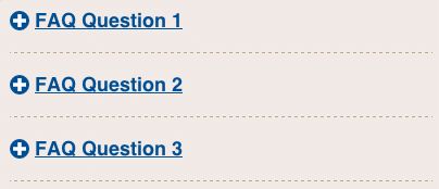
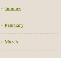
Prior to the introduction of modular concepts, it was common for me to write the CSS for both an FAQ section of a site and sidebar archive as two different concepts. For example:
HTML
<div id="faq">
    <div>
        <h3><a href="#">FAQ question</a></h3>
        <div>
            <p>FAQ answer</p>
        </div>
    </div>
    <div>
        <h3><a href="#">FAQ question</a></h3>
        <div>
            <p>FAQ answer</p>
        </div>
    </div>
</div>


<ul id="archive">
    <li><a href="#">Month 1</a>
        <ul>
            <li><a href="#">Blog Post Title</a></li>
            <li><a href="#">Blog Post title</a></li>
        </ul>
    </li>
    <li><a href="#">Month 2</a>
        <ul>
            <li><a href="#">Blog Post title</a></li>
            <li><a href="#">Blog Post title</a></li>
        </ul>
    </li>
</ul>
CSS
#faq > div {
    border-bottom: dashed 1px #bca785;
    margin-bottom: 10px;
    padding-bottom: 10px;
}

#archive > ul > li {
    border-bottom: dashed 1px #bca785;
    margin-bottom: 10px;
    padding-bottom: 10px;
}
New School
I may have recognized the repetition in two of the declaration blocks and condensed the CSS to reduce redundancy:
#faq > div,
#archive > ul > li {
    border-bottom: dashed 1px #bca785;
    margin-bottom: 10px;
    padding-bottom: 10px;
}
Newer School
However, there is a way to simplify things further by looking at different groups of styled elements for repeated patterns and abstracting the parts that are common among them. In the examples of the FAQ and archive, that means recognizing that they both have a thin line separating some items. As such, the styles can be written once and applied as necessary in the HTML via classes.
Taking it one step further and considering that this style pattern might be used in places other than an FAQ or an archive, we could end up with something like:
.separator {
    border-bottom: dashed 1px #bca785;
    margin-bottom: 10px;
    padding-bottom: 10px;
}
With this approach, the style pattern is not limited to the FAQ and archive. Writing it this way fulfills the object-oriented programming ideals:
- Readable. Developers can quickly discern the purpose of this style.
- Scaleable. As the site grows, wherever this pattern is required it can easily be reused by adding
class="separator"as needed in the HTML. - Maintainable. If the styles for separating items should change during a redesign, they can be found and adjusted quickly.
- Code quality. Simplifying and abstracting styles into patterns lessens the fragility of our codebase. It is less likely that changes to another set of styles will break this style pattern.
Where to Start?
I find it is easier to get a sense of what parts will make up the system by viewing more than one comp (or pages in an existing site) at a time. But even if all I have is one finished comp to reference, it is possible to make an educated guess what content blocks may fit a recurring visual pattern. For example, modals, pagination, breadcrumbs and buttons are often repeated throughout a site.
Other modules could be widget-like, such as tabbed content and tooltips. Recognize these elements for what they are instead of what they contain as content. This makes it easier to think about how else they may be used across the site so that they can be plugged into different places in the layout.
Expanding upon the earlier FAQ and archive examples:
- The design solution for the FAQ is to show the list of questions. Tapping a question will expose the answer beneath it.
- The blog archive lists the months when posts were written. Tapping on the month exposes the list of posts underneath.
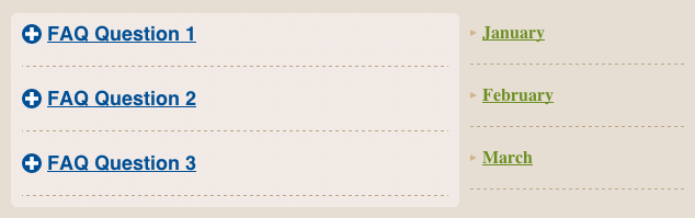
Instead of building out an “FAQ module” and “archive module” each with its own set of styles, recognize that the FAQ and the archive both use an accordion treatment for presentation.
I only need to build one accordion module that can be used for both, and then drop the FAQ content into one and the archive content into the other. The FAQ and archive would also have a similar markup pattern:
- A wrapper to contain all the pieces and parts of the accordion.
- Top level accordion items, which have the padding and bottom border to separate them as in the earlier example. We’ll use the
class="separator"on them. - A tappable area that reveals the related accordion content.
- A container for the additional content that is revealed once the tappable area fires the event.
Now that we have a rough outline of what our accordion structure must have, it’s a good time to discuss naming conventions in a modular front end. The outermost container should use the class name “accordion” because it seems like an obvious choice. In order to scope our styles for an accordion module to ensure they don’t “leak out” into other areas of our CSS, it’s wise to prepend other classes significant to this module with “accordion.”
For example, the tappable area that exposes the rest of the content below it could use the class name “title,” but there is a strong chance other areas of a rendered page could use that same class value, and those styles won’t necessarily fit what we need for the accordion module.
In OOCSS methodology, the styles would be written as:
.accordion .title {
    ...
}
SMACSS methodology, introduces less specificity:
.accordion-title {
    ...
}
There are plenty of different naming convention suggestions flying around the web right now. The one I have adopted is an adaptation of BEM (Block__Element–Modifier). While it is a bit verbose, it is explicit enough to reveal the role a specific set of styles plays. This naming convention would appear as:
.accordion__title {
    ...
}
In the above convention, “accordion” is the block, where “title” is the element that exists inside that block. The block and element names are separated by two underscores, which aids readability a bit inside the HTML attributes. We’ll use the same convention for the content container that gets revealed once the tap event is fired: “accordion__body.” As we start to gather a rough concept for the accordion, the naming structure begins to emerge:
Accordion Structure Naming Convention
class="accordion"
    class="separator"
        class="accordion__title"
        class="accordion__body"
With this architecture plan in mind, it’s possible to apply these classes to both of our accordion modules:
<!-- FAQ -->
<div id="faq" class="accordion">
    <div class="separator">
        <h3 class="accordion__title">
            <a href="#faq-content1">FAQ Question 1</a>
        </h3>
        <div class="accordion__body" id="faq-content1">FAQ Answer 1</div>
    </div>
        <div class="separator">
        <h3 class="accordion__title">
            <a href="#faq-content2">FAQ Question 2</a>
        </h3>
        <div class="accordion__body" id="faq-content2">FAQ Answer 2</div>
    </div>
</div>


<!-- Archive -->
<ul id="archive" class="accordion">
    <li class="separator">
        <h4 class="accordion__title">
            <a href="#archive-content1">Month 1</a>
        </h4>
        <ul class="accordion__body" id="archive-content1">
            <li><a href="#">Blog Post Title 1</a></li>
            <li><a href="#">Blog Post Title 2</a></li>
        </ul>
    </li>
    <li class="separator">
        <h4 class="accordion__title">
            <a href="#archive-content2">Month 2</a>
        </h4>
        <ul class="accordion__body" id="archive-content2">
            <li><a href="#">Blog Post Title 1</a></li>
            <li><a href="#">Blog Post Title 2</a></li>
        </ul>
    </li>
</ul>
Notice that the styles are independent of a specific DOM structure. It won’t matter if the headings in the tappable region are h3s or h4s. It doesn’t matter if the classes are applied to divs, uls or lis. It won’t matter if the class="accordion" is applied to elements in the main content area or a sidebar. The styles have been liberated to go wherever they fit a need, while not sacrificing the document outline of the rendered pages.
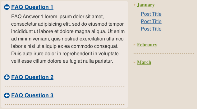
One of These Is Not Like the Other
With accordion styling abstracted into its own module, most of our styling work for accordions is done. We just need to tweak a few things to distinguish the FAQ and archive accordions from each other. It is tempting to alter the styles of the archive based on its unique identifier (id="archive"), but that should be avoided! We cannot be certain that the alternative styling for the accordion will only apply to one of the accordions. We don’t know what the future holds. The look and feel of the archive could be used as a solution to some other portion of the site down the road, so we need to keep things flexible.
The better choice to address these differences, is to extend or modify the accordion module or its elements. For example, one of the differences is that the element assigned class="accordion__title" in the archive will appear a bit smaller and with different font styles than the element in the FAQ. With the addition of class="accordion__title--alt", we can adjust the existing styles for the title as necessary.
In keeping with the Block__Element–Modifier naming convention, “accordion” represents the block, “__title” stands for the element, while “–alt” is the modifier.
Both Accordions’ HTML with Layout
    <div class="main">
        <!-- FAQ -->
        <div id="faq" class="accordion">
            <div class="separator">
                <h2 class="accordion__title">
                    <a class="accordion__toggle  js-accordion-toggle" href="#faq-content1">
                    <i class="icn  icn--accordion  js-accordion-state">Open</i>
                    FAQ Question 1</a>
                </h2>
                <div class="accordion__body  is-closed">
                    <p>FAQ Answer 1 lorem ipsum dolor sit amet, consectetur adipisicing elit, sed do eiusmod tempor incididunt ut labore et dolore magna aliqua. Ut enim ad minim veniam, quis nostrud exercitation ullamco laboris nisi ut aliquip ex ea commodo consequat. Duis aute irure dolor in reprehenderit in voluptate velit esse cillum dolore eu fugiat nulla pariatur.</p>
                </div>
            </div>
            <div class="separator">
                <h2 class="accordion__title">
                    <a class="accordion__toggle  js-accordion-toggle" href="#faq-content2">
                    <i class="icn  icn--accordion  js-accordion-state">Open</i>
                    FAQ Question 2</a>
                </h2>
                <div class="accordion__body  is-closed">
                    <p>FAQ Answer 2</p>
                </div>
            </div>
            <div class="separator">
                <h2 class="accordion__title">
                    <a class="accordion__toggle  js-accordion-toggle" href="#faq-content3">
                    <i class="icn  icn--accordion  js-accordion-state">Open</i>
                    FAQ Question 3</a>
                </h2>
                <div class="accordion__body  is-closed">
                    <p>FAQ Answer 3</p>
                </div>
            </div>
        </div>
    </div>

    <aside class="secondary">
        <!-- Archive -->
        <ul id="archive" class="accordion list--unstyled">
            <li class="separator">
                <h4 class="accordion__title  accordion__title--alt">
                    <a class="accordion__toggle  accordion__toggle--alt  js-accordion-toggle" href="#">
                    <i class="icn  icn--accordion-alt  js-accordion-state">Open</i>
                    January</a>
                </h4>
                <div class="accordion__body  is-closed">
                    <ul class="list--unstyled">
                        <li>
                            <a href="#">Post Title</a>
                        </li>
                        <li>
                            <a href="#">Post Title</a>
                        </li>
                        <li>
                            <a href="#">Post Title</a>
                        </li>
                    </ul>
                </div>
            </li>
            <li class="separator">
                <h4 class="accordion__title  accordion__title--alt">
                    <a class="accordion__toggle  accordion__toggle--alt  js-accordion-toggle" href="#">
                    <i class="icn  icn--accordion-alt  js-accordion-state">Open</i>
                    February</a>
                </h4>
                <div class="accordion__body  is-closed">
                    <ul class="list--unstyled">
                        <li>
                            <a href="#">Post Title</a>
                        </li>
                    </ul>
                </div>
            </li>
            <li class="separator">
                <h4 class="accordion__title  accordion__title--alt">
                    <a class="accordion__toggle  accordion__toggle--alt  js-accordion-toggle" href="#">
                    <i class="icn  icn--accordion-alt  js-accordion-state">Open</i>
                    March</a>
                </h4>
                <div class="accordion__body  is-closed">
                    <ul class="list--unstyled">
                        <li>
                            <a href="#">Post Title</a>
                        </li>
                        <li>
                            <a href="#">Post Title</a>
                        </li>
                    </ul>
                </div>
            </li>
        </ul>
    </aside>
Updated Accordion CSS
/* ==============================================================
   A few base styles plus column layout
   =========================================================== */
.wrap,
.main,
.secondary {
    -webkit-box-sizing: border-box;
       -moz-box-sizing: border-box;
            box-sizing: border-box;
}

.wrap {
    background-color: #e7ded3;
    margin: 0 auto;
    max-width: 634px;
    overflow: hidden; /* to contain floats */
    padding: 10px;
}

h1 {
    border-bottom: double 4px #bca785;
    color: #6b8e23;
    font-size: 26px;
    margin-top: 0;
}

ul, p {
    color: #333;
    margin-top: 0;
    margin-bottom: 1em;
}

a {
    color: #369;
}

.main {
    background-color: rgba(255, 255, 255, .4);
    border-radius: 5px;
    float: left;
    padding: 0 10px;
    width: 66.666%;
}

.secondary {
    float: right;
    padding-left: 10px;
    width: 33.333%;
}

/* ==============================================================
   The Accordion
   =========================================================== */
.accordion {
    font-family: sans-serif;
    line-height: 1.5;
}

.separator {
    border-bottom: dashed 1px #bca785;
    margin-bottom: 10px;
    padding-bottom: 10px;
}


/* ----------------------------------
   Base title style - applies to all accordion titles
   ------------------------------- */
.accordion__title {
    font-size: 18px;
    line-height: 1;
    margin: 0;
    overflow: hidden; /* to contain floats */
}

/* Alternate title style - extends accordion__title */
.accordion__title--alt {
    font-family: serif;
    font-size: 16px;
}


/* ----------------------------------
   Base toggle style - applies to all accordion toggles
   ------------------------------- */
.accordion__toggle {
    color: #004f95;
    display: block;
    padding: 10px 0;
}

/* Alternate toggle style - extends accordion__toggle */
.accordion__toggle--alt {
    color: #6b8e23;
}


/* ----------------------------------
   Base icon style - applies to all accordion toggles
   ------------------------------- */
.icn {
    background-position: left top;
    background-repeat: no-repeat;
    float: left;
    margin-right: 5px;
    /* image replacement styles in next 3 declarations */
    overflow: hidden;
    text-indent: 100%;
    white-space: nowrap;
}

/* FAQ icon style - extends icn */
.icn--accordion {
    background-color: #004f95;
    background-image: url("img/icn-accordion.png");
    border-radius: 50%;
    height: 18px;
    width: 18px;
}

/* Archive icon style - extends icn */
.icn--accordion-alt {
    background-image: url("img/icn-archive.png");
    height: 6px;
    margin-top: 5px;
    width: 6px;
}


.accordion__body {
    overflow: hidden;
    padding-left: 23px;
    -webkit-transition: all .5s ease-in-out;
       -moz-transition: all .5s ease-in-out;
        -ms-transition: all .5s ease-in-out;
         -o-transition: all .5s ease-in-out;
            transition: all .5s ease-in-out;
    visibility: hidden;
}

.accordion__body > * {
    margin-top: 0; /* this might normally be addressed in reset styles */
}

.accordion__body > :last-child {
    margin-bottom: 0;
}


/* ----------------------------------
   States: styles that apply based on Javascript events
   ------------------------------- */
.icn--is-selected {
    background-position: left bottom;
}

.is-closed {
    max-height: 0 !important;
}

.is-open {
    max-height: 999px !important; /* work-around to animate unknown height */
    visibility: visible !important;
}


/* ----------------------------------
   Lists: styles that cancel User Agent styles for lists
   ------------------------------- */
.list--unstyled {
    list-style: none;
    margin-bottom: 0;
    margin-top: 0;
    padding-left: 0;
}
Why this Approach to Development Is Good
The most noticeable benefit of this style of architecture is lessening repetition when declaring styles. There will always be some repetition, but the goal here is to minimize it. Setting the accordion to have base styles and then extending those styles allows reuse of what is already there, without piling on class names in the CSS to take on the same set of styles, such as:
Stacks of Classes Piling Up
.accordion,
.faq,
.archive,
.accordion-super {
    common: all-of-the-things;
}
Also, we don’t end up with combinations of selectors that share similar styles but can’t be reused elsewhere because of specific DOM dependency:
DOM Dependent Selectors
.accordion-super h1 {
    color: blue;
    font-family: serif;
    font-size: 20px;
}

.faq h2.question {
    color: blue;
    font-size: 18px;
}

.archive h4 {
    color: green;
    font-family: serif;
    font-size: 14px;
}
The same example as above can be written another way:
.accordion-super h1,
.faq h2.question {
    color: blue;
}

.accordion-super h1,
.archive h4 {
    font-family: serif;
}

.accordion-super h1 {
    font-size: 20px;
}

.faq h2.question {
    font-size: 18px;
}

.archive h4 {
    color: green;
    font-size: 14px;
}
The second version illustrates that even with this attempt to reduce repetition for a style, there is now a more complicated picture of what is being applied where. Modules and extending those modules gives a clearer representation of what is going on. It also makes it easier to scan through the styles for editing.
Where’s the Rub?
When this method for development first hit the scene, there was a backlash that it was akin to “classitis” because nearly every element has a class value (or several). The difference between the dreaded classitis and today’s modular classes is the actual structure itself. Real classitis used divs for everything and threw classes on them to differentiate one div from the next, like so:
<div class="wrap">
<div class="wrap-inner">
<div class="header">
<div class="logo">
<img src="#" />
</div>
<div class="site-title">Site Title</div>
<div class="nav">
<div class="nav-list">
<div class="nav-item">
<div class="nav-item-inner"><a href="">Nav Item 1</a></div>
</div>
<div class="nav-item">
<div class="nav-item-inner"><a href="">Nav Item 2</a></div>
</div>
<div class="nav-item">
<div class="nav-item-inner"><a href="">Nav Item 3</a></div>
</div>
</div>
</div>
</div>
<div class="main-content">
<div class="main-content-title">Main Content Title</div>
<div class="main-content-inner">Main content goes here</div>
</div>
<div class="sidebar">
<div class="sidebar-title">Side content title</div>
<div class="sidebar-inner">Secondary content goes here</div>
<div class="footer">
<div class="copyright">© old-skool era</div>
<div class="contact-us">
<a href="#">Use our contact us form!</a>
</div>
</div>
</div>
</div>Scary, huh? The resulting convention was to use proper HTML elements such as h1-h6 for titles and lists for navigation lists, etc. (still a good thing, by the way). But in an effort to clean up junk HTML, a balance was disturbed. The goal became keeping the HTML pure, using little to no classes or ids, and traversing the DOM tree in the CSS selectors to apply styles. In fact, CSS3 provided a large swath of new ways to traverse the DOM for us. The funny thing is, now that we have all these fancy new selectors, we are steering away from using them. Is the lesson there “Be careful what you wish for?”
Why the Change in Thinking?
While the development community was evangelizing the separation of structure from presentation from behavior by using external files for CSS and “unobtrusive Javascript,” the structure and presentation were still too tightly coupled in the CSS. Additionally, the presentation and behavior were getting tangled up by allowing CSS and Javascript to use the same classes as hooks for each of their needs. Even those hooks are better served by some separation: modularity, if you will.
These pain points, while more glaring on large sites with teams of developers, still exist for a small site with a single dedicated developer once that site needs to grow or something needs to change. Redesigns don’t always have to mean a rewrite from the ground up!
Consider the accordion example in this article as more of an accordion template. The set of classes that makes up an accordion will likely be the same even in a redesign. What is most likely to change about the accordion widget is its skin.
Depending on the complexity of the site, it might be beneficial to break out a module’s theme, a la SMACSS. Harry Roberts built an entire framework that sets up layout and modules with no theme to it. This methodology allows a front-end dev to keep the scaffolding intact from redesign to redesign. They need only tweak the layout grid if necessary, rearrange the modular blocks for rendering and apply a new skin as necessary. Now that’s efficiency!
Going the Extra Mile
While building up a collection of modules, it can be beneficial to compile them into a pattern library: A single location where all the modules live independent of page layout structures.
One of the benefits of a pattern library is that it becomes a living, visual style reference when additional site enhancements are requested. If you have to tackle a new feature, you can review existing components to determine if a solution already exists within the collection — which may be nothing more than a combination of current modules. It also aids everyone on the team, providing a set of standards to ensure the experience across the modules and the site is consistent.
Another benefit is that this collection of modules can become a testing ground. As a new module is developed, you can test to ensure that existing styles don’t break or new styles bleed into other modules. If something were to go awry, you will more easily recognize it and intervene because everything is in one place.
Pitfalls to Avoid
- Avoid over-abstracting styles. Remember, there will be some repetition in styles across modules. The goal here is to reduce that repetition.
- Don’t let a complex design deter you from creating modules. It’s ok to have modules comprised of other modules.
- Don’t assume that large sites and teams are the only sites that benefit from thinking modularly. Less repetitive CSS means smaller files to download. All your site’s visitors win!
Things to Do
- Look through an existing site to find repeating patterns. These are your module candidates.
- Test out new modules using tools like the inspector to mock up how to rework blocks of elements.
- Collect modules into a testable framework by building a pattern primer/style guide.
Further Reading
- Scalable and Modular Architecture for CSS, Snook.ca Web Development, Inc., 2013
- “The open/closed principle applied to CSS”, CSS Wizardry, 18 October 2013
- “About HTML semantics and front-end architecture”, Nicolas Gallagher, 18 October 2013
What patterns and naming conventions for classes work best for you?