Our work helps people do all sorts of things, like buying a raincoat, booking a hotel, and traveling from the Tate Modern to Buckingham Palace. We’re responsible for making information clear and meaningful for everyone, including people with disabilities. So how can we approach content and accessibility? How can we write for people with a range of abilities?
After Irene Walker’s talk at the Content Strategy Forum in London, I started exploring these questions. The Web Content Accessibility Guidelines (WCAG 2.0) address presentation and behavior (i.e., HTML, CSS, and JavaScript), with a focus on multimedia content. For textual content, we need to dig into the principles and chart a clear path for our visitors.
With a few strategic tools and a commitment to inclusion, we can improve our writing, reach more people, and avoid legal issues.
Be A Great Tour Guide
Accessible content is good content for everyone. Being clear and appropriate is a great starting point. Let’s explore a real example to take it to the next level.
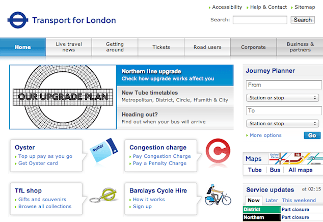
Transport for London provides public transit information for the UK’s capital. The site seems pretty clean and even includes an accessibility statement. But when we unearth the content, a few basic problems come up, like how the content is organized, named, and cross-linked. I’ll guide you through these issues and show you how to resolve them.
Point Out Hidden Gems
A great tour guide shows you things you didn’t know existed.
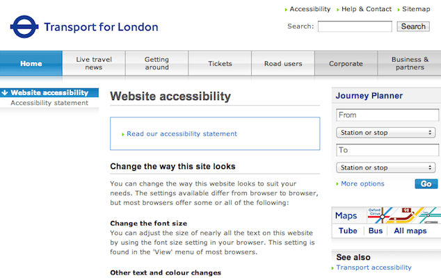
The Accessibility link is easy to spot in the global header. It takes you to the Website Accessibility page, which outlines how to change the site’s presentation and navigate with a keyboard. We can assume most people with disabilities already know how to do these things. Is this the best use of top-level navigation?
Likewise, the Accessibility Statement mentions design decisions that support people with disabilities. How can we make this section useful?

Hand-pick links for the intended audience and highlight them clearly. If you’re not sure where to start, search the site or dive into a content inventory. Here are two examples:
- Journey Planner lets you pick the fastest way to your destination with the fewest number of stairs or escalators.
- Freedom Pass makes almost all public transport free for disabled Londoners.
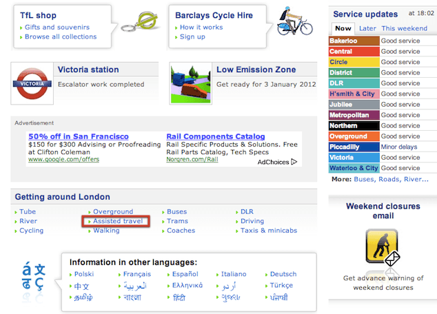
Transport for London took a similar approach in the “Information in Other Languages” section at the bottom of the homepage. For each language page, like the Italian guide, the site provides a tailored, concise list of tools and downloadable information.
Create A Hierarchy for Learning
When developing content, the main W3C guideline we can follow is to write for readability. This means a person or assistive technology can read and interpret what you wrote.
If someone needs travel assistance, would the information on the Transport for London homepage help them? Can we organize the content so a person with visual or cognitive disabilities can navigate easily? Can we make the headings more understandable or reduce the number of words on the page?
Let’s look at the current hierarchy. To see how the homepage content flows, view it in your browser with styles turned off. This exercise is also helpful when evaluating how the content sounds to someone with a screenreader.
The body sections are:
- Northern line upgrade
- New Tube timetables
- Heading out?
- Oyster
- Congestion charge
- TfL shop
- Barclays Cycle Hire
- Going out this weekend?
- Low Emission Zone
- Advertisement
- Getting around London
- Journey Planner
- Service updates
Let’s momentarily ignore the capitalization inconsistency. The user needs the Assisted Travel link in the Getting Around London section, but it comes after line upgrades, the Transport for London souvenir shop, and Google advertisements.

This structure makes it seem like almost everything is more important than getting around London. But isn’t that why people visit the site?
Organize and Plan the Journey
To avoid frustrating visitors, organize information so it focuses on their needs. Depending on the size of your organization, this may be a daunting task. You’ll probably need approval to make changes and help implementing them. But if you can get this right, you’ll save everyone time and frustration, especially your visitors.
Disclaimers aside, let’s step through restructuring the page:
- Test your site with people of various ages and abilities. Research people’s mental models by asking them why they’re using the site and what they expect to do with it.
- Study any information you can get about how people use the site (e.g., analytics, contact center data, surveys).
- Define top user tasks from your research.
- Create a message hierarchy that outlines what you need to say. Start with the most important information to your users.
- Group similar information and separate unrelated topics.
- Work with your team to update the hierarchy.
Without making too many assumptions about Londoners, here’s a suggestion of a cleaner outline for what’s already on the homepage with consistent titlecasing.
Plan Your Trip
- Journey Planner
- Maps
- Service Updates
- Disruptions and Upgrades
Getting Around London
- Tube
- Buses
- Assisted Travel
- Coaches
- Cycling
- Docklands Light Railway
- Driving
- Overground
- River
- Taxis and Minicabs
- Trams
- Walking
Transit Store
- Oyster Travelcard
- Gift Shop
Road Users
- Low Emission Zone
- Congestion Charge
- Advertisement
By taking time to structure what you want to say, you can ensure the information is easy to understand, no matter how it’s presented.
Watch Your Words
You know your site more than you realize, as you probably spend hours looking at it. When writing instructional content, give users turn-by-turn directions or include a link that does. Give people a clear path to what they need; never assume they know how to perform a task.
Choose terms and names for things carefully. Clear headers and links guide people through content quickly, like big signposts in a Tube station.
Avoid jargon, slang, and acronyms. If you have to use an unusual term, include a brief definition in plain language. Labels like “Oyster,” “TfL,” “DLR” assume the user is a local. Since London is one of the world’s top travel destinations and the transit system is growing quickly, it would help to write out these terms.
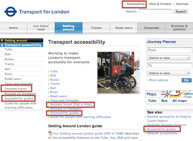
Create contrast between similar ideas and sections of content. Use distinct, meaningful links consistently. For example, look at these terms on the Accessibility page.

It’s not immediately clear how these links differ:
- Accessibility
- Accessibility Guides
- Website Accessibility
- Assisted Travel
- Transport Accessibility
This is true for other links on the site, like “Set up Auto top-up” and “Top up pay as you go and Travelcard” for Oyster card members. A simple nomenclature audit can help you identify word choice problems:
- Make a list of labels from tabs and links. Don’t stop with your global navigation; sift through body paragraphs, forms, and your site map.
- Organize the labels by topic.
- Change anything that’s inconsistent, too similar, or unclear.
For the example above, give similar pages more specific titles to strengthen meaning, such as:
- Accessibility in London
- Dial-a-Ride Transport Service
- Large Print, Braille, and Audio Guides
Clear navigation and link names eliminate confusion and improve site usability for everyone. And for extra points with your boss, consistent labels make localization cheaper too.
Going the Extra Mile
Revisit your content regularly with fresh eyes and ears. Schedule time to reread one or two pages of the site each month.
Find a quiet room and read the content aloud slowly or listen to it with an online screenreader.
Ask yourself:
- Does this make sense?
- Does the order support our users?
- Is the most important information at the top?
- Can this be broken down or better organized?
- Does this cover what we need to say in the simplest way?
While you’re exploring, watch for:
- Inconsistent names and labels
- Media without captions or transcripts
- Wordy headers and sentences
- Broken links
- Passive voice
- Broken styling (issues with the CSS)
Fix or remove these issues and keep trekking.
Pitfalls to Avoid
- Don’t use generic links like “read more” and “click here.” Be precise with links and calls to action.
- Don’t assume the user knows how to perform a task. Give step-by-step directions or provide a link that does.
- Don’t use unusual words, acronyms, and idioms.
Things to Do
- Focus on top user tasks.
- Read content aloud for comprehension.
- Surface useful and relevant links.
- Keep talking about accessibility.
Further Reading
- “Web Accessibility Initiative”, W3C, 2 August 2005
- Web Content Accessibility Guidelines (WCAG) 2.0, W3C, 2008
- “Introduction: Accessibility for Web Writers, Part 1”, 4 Syllables, 27 September 2010
- “Writing Clearly and Simply”, WebAIM, 11 June 2006
- “Politics and the English Language”, Horizon, 1 April 1946
How do you approach accessibility when writing? What other sites do it well?
Share Your Thoughts
Please Log in or Sign up to share your thoughts.