When we talk about content, it’s easy to think of it as being limited to editorial content: the stuff writers and editors plan, create, publish, and maintain. However, the internet is full of content not created by companies or website makers, but by everyone who makes a Facebook account, joins Twitter, reviews a product on Amazon, or comments on a blog post.
We call this stuff by the exceptionally clunky name of “user-generated content,” and it’s right at the heart of content strategy and user experience design (UX). And while we can’t—and shouldn’t—try to dictate exact nature of the content our users create, our design choices do shape the content our users submit, and affect how it’s used.
To explore this notion in practice, let’s consider the problem of user-generated content within ecommerce systems, with iTunes App Store and its Googley sibling, the Android App Market, as our central examples. Nearly all smartphone users must contend with an app marketplace at some point, and the current crop is surprisingly difficult to use—for reasons that have everything to do with content choices.
The App Jungle
Anyone who’s tried to use the iTunes App Store to find an iOS app for a specific purpose has experienced the chaos that can arise when experience designers create sites that rely on loosely planned user-generated content to help users find products.
The App Store—and its lighter-weight Android twin—aren’t the only “places” on the internet that suffer from these problems, but they are highly visible examples. Furthermore, they both rely on two different classes of user-generated content to help people find apps: reviews and ratings created by the end users, and descriptions created by the developers who made the apps. As such, they perfectly demonstrate many of the trade-offs UX and editorial people must consider when planning user-generated content.
Developer-Generated Content: Freedom vs. Usefulness
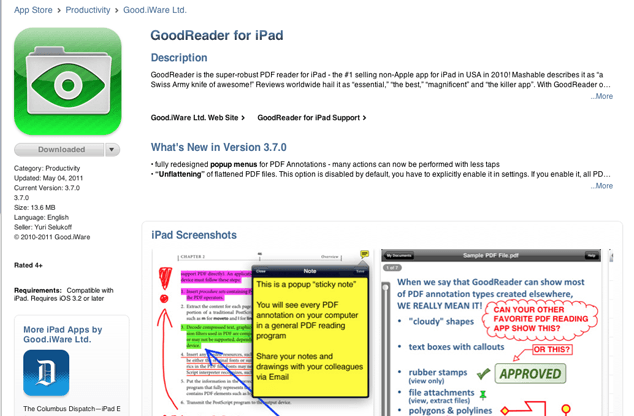
On the iTunes App Store and Android App Market, developers submit content that describes each app and, theoretically, entices app seekers to download it. This content is organized into a number of fields, the most notable of which is the “Description” field, which initially displays a limited number of characters:


As long as they don’t violate any of the marketplace’s branding or content rules, the exact contents of the Description field are left to the discretion of the developer. And as you might guess, the result has a high degree of inconsistency. While all developers include at least a basic description of the app, some supplement this with references to independent reviews or use the field to summarize user reviews—others highlight specific features of the app or the steps required to use it.

Apple gives developers the freedom to use the App Description field in whatever way they deem best. In fact, the Description guidelines (via design blog Dirt and Rust, as the official guidelines are only available to paying app developers) are startlingly rudimentary:
App Description
Must be medium length, not three sentences and not 1000s of words. Probably 5-7 sentences will do – think about this information fitting on an iPhone screen, with the user on the App Store searching for our product.
For app developers who employ copywriters or marketers, this freedom maximizes developers’ options for describing and promoting their products.
On the other hand, for the rather larger group of developers who don’t have strong content capabilities, it allows them to create rambling, semi-coherent content that makes it quite difficult for users evaluate which app they need.
It’s more than just content quality. Without guidelines for form and style, developer-created content is inconsistent and can complicate the task of comparing apps.
Better Descriptions from the Pros
To see how we might usefully influence user-generated descriptions, we can turn to two of the web’s biggest and longest-standing product sales sites: Amazon and eBay. The two sites represent opposite approaches to the standardization of externally created product descriptions, but both offer useful lessons.
Amazon simply displays a standard set of editorial reviews from trusted sources as the description. If a given book hasn’t been reviewed by the usual suspects, Amazon displays a short written description from the publisher.

eBay, on the other hand, is a free-for-all. As long as you don’t misrepresent your product or break the company’s rules about displaying offensive content, you can put anything you want in your description.
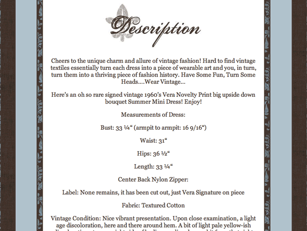
Interestingly, eBay’s sellers have gradually developed standardized sets of information on their own as a way of accommodating user needs. For example, women’s vintage dress descriptions nearly always include:
- item color and material;
- vintage size and modern equivalent;
- measurements for bust, waist, and hip; and
- condition notes with detailed descriptions of any flaws in the garment.

These grassroots standardizations allow eBay buyers to rapidly compare items and assess fit, condition, and value. And the fact that so many sellers have come to adopt them on their own emphasizes their very real usefulness to potential buyers.
What you can do
If you’re offering an array of user-submitted items that need descriptions—downloads, tangible products, even large chunks of content—consider the potential benefits of using standardized forms or content types.
Requiring, or even gently encouraging, your content submitters to use standard fields and consistent formatting, or to address the same questions, can be a simple way to make it easier for people to evaluate products or other items and find what they’re looking for.
User Reviews: Easy for the Creator vs. Useful for the Reader
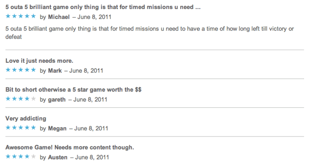
User-created product reviews humanize online shopping by offering buyers a seemingly objective view of how a product has suited other people. However, without context the “humanity” of reviews is left open to doubt.
Useful reviews Depend on Context
The best review would be sent back in time by a version of you from the future, and it would say simply “YES, BUY IT” or “NOOO RUN AWAY.” The next most helpful review is one written by someone enough like you that you can easily extrapolate from their experience. The least helpful sort of review isn’t one written by someone about whom you know nothing. When you can’t tell anything about a reviewer, you can’t tell whether or not the reviewer’s experience will predict your own. In effect, these reviews worsen the signal-to-noise ratio.
Put enough contextless reviews in one place and some site users may even begin to suspect that the reviews aren’t “real”—that they’re written by ringers as a favor to the product maker, or purchased for money, as happens on most major sites that collect reviews, including the App Store and Amazon. Mistrust is contagious: the suspicion of fraudulent or dishonest reviews can drag down the reputation of a whole site or marketplace—especially if the marketplace in question isn’t an behemoth like iTunes.
So one of the things site makers should consider during content planning is how they can contextualize user reviews in ways that make them as helpful—and trustworthy—as possible.
User Profiles Deepen Context
The iTunes App Store offers browsers the ability to view all reviews written by a given reviewer. The link to this embryonic user profile looks just like the text around it—no underline or anything else to indicate a link—so it’s not especially inviting. But at least it’s there: on the Android App Market, there are no user profiles at all.

When you’re deciding what information to require from your reviewers, look for ways to deepen context for the end user. Amazon product reviews, for example are all tagged with my full name and hometown, and display prominent links to my other reviews and user profile. It’s pretty clear just from all this data that I’m a real person—and anyone who wants to learn more about my literary taste can check out my other reviews for context.

Your user profiles may be quite simple. If you do go bare-bones, it’s good idea to give people the option of adding more information if they want to.
As you plan a registration system, you may also want to consider unobtrusive ways of requiring or suggesting that content creators use persistent identities, if not “real names.” There’s value in anonymity, but persistent identities—usernames that are connected to several accounts across the internet—increase accountability. If a user has spent years making contributions under a single username, or has connected his or her product review identity to a Twitter or Facebook account, for example, that user is probably less likely to be a paid shill. (See the “Further reading” section for more on the virtues and drawbacks of persistent identities.)
Ratings and Reviews: Both Useful
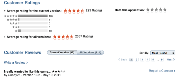
The simplest reviews necessarily convey the least amount of information. A simple “like” is only valuable if you care about sheer numbers of people. One step up from a “like” button is the star-based rating system, which can be helpful in aggregate. Many sites and applications allow users to provide star ratings alone, but also encourage them to write actual reviews—the iTunes App Store and Android App Market both take this approach, though they display the information differently.


Consider building a minimum review length into your system, separating star-ratings from full reviews, or both.
What You Can Do
Anything you do to frame reviews with information that builds credibility and adds context will help your users. Of course, if you ask too much of your review writers—for instance, by forcing them to fill in too many form fields—some of your reviewers will simply give up.
As with developer-generated descriptions, the challenge is to balance the needs of your end users (review readers) with the time investment required of your content creators (review writers). Some user communities will require more context than others, and some groups content creators are willing to give far more time and energy than others. Part of your job in planning for user-generated content is to figure out the needs of your specific community, and to make choices that serve those who create and use the content.
Going the Extra Mile
There’s far more to planning for user-generated content than this brief article has covered: if you collect content from users, you’ll need to consider presentation, moderation, and privacy concerns, just as a start. On the content-shaping side, too, there are many options to think about.
To provide even more context, consider combining user-generated content like reviews with automated elements like product popularity rankings or Amazon-style, “X% of people bought this item” features. You might also think about using less popular forms of user-generated content, like user-assembled lists, collections, or topical guides that let highly motivated content creators offer more, without requiring too much of creators who are less invested in your site or system.
Pitfalls to Avoid
- Decisions that you don’t make are still decisions. Don’t forget to think through the repercussions of your choices about user-generated content.
- Don’t assume that you’ll get it right the first time. Plenty of successful sites continually tune their user-generated content systems and decisions.
- Don’t assume that what works for one audience works for all. Simply copying Apple’s or Google’s or Amazon’s strategy can be harmful for sites with niche audiences.
Things to Do
- Strive for a balance that makes sense for your content creators and the people who’ll read the content those creators submit.
- Decide what kinds of content and context will be most helpful to end users, and then figure out how best to help your content creators submit useful work.
- If you choose to steer your content creators toward standardization, offer templates, simple questions to answer, and plentiful examples.
- Consider whether you’ll allow users to rate reviews or comments, and whether you’ll let developers/product makers or other end-users respond to reviews.
Further Reading
- “Content Strategy and the User-Generated Content Conundrum”, CMSWire, 28 February 2011
- “Anonymous Comments: Are They Good or Evil?”, mathewingram.com, 20 March 2010
- “Truth, and Safety, in Reputation”, Honestly.com, 13 August 2010
How do you shape user-created content in your own projects, product-related or otherwise?
Share Your Thoughts
Please Log in or Sign up to share your thoughts.