As advertisers and publishers fully embrace digital, we’re faced with a hefty editorial challenge. Print books and magazines let you enjoy one piece at a time without interruption. As Clive Thompson says, “One of the chief pleasures of a book is mental solitude, that deep, quiet focus on an author’s thoughts—and your own.” Finding that kind of focus isn’t easy online.
Readability, Instapaper, Safari Reader, and Evernote Clearly address this gap by giving you a distraction-free view of the web. But should readers rely on special features to enjoy our websites? Or can we design for reading from the start? This is the art of the quiet interface: a tricky balancing act of cutting and connecting the information our readers interact with.
A Tasty Example
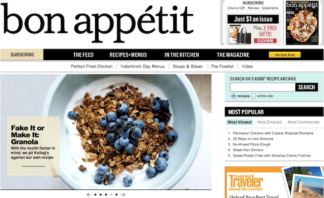
Quiet is rare in online magazines, where empty corners invite ads, social media plugins, and subscription offers. Let’s work with a specific example close to my foodie heart. With over 1.5 million paid subscribers, Bon Appétit attracts a variety of readers from home cooks to chefs and gourmands. Strong writing and a passionate audience present Bon Appétit with a big opportunity to serve up fresh, timely content.
Let’s look at two ways to make their content more inviting: slower pacing and smarter content pairings.
Don’t Bombard the Reader
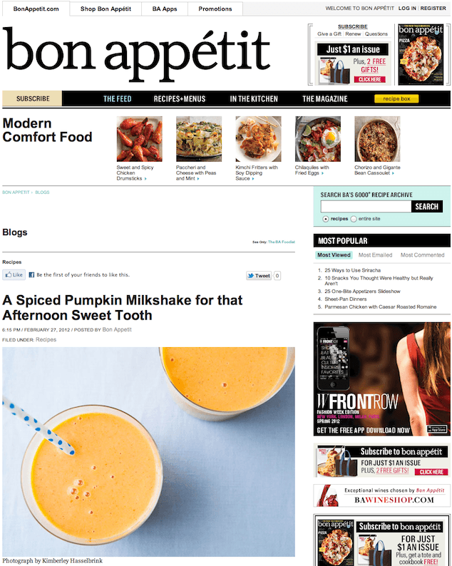
Every page of Bon Appétit is brimming with great information, to the point of being a bit overwhelming. We can solve this problem by eliminating interruptions and improving the focus of the content, starting with the homepage.
Avoid Interrupting
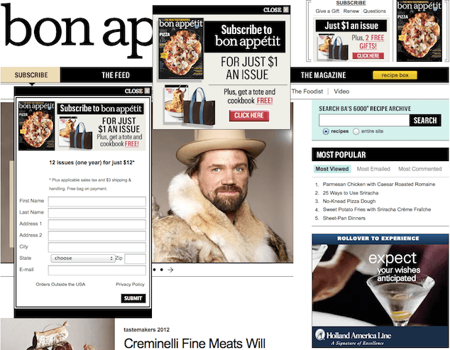
When you first visit the site, a pop-up message hovers over the page. “Subscribe,” it says, for “Just $1 an Issue.” The same message displays next to the pop-up in the top-right corner, adding: “Plus, 2 Free Gifts!” If you’re feeling patient and want to read the featured article, you may hover over the carousel only to be interrupted by another subscription request in the sub-navigation.
Well-timed content helps the reader get closer to your brand. We can improve the flow here with a few strategic questions:
- Has the reader had a chance to process the most important information?
- Does the presentation and structure of the content help people do what they came to do?
- Is this the best time and place to ask for subscriptions?
- Can we use calls to action more sparingly to strengthen their message?
- Does the navigation serve the audience or the organization?
Try not to be pushy or forceful. As reader advocates, we should eliminate interruptions that could irritate or frustrate people. Calls to action are especially tricky to get right. We could quickly cut one of the pop-ups here to resolve the immediate issue. Finding the right long-term solution may require in-depth content testing.
Keep It Focused
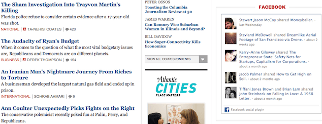
Cut confusing information where you can. In this case, ads and social updates in the sidebar distract the eye from the main features.
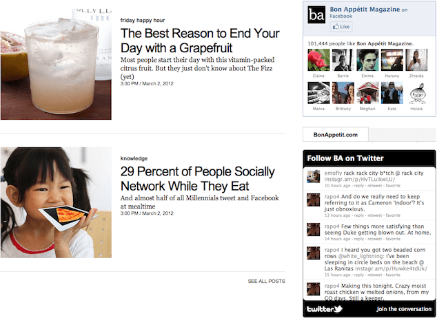
For the Facebook section: Are the fans relevant here? Would the cocktail article be more enticing without their faces alongside it?
For the Twitter section: Do the tweets help guide the reader or encourage subscriptions? Do these voices suit the brand? Could we improve focus on the page without this section? Why does this section have a tab for the homepage?
Keeping business goals in mind, we could explore several ways to make the social bits less distracting and more effective:
- Give feature images more visual weight than social modules. As it is, the Facebook section is bigger than the grapefruit cocktail.
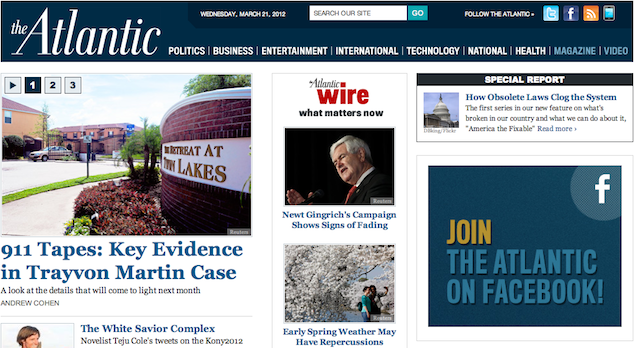
- Switch the Facebook focus from random people to the Bon Appétit brand. The Atlantic does this well, by crafting their own Facebook features and dynamically sharing articles your friends are reading.
- Update the Twitter module with the Bon Appétit account, rather than the staff list.
- Replace the streaming social bits with basic “Like Us” and “Follow Us” icons.
While there are many ways to improve the focus on the site, it’s up to us to research and test these ideas to find the right solution for the brand. Reducing the noise on the page shows readers we’ve earned their attention. If people can concentrate on our content, they’re more likely to delve into it.
Slow Things Down
Slowness encourages stillness. When we slow down the flow of information and set a healthy pace for our readers, we encourage them to sit and enjoy the content—and come back for more.
Start With a Taste
The homepage serves several purposes, with none more important than orienting the reader. By giving readers a sense of place, we also give them a sense of possibility and confidence to explore.
Treat your homepage like an appetizer, not a feast. Give the reader a taste of what’s there without overwhelming them with choices. As we’re all curious folk, people naturally find what interests them most and move further into it, so long as you give them room to breathe.
As an example, the blog page has quite a bit going on:
- Ads and subscription requests
- Navigation
- Featured recipes
- Blog posts
- Popular blog posts and recipes
- A newsletter signup form
- Social feeds and social icons
It takes several minutes to see what’s there, let alone choose what to focus on. Make the content more digestible by reducing the volume where you can:
- Present a smaller variety of topics at a time. Use the blur test for reference.
- Use graphics wisely, as they can distract the eye and reduce conversion. Work on reducing the number of images in the sidebar.
- Remove irrelevant or repetitive bits. If they’re absolutely necessary, try clustering less important pieces (e.g., related articles, offers, and links) and moving them below the feature.
- See how your competition keeps all the extra bits organized. Chow limits ads, starts with fewer articles, and keeps the eye on the featured content.
- Strike a balance between what readers enjoy and what your organization wants to publish. Use analytics data to find popular posts, search keywords, and drop-off pages.
Rather than bringing everything to the table at once, start small and entice the reader to stay a while.
Set a Deliberate Pace
Along with simplifying and breaking things down, give the reader ample time to enjoy each section. This means thinking about how long someone needs to read the pieces themselves. Much like various parts of a meal, different types of information require different amounts of time to digest. Bon Appétit includes:
- Long-form essays, reviews, and interviews
- Medium-length recipes and menus
- Quick instructional videos and slideshows
- Bite-sized tips and status updates
With this much variety in topics, depth, and breadth, planning the content’s timing is imperative. Longer reads deserve slow consideration. Recipes may take even longer; though the sentences may be concise, the steps to make a meal could take hours. Tips and tricks would be brightest just before or after a main feature.
Here are some places we could improve pacing within the site.
- Turn off auto-advancing on the homepage carousel.
- Home cooks may find the Do Ahead section valuable when planning a meal with several dishes. Consider bringing that up before the recipe.
- Pull helpful tips out of slideshows that require the reader to scroll with each click.
- Keep videos front-and-center if they’re important to the feature.
Decisions like these take time to get right. Consider these questions when arranging and pacing your content:
- Are things in order? Do the pieces flow naturally?
- Is anything hiding that breaks the reader’s train of thought?
- Can you slow anything down to give the reader more time?
- Do the elements work together?
Pair Intelligently
Quieting things down helps readers familiarize themselves with individual topics and techniques. Once you minimize noise and maximize attention, take it one step further and tie things together in a smart way.
Keep Logical Items Together
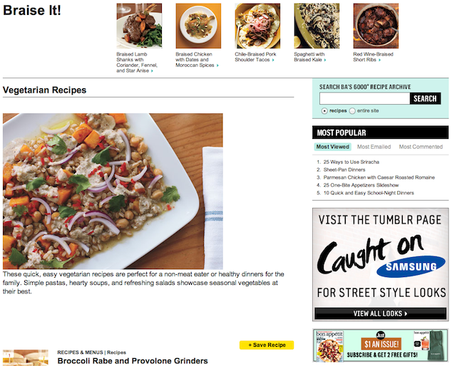
Recipes could pair better with suggested menus. For example, it would be prudent to showcase veggie-friendly items with vegetarian recipes, rather than meat braising tips:
Make Helpful Connections
Help the reader understand complex topics by associating different types of content in meaningful ways. If you’re not sure where to start, dive into common questions in the comments.
As an example, this recipe confused several readers, as it doesn’t specify which type of kosher salt to use (and salt varies in saltiness, based on the brand). This is an important detail. Consider updating the article to specify the brand of salt and link to a related article about choosing the right salt.
Another way to make helpful connections is to read through an article and think about what questions it raises for you. This shopping list answers one question, but does it need to end there? Perhaps we could include a few hand-picked recipes inline or at the bottom that call for these fancy ingredients.
When one thing doesn’t fully stand on its own, it makes sense to pair it with another. Revisit your content regularly, so you can find and explore ways to connect ideas for readers.
There’s a feast of information here, just waiting to be picked and paired in a fresh way. Treat each piece of content—whether ad, image, text, or video—with the care a chef would with give to their ingredients.
Going the Extra Mile
Keep the noise down on social channels too. Social sites like Facebook and Twitter give you a great way to keep avid fans in the loop. But that doesn’t mean you have to post everything that goes up on the site. Keep it brief and use your feed wisely. Be careful not to post too many things in a day or retweet bits that don’t fit your brand.
Pitfalls to Avoid
- Avoid overloading pages with tertiary content.
- Don’t interrupt. Give readers the time they need to digest important details.
- Don’t overuse calls to action. Keep marketing messages to a minimum.
Things to Do
- Review your site regularly to keep things fresh.
- Keep the site focused on what people need.
- Connect the dots for people by tying together related topics.
Further Reading
- “The Future of Reading in a Digital World”, Wired Magazine, 22 May 2009
- “The Shocking Truth About How Web Graphics Affect Conversions”, KISS Metrics Blog, 24 February 2012
How do you create a quiet, engaging space for readers?