So much of web development is really just a snapshot in time. Within weeks, days or even hours, the landscape will change. A new browser will be released, a new technique will appear, and so on. As web developers, we often want to tweak; to implement the latest techniques and deliver a “perfect” site. The reality is, though, budgets and timelines dictate what we can do.
Such is the nature of web development. If we keep tweaking and tweaking and tweaking, the site may never launch. We have to make choices that address the needs of the site without pushing the project over budget or extending deadlines.
This is the scenario Algonquin Studios faced with the Buffalo Soccer Club (BSC) web site. The pilot program for Algonquin Sports for Kids, Inc., BSC was recently awarded the U.S. Soccer Foundation Programming Grant for 2012. As a result of this win, we decided it was time to revisit the site. There were three catches:
- We were donating our time, so the development budget was tight.
- We had about a week before we needed to launch the redesign.
- We had to fit it in among existing projects, leaving less than 40 hours to devote to building, testing, adjusting content, and deploying.
We quickly realized we had to make decisions on what we could or couldn’t do.
Key Design Features
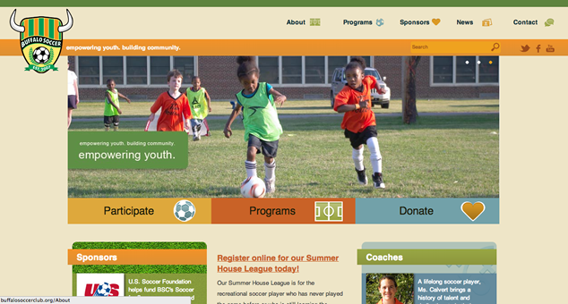
BSC’s design emphasized images and videos. The home page called for an image carousel to anchor the top of the page and showcase photos of the program, as well as two smaller carousels that featured coaches and sponsors.
We also knew that the internal site pages would need to feature photos and videos, though we didn’t know what sizes and styles the authors would ultimately use.
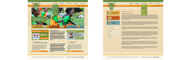
Finally, while some of these design elements weren’t intended to be responsive, our graphic designer produced quick mock-ups of how she envisioned elements on the page adjusting. This additional design reference proved critical as I started the build, giving us all a common understanding and helping drive the decisions we made.
Prioritizing
From these designs, we had to quickly determine how I would handle delivering all the features that we wanted within our limited time. For this I worked up a general list of questions for prioritizing features:
- Will this feature take a substantional amount of time?
- Can this feature be replicated in a simpler fashion?
- Does this feature slow a user’s access to the content?
- Will the testing for this feature require a large chunk of time?
- If the feature breaks, can we remove it without breaking the rest of the site?
Answering these questions helped identify whether a feature would make it into the new site, get tabled for a later project, or simplified to allow at least some aspect of it to still make into the site.
We understood early on that the many sources of images and video that make their way to the site would make it hard to develop a catch-all approach to account for scaling on different devices. In addition to our tight timeline, we also couldn’t put too much burden on our authors, so I decided on a simpler approach of letting authors identify which images should adjust in our responsive layouts — just flagging the large ones so that a custom style would be applied.
The carousels on the home page were also cut back early on, and without time to thoroughly research and vet touch-friendly responsive carousels, I opted to re-use existing code for the main carousel. For the remaining two carousels we agreed to drop them altogether and simply randomly load one item for each from a library of options. I performed this work server-side to reduce burden on the browser and because we already had the code.
Implementing a Responsive Layout
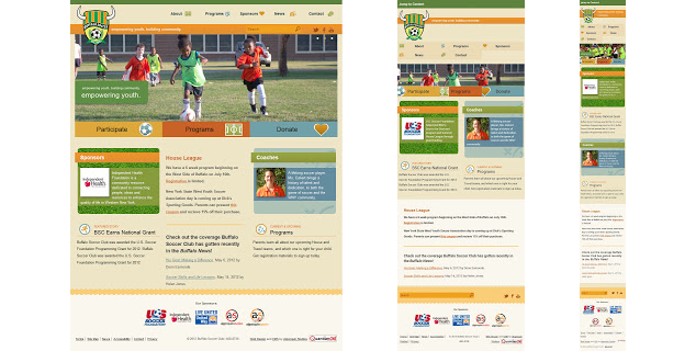
Thanks to those early responsive mock-ups and our efforts to prioritize, we ultimately built a responsive site for BSC that delivered the most important features.
Navigation
I used a fly-out menu for the navigation when used in a wider viewport. The width where the navigation and logo start to overlap is where I created a breakpoint for the header of the site, converting the navigation bar to simple links and moving the social media links and search box to the footer.
I decided to keep individual links in the primary navigation visible on smaller viewports, as opposed to disappearing behind a menu button/link. A combination of over-the-shoulder user testing along with prior experience lead me to believe that our users wouldn’t immediately recognize the traditional mobile menu icon (typically the three horizontal lines). By leaving all the navigation options visible, the navigation was familiar to those who might have also visited the site on desktop computers.
I did make one compromise based on our timeframe: placing the secondary navigation above the page content. The additional time for testing absolute positioning, floats and breakpoints across all our potential target devices felt like too much of a task that could take away from other features. I opted to leave it for a second pass after launch, which would also give me an opportunity to gather important user feedback.
To help mitigate the top-positioned sub-navigation, I include a “Jump to Content” link, which is the same link I already have in place as an accessibility aid for screen reader users. Unlike most desktop sites which hide the link, making it unavailable to a screen reader, this one is positioned off screen and is visible by tabbing through the page. For the tablet/mobile experience it is displayed on the screen by default.
a#SkipLink {
  display: block;
  color: #fff;
  background: #5E833E;
  margin: 0;
  padding: .5em;
  font-weight: bold;
}

a#SkipLink:link, a#SkipLink:visited {
  color: #fff;
  text-decoration: none;
}

@media screen and (min-width:800px) {
  a#SkipLink {
    position: absolute;
    left: -1000px;
    z-index: 10;
  }

  a#SkipLink:active, a#SkipLink:focus, a#SkipLink:hover {
    display: block;
    top: 0;
    left: 0;
  }
}
<a href="#Skip" accesskey="s" id="SkipLink">Jump to Content</a>Footer
Bucking convention, we decided to move the site search to the footer. Our logs showed that users of the old site just weren’t using the search box. Typically the content they wanted was linked from the home page, so as long as we continued to feature that critical content on home, I was confident we’d be in good shape.
In terms of responsive development, the footer didn’t need much adjustment. Sponsor images, for one, reflowed nicely across different viewports. Additionally, the re-located search box shifted with the width of the page when the browser window is narrow. And the rest of the links in the footer adjust from three columns when in a wide display to one column in a narrow display.
Home Page Columns
The two outside columns of content on the home page are fixed-width in anticipation of adding carousels to cycle between highlighted coaches and sponsors. As the window narrows, the middle column of content is intentionally pushed down to below the two columns, while at yet smaller widths even the outside two columns stack up to create a single column layout. The decision for this approach was dictated by BSC’s audience and content authors.
For our target audience — families participating in the program — we needed to promote the sponsors on the home page. Putting sponsors at the top of the stack satisfied the need to keep them prominent (albeit one at a time) while the other logos were pushed to the bottom. The “Jump to Content” link from the top of the page brings users directly to the page content, skipping the featured sponsor image. Users already bypassing lengthy navigation would end up right in the content most relevant to them.
To support BSC’s content authors, who aren’t web developers, I needed to account for content that might not scale well. So, as the page narrows, the middle column made up of content from our authors slides below the other two columns. In narrow viewports, the middle column immediately has the full width of the window without overlapping the other two columns. Eventually the viewport gets so narrow that the entire layout shifts to one column anyway, but this at least addresses narrow displays and tablets.
The tricky part is that this was done with floats, not absolute positioning. Early testing (translation: testing it as I was coding it) showed a problem with some older Android browsers. Unable to quickly determine the issue, I was just as quickly able to re-code the page with floats. When my testing showed it working, I was able to move on to the next task.
The HTML I used for the columns on the home page:
<div id="HomeBoxes">
  <h1>Buffalo Soccer Club : Home</h1>

  <!-- Column 1 -->
  <div class="column" id="Col1">
    <div class="feature">
      <h2>Sponsors</h2>
      <p class="features" id="Feature1Cycle2">content</p>
    </div>

    <h2 class="linked">Featured Story</h2>
    <dl>
      <dt>content</dt>
        <dd>content</dd>
    </dl>
  </div>

  <!-- Column 2 -->
  <div class="column" id="Col2">
    <div class="feature">
      <h2>Coaches</h2>
      <p class="features" id="Feature2Cycle1">content</p>
    </div>

    <h2 class="linked">Current & Upcoming</h2>
    <dl>
      <dt>content</dt>
        <dd>content</dd>
    </dl>
  </div>

  <!-- Middle Column -->
  <div class="column" id="Skip">
    <div>
      <p>content</p>
    </div>
  </div>
</div>
And the corresponding CSS:
#HomeBoxes {
  margin: 2em auto 0 auto;
  clear: both;
}

div.feature	{
  margin: 0 7px 0 10px;
  padding: 1em 0;
  min-height: 13em;
}

@media screen and (min-width:600px) {
  #Col1 {
    float: left;
    width: 49%;
  }

  #Col2	{
    float: right;
    width: 49%;
  }

  div.column#Skip {
    float: left;
    width: 100%;
  }
}

@media screen and (min-width:800px) {
  #HomeBoxes {
    max-width: 960px;
    border: none;
  }

  #Col1	{
    float: left;
    width: 33%;
  }

  #Col2 {
    float: right;
    width: 33%;
  }

  div.column#Skip {
    max-width: 33%;
  }

  div.feature h2 {
    margin-top: 0;
  }

  div.column#Skip {
    padding: 0;
    margin-bottom: 0;
  }
}
During development, I planned to revisit the columns to convert them to positioned elements. Keeping budget and time constraints in mind, I ultimately abandoned this plan. While the code may not be pretty, the columns satisfy the requirements and haven’t posed any problems.
Making Images and Links Responsive
Going into the new build, I recognized that our mobile users for the most part weren’t sporting high resolution devices. The desktop browsers visiting the site also didn’t typically support vector images in the form of SVG. This made the decision to stick with standard-resolution raster images much easier, somewhat offsetting the potential bandwidth concerns of high-resolution images.
On the home page I implemented an existing carousel script from another site my team had recently completed. Without time to evaluate all the available options, and given how little in-site traffic carousels typically generate, I was comfortable dropping this into the site considering the available timeline. It proved to be a bit trickier than I expected, as it did not scale well for smaller displays and needed help to print well.
To address these challenges, I turned to a simple jQuery image cycler and CSS to scale the image for smaller viewports. The links that allow the user to jump between images get a larger hit area as the window gets smaller to account for a finger instead of a mouse pointer.
The HTML for the carousel:
<div id="ImgCyclerWrapper">
  <div id="ImgCycler">
    <a href="/About"><img id="slide1" src="About.jpg" width="960" height="318" alt="About Buffalo Soccer Club"></a>
    <a href="/Programs"><img id="slide2" src="Programs.jpg" width="960" height="318" alt="Programs"></a>
    <a href="/News"><img id="slide3" src="News.jpg" width="960" height="318"  alt="Featured News & Events"></a>
  </div>
</div>
The styles simply scale the image to 100% of the container, with its height set to auto. This approach preserves the ratio and prevents the image from looking “squished” (I believe that is the technical term). At the full layout size, I set the dimensions in pixels.
#ImgCycler {
  width: 100%;
  height: auto;
  min-height: 105px;
  overflow: hidden;
  margin: 0;
}

#ImgCycler img {
  width: 100%;
  height: auto;
  display: none;
  border: none;
}

@media screen and (min-width:960px) {
  #ImgCyclerWrapper, #ImgCycler {
    height: 318px;
  }

  #ImgCycler img {
    width: 960px;
  }
}
I also set the links that cycle through the images to be larger on smaller displays, ideally making it easier to touch the one you want. For larger displays, I relied on the assumption that users had a mouse (granted, this may not be true for all users) and reduced the size of these links.
#CyclerNav {
  width: 100%;
  height: 24px;
  margin-top: -30px;
  position: relative;
  z-index: 900;
}

#CyclerNav a {
  float: left;
  text-decoration: none;
  height: 11px;
  width: 11px;
  padding: 10px;
  background: url(CyclerNav_bg.png) no-repeat center center;
  display: block;
}

@media screen and (min-width:800px) {
  #CyclerNav {
    width: auto;
    height: auto;
    position: absolute;
    top: 10px;
    right: 10px;
    float: right;
    margin: 0;
    z-index: 900;
  }

  #CyclerNav a {
    margin: 0 0 0 5px;
    padding: 0 5px;
  }
}
The three “call to action” links below the cycling image adjust at smaller widths to partially hide the background image off the left side of the link, while allowing the entire image to display at larger widths. CSS transition effects are in use for the mouse hovers at these larger sizes, but not for smaller viewports where I assumed users are touching a screen, not clicking with a mouse.
<ol id="CallsToAction" class="home">
  <li><a href="/About/GetInvolved" class="GetInvolved">Participate</a></li>
  <li><a href="/Programs" class="Programs">Programs</a></li>
  <li><a href="/Sponsors/Donations" class="Donations">Donate</a></li>
</ol>
Abbreviated CSS, showing just one of the calls to action:
ol#CallsToAction.home a.GetInvolved {
  background: #dea83c url(CTAHome_GetInvolved.png) -40px 50% no-repeat;
}

@media screen and (min-width:600px) {
  ol#CallsToAction.home a.GetInvolved {
    background-position: -20px 50%;
  }
}

@media screen and (min-width:800px) {
  ol#CallsToAction.home a.GetInvolved {
    background-position: 90% 50%;
  }
}
Large Lead-in Image
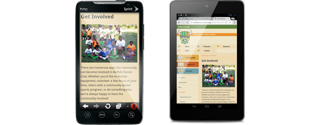
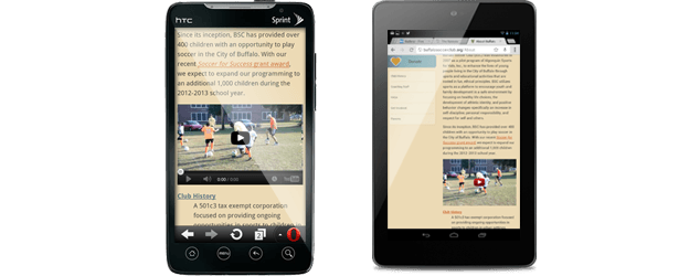
Many of BSC’s internal site pages feature a large, lead-in image. The idea is that the image of kids and coaches might be more compelling to people who want to donate and/or volunteer for the program. Seeing people puts a face to the program and a sense that visitors who donate time or goods are helping real people in their community.
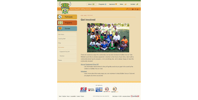
The challenge, of course, is displaying a photo that isn’t too large at small sizes, too small at large sizes, or too heavy for a quick download over slow connections. An additional challenge is getting the image to flow with the page content. All of this must also be manageable for a content author using a WYSIWYG editor with no knowledge of HTML or CSS. While training is important, I needed to keep the process as simple as possible to accommodate BSC interns and volunteers cycling through the ranks.
My original plan was to use a JavaScript function to detect the image dimensions and assign a class based on where it fit within a simple set of ranges. Both the coding and testing time coupled with the range of devices I’d have to support put that idea on the back burner pretty quickly.
Before you ask, I built this site before trying the technique of JPG images at double dimensions but dramatically lower image quality. However, I’m not planning on revisiting it for this site since it involves re-training authors.
So I decided that the lead-in images will only scale up to true dimensions on larger viewports and when the viewport is smaller, they will scale down. To make this work, I had to identify reasonable image widths that should trigger scaling or wrapping. For images over 300 pixels in width (the size I identified that should not allow text wrapping in smaller displays) the author needs to select from a pre-defined class in the WYSIWYG editor: gt300.
<img src="IMGP0883_500.jpg" width="500" height="346" class="gt300" alt="">With the gt300 in place, I was able to scale the image when the viewport is less than 800 pixels in width. Otherwise it will display at its raw size:
.Content img.gt300 {
  width: 98%;
  height: auto;
}

@media screen and (min-width:800px) {
  .Content img.gt300 {
    width: auto;
    height: auto;
  }
}
Over-sized images can of course break this wide open. It turns out that the minimal barrier of creating an image and embedding it in the page (or perhaps the more significant barrier of getting the image file off a digital camera) proved to be enough that the site hasn’t been overwhelmed with over-sized images.
Down the road as the site layout changes, classes on the images throughout the site can be ignored or used in a different way. With the initial goal only to affect image scaling, the class name itself just references a file attribute, not an overall design goal or objective.
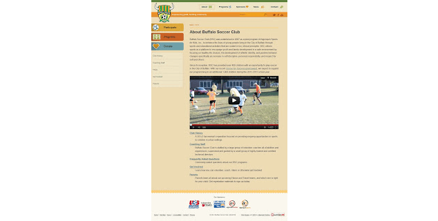
Embedded Video
As a soccer club, it stands to reason that the program director and coaches might want to embed plenty of videos for parents. I opted to use YouTube to get the best cross-browser experience, but also quickly discovered how tricky it can be to deal with video embedded on a responsive site. Since the content authors don’t know HTML, I create a class for the video wrapper and trained the authors to apply it via a menu in the WYSIWYG editor whenever embedding video.
<div class="videoWrapper">
  <iframe height="315" src="http://www.youtube.com/embed/e3IC9E-PaGs" frameborder="0" width="420" allowfullscreen=""></iframe>
</div>
This class adjusts the width of the video to fit the available content area. As with the responsive images, the styles maintain the aspect ratio of the video and prevent squishing. There is also a style to hide the video when the page is printed, since the nature of the videos don’t offer much value on a sheet of paper.
.videoWrapper {
  position: relative;
  padding-bottom: 56.25%; /* 16:9 */
  padding-top: 25px;
  height: 0;
}

.videoWrapper iframe {
  position: absolute;
  top: 0;
  left: 0;
  width: 100%;
  height: 100%;
}

@media print {
  .videoWrapper {
    display: none;
  }
}
When the site was first developed, my tablet testing platform was primarily an iPad 2. Since then I have gotten a Nexus 7, an iPad 3, an iPad Mini, and have had access to some phablet devices, and I am pleased to see that the video layouts (as well as the rest of the layout) behave as expected on these devices.
A Living Medium
Finding the balance between budget, timeframe and development is as important a skill as the actual techniques you use to build. You have to focus on the project must-haves, and then decide the most effective development strategy that will deliver those key features on time and on budget.
But you also have to embrace the web as the living medium it is. Trying to launch a “perfect” site isn’t technically possible, because of the changing nature of the web. The goal, instead, is to deliver a site that meets the project needs by making smart compromises that establish a foundation to build and grow as those needs change.
You can always go back and refine or revise. And if you never find a need to revisit, then the “issues” you were concerned about during development might not have been the show-stoppers you thought they were.
Even some of the development on Buffalo Soccer Club site has been supplanted with techniques that are now a better fit. For example, I could handle the responsive images differently now that I’ve had 8 months more experience and projects on which to try them. I could also put QR codes on the printed page now that I know I can load them only when the page is printed.
But neither of these are causing problems for site users right now. When needs change and these features are necessary, the project can easily be revisited.
Going the Extra Mile
Styled print views of sites are often neglected, especially when budgets and timelines require development compromises. But a print version of your site isn’t something that should be a compromise. Nearly every desktop browser (and some tablets) offers users a way to create a printed version of the content on your site. Lack of print styles on a site is a failure of development and testing. It means a site isn’t truly responsive if it only adapts to screens.
We didn’t sacrifice print styles for the Buffalo Soccer Club site. Aside from my own conviction about the importance of a print version, it was a known must-have. Parents and grandparents of the kids in the soccer program sometimes come with pages printed from the site, such as schedule details and sign-up information.
Some of the techniques I implemented for the soccer club site’s print styles included removing the video, navigation, social media icons, search, and so on. I retained the logo, breadcrumb trail and copyright information, and otherwise let the content fill the page.
Delivering prints styles with a site launch is part of the development foundation essential for launching critical features that can be revisited as needs evolve. Check out Printing The Web, Tips And Tricks For Print Style Sheets and Make your website printable with CSS for more suggestions on crafting print styles.
Pitfalls to Avoid
- When coming up with a design, only design what you can code or are reasonably confident you can code. Getting client sign-off or a budget approval on an element you later find you cannot build can derail a project.
- Don’t code pieces of your site in a vacuum. Re-using styles, images and elements can go a long way toward speeding up a project and reducing user download time. You won’t know this if you aren’t looking at the whole picture.
- Avoid using frameworks or code you don’t understand. If you have to debug something you didn’t write, it can take you far too long and you may find help sites are lacking what you need.
- Don’t pretend you are a user. You aren’t. If you can code, you are probably a terrible example of a user. Unless your audience is you and your clones.
Things to Do
- Identify your most “extreme” features at the start. If you can’t fit them into your budget, the beginning is the best time to catch them.
- If you aren’t the designer, but just the implementor, identify areas that may be tricky or costly to implement as soon as you can.
- If you aren’t the designer, make sure you spend some time with the designer understanding how he or she envisioned aspects of the design functioning. It saves surprises down the road and also establishes a dialogue.
- Do user testing. In the absence of user testing, over-the-shoulder testing of any users you can find will be a great help.
- Modularize your code. Each time you find a solution to a challenge, save that block of code for later re-use and potential tweaking.
Further Reading
- “Rundown of Handling Flexible Media”, CSS-Tricks, 17 September 2012
What design and development decisions or compromises have you made when the time and budget are tight?
Share Your Thoughts
Please Log in or Sign up to share your thoughts.