These days, “storytelling” has become quite the buzzword in industries ranging from marketing to public speaking. However, this is one trend where there is actually substance behind the hype. Storytelling is a primal form of communication as old as humankind and may be the distinguishing factor that makes us who we are.
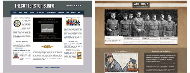
While storytelling is powerful, it is a seldom-used tool in the web designer’s arsenal. In this article, we’ll examine how two different sites, The Cutter STORIS.info and the War Untold, use storytelling. Before comparing and contrasting these sites, let’s first take a look at what makes stories so compelling.
The Power of Storytelling
Stories are the primary way we absorb, manage, store, access and communicate information, as well as connect with others. It is how our brains are wired, and how we make sense of an otherwise seemingly chaotic and random world. Indeed, our brains respond to content by looking for the story that explains the situation. The story helps us create cognitive maps, mental models and narratives.
Storytelling is a powerful communication and connection tool because:
- Stories provide order and meaning by simplifying the complex.
- Stories can make material more memorable.
- Stories can illicit feelings and emotions.
- Stories powerfully persuade where facts cannot, allowing the audience to come to a desired conclusion on their own.
Additionally, stories can convey information in a manner that breaks through the haze of information overload, further helping users better accomplish their goals. But most importantly, stories are one of the key ways to connect with an audience.
In The Psychological Power of Storytelling, author Pamela Brown Rutledge suggests that “when organizations, causes, brands or individuals identify and develop a core story, they create and display authentic meaning and purpose that others can believe, participate with, and share.” This makes storytelling invaluable when creating a digital property such as a website or app.
Parallels with Web Design
Much of what needs to be considered when creating a story is the same as what’s needed for creating a website or app:
- Who is the audience?
- What are your goals?
- Do you have a clear meaning?
A good story has a good flow, makes a point and is most effective by showing, not telling. Good stories keep your audience engaged, and use a familiar structure to capture attention so that users want to know what happens next and are compelled to continue following the story. Doesn’t that sound very similar to the things we strive for when building websites?
Storytelling Applied to Web Design
Storytelling isn’t just about content. For websites and digital media, stories can be conveyed on multiple levels, with content being only one of them. In fact, to effectively communicate a story digitally, we must leverage all aspects of web design and interweave them into one beautifully recounted holistic package.
In applying storytelling to web design, we must bear in mind the differences between a spoken or written narrative and one that is communicated through the totality of a website or app. These differences are most notable in:
- Content
- Visual
- User Experience
Content
With content, we need to remember that unlike a spoken or written narrative, the web is completely non-linear. Users can drop into our websites at any given point, so it is important to provide content-orientation cues (or markers of locality) so that the user is best able to construct the story for themselves based on the information available.
A story that is told well through content does so by establishing strong connections between information. Furthermore, the story should be told not only through the macro-content of the site, meaning the main paragraphs and large teaser text, but also through micro-content in the form of titles/headings, navigation labels, hyperlink text, button text, form field labels and URLs.
Visuals
Visuals should not only “illuminate” the story, but further tell the story. What do I mean by this? First, we need to consider the human brain’s predilection for visuals, otherwise known as the Pictorial Superiority Effect (PSE). This means that sighted users absorb 75% more information from pictures than any other type of sensory input.
By understanding the story that we want to tell visually, we can use that to guide design choices of color, whitespace, typography, texture, proportion and hierarchy to powerfully communicate part of story without words.
User Experience
The interactivity of the web means that we can leverage the user experience to further enhance the story told through content and visuals. We do this by artfully guiding the user through the site towards their objectives in a way that enhances the story you are telling, as well as the story the users create as they experience the site or app. Storytelling incorporated into a site’s interactivity can inform how users move from page to page, how and when modal windows are employed, and the ways in which visual promptings of “what happens next” are structured.
If this all seems like a lot to think about, relax. The good news is that you’re probably already employing several forms of storytelling in your digital properties on some level subconsciously. Some of the best practices in web design, usability and content strategy already put us on the path of storytelling in web design. The trick is to make that which has been subconscious conscious, and then take that awareness and begin to push towards mastery.
Compare and Contrast
Theory is great, but in order for us to get to a point of mastery, even the best theories need to be supported with practice. Let’s put some of the concepts discussed above to work by comparing and contrasting two sites for history enthusiasts that are rife with storytelling potential.
The Cutter Storis
The STORIS is a WWII-era Coast Guard cutter ship rich with history, serving over 64 years of active service from 1942-2007. The goals of the reader-submitted Cutter STORIS site are three-fold:
- To share the historical significance and achievements of the ship
- To provide detailed information on the STORIS
- To have the most recent information possible on the efforts to make the STORIS Alaska’s first maritime museum
Given the target audience and the stated objectives of the site, it’s clear that storytelling should be a critical aspect of the website on all levels: content, visual design and user experience. Let’s take a look at how well storytelling is interwoven on the homepage.
Content
At first glance of the homepage, the site looks like that of a government agency, and the content only furthers that impression, with formal, stiff information that lacks color or dimension. The headlines are informational without being evocative, and they simply echo the navigation which provides little encouragement to the visitor to delve into the site.
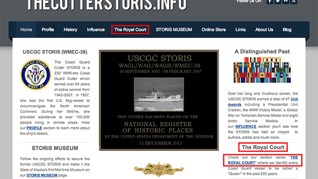
Ideally, headlines should all play into the theme and further weave the tale of the site. Additionally, the hyperlinks within the content should be rewritten more like compelling teasers so that they stimulate the audience’s curiosity and imagination, and drive users deeper into the site.
Visual
The minimal contemporary design of The Cutter STORIS.info gives no indication of the historical depth of the content and premise of the site. While the colors work with the subject of a naval ship, the site is geared towards history buffs. More texture could be employed to bring to mind age and the passing of time.
Ironically, although the ship itself is the main star of the site, the ship’s image is the one of smallest elements on the page. To effectively tell the story of the ship, larger photos of the vessel from then and now should be featured to visually indicate the priorities of the site.
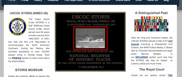
Furthermore, the homepage lacks visual hierarchy and doesn’t use the space effectively to tell the story of the rich history behind the STORIS.
User Experience
From a UX perspective, the homepage is not structured in a way that encourages discovery of the content and features of the site. The site lacks “teasers” in the form of interactive elements that engage the user’s attention and encourages them to explore the rest of the story of the site. Even simple “Read more” links at the end of the paragraphs would prompt readers to read further. Another option would be to extend the previous suggestion of a larger image area into a slideshow with links that draw the user deeper into the site.
War Untold
The War Untold is a site created to tell stories of individuals who served in the Great War. The site is designed not only to commemorate their service, but also to provide a forum for the unheard voices of the everyday people who spent part of their lives on the battlefields of WWI.
Like The Cutter STORIS site, the historical orientation of this site (plus its focus on de facto stories) begs for storytelling to be an essential quality of this site. Let’s see how well storytelling is actually incorporated into this site.
Content
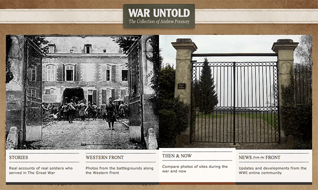
By using evocative language such “The Western Front,” “Then and Now” and “News from the Front,” the navigation titles do a good job of laying the foundation for telling the site’s story. The descriptive micro-content under the navigation titles further explain what content will be found in each section, enticing the user to click the links to find out more information.

Going deeper into the site beyond the homepage to the “Stories” landing page, the content is concise, but the heading text uses language that pulls the reader to click through the stories to find out more. Once at the individual stories, the introductory content and pull quotes arouse interest that makes users want to keep reading.
Visual
On the homepage, the mixture of vintage and modern photographs tell the story of the historical nature of the site without even needing the content. The image carousel is the largest element on the page and draws the user into wanting to know the story of the website. Additionally, the carousel provides visual interest and dimension to the stories that are contained within the site.
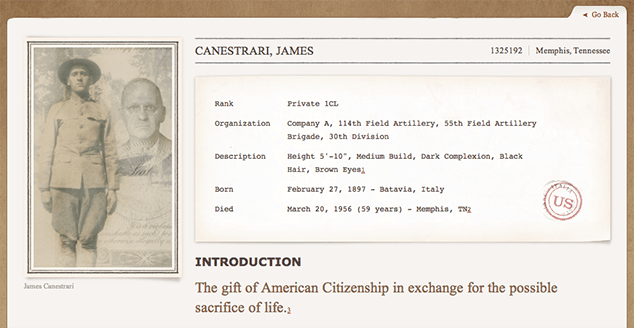
The use of texture and typography also speak to the era of the site’s focus, conveying a sense of vintage quality. On pages deeper in the site, the design conveys a sense of history and story by using a vintage newspaper motif on both the “Stories” and “News from the Front” sections.
On the “Stories” pages, the introductory content mimics a drafting information card, while the page content area looks like a folder tab, further creating a perfect synergy between the content and visuals of the site.
User Experience
The interactive navigation bar and image slideshow on the homepage both incite the user to further investigate and seek more of the story. However, while the home page features a “See More Links” button, it could benefit from more “Read More” links.
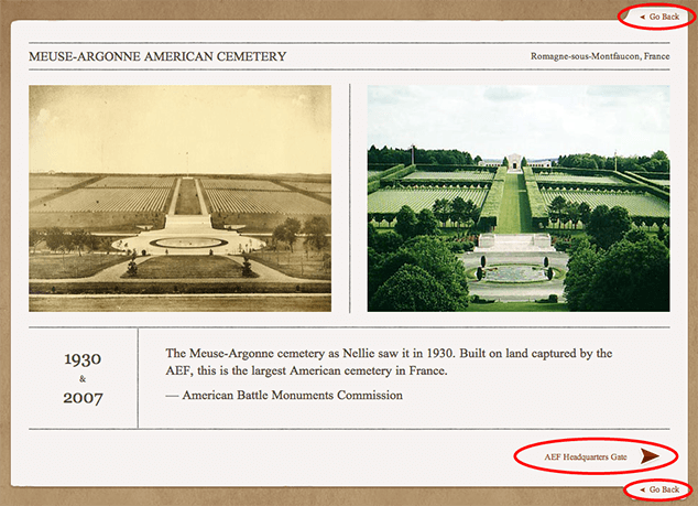
The “Then and Now” area of the site provides clear UX indicators to not only encourage the user to keep moving on to more content, but also to help orient users on the pages. At the lower right of each page’s main content section is a link to the next page, while both the lower right and upper right of the main content section have a “Go back” link to return the user to the section landing page.
The End?
In this case, “the end” is really only the beginning. The Cutter STORIS’ site does have a good structure, but it could learn a lot about communicating through storytelling from War Untold. With just a little reworking of the visuals and content, the Cutter STORIS site could be a poster child for storytelling through web design.
And so can your sites! The Cutter STORIS and War Untold sites are simple examples you can learn from to get a better understanding of how to incorporate storytelling into your websites and apps. And while storytelling can certainly make your digital properties more enjoyable for your end users, this process is not just for the audience. The practice of interweaving storytelling will also enhance the acts of conceptualizing, designing and building a website, making it a joy for you to create as well.
So go forth, my friends, and start telling stories — for the benefit of everyone!
Going the Extra Mile
Increase your awareness of stories that move you and start paying attention to which particular elements made these stories powerful for you. Begin to look at ways you can incorporate those elements into your planning to interweave into future projects.
Pitfalls to Avoid
- Incorporate storytelling into your thinking, planing and process as early as possible.
- Focus on how to tell the stories through all three levels of content, visuals and user experience.
- Don’t try to retrofit storytelling into your project once it is all built. Do it from the beginning to save yourself extra time and money.
Things to Do
- Understand that storytelling is not just a “good idea.” It is a critical piece that makes your website or app stand out from the crowd.
- Know your audience well enough to understand how to most powerfully convey the story of your site to them.
- Interweave storytelling on all levels of your digital property: content, visuals and user experience.
Further Reading
- “Making up Stories: Perception, Language, and the Web”, A List Apart, 23 August 2011
- “The Power Of Storytelling”, The Dragonfly Effect, 6 October 2010
- “The Importance of Storytelling in Web Design”, Adobe MAX, 8 May 2013
What ways have you incorporated storytelling into your site content, visuals or interactivity?