An accessibility lawsuit against JetBlue in late 2010 hasn’t received much press compared to other accessibility court cases. Lawsuits like these remind us that, as web developers and designers, we should try our best to meet the needs of people with disabilities. And this something we can do well by following the World Wide Web Consortium’s current Web Content Accessibility Guidelines (WCAG 2.0).
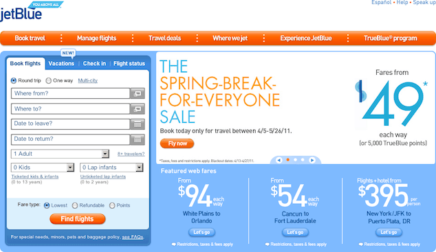
There are a lot of basic accessibility errors on jetBlue.com. For example, the entire navigation bar below the main area of the site uses functional images (which include graphic text) without any alt text at all:

alt text. These are functional images as they are part of a link and must have alternative text.Some of the other alternative text doesn’t provide an appropriate replacement for the image. For example, the image that reads “From $54 each way” has alt text of “54”. Then, there are tables for layout and the inappropriate heading structure—the only h1s on the page are for help content bubbles that are hidden for most of the time.
These items pose some significant barriers to accessibility. But when you attempt real tasks on jetBlue.com, such as booking a flight, you start to get a clearer picture of just how difficult it can be to use. Let’s look a bit deeper at one particular aspect of accessibility that is often missed: keyboard usage.
Most of us are familiar with the fact that people who are blind use a keyboard for navigation and other functionality. Many others rely on the keyboard as well but have perfect vision. Sighted keyboard users may have difficulty with fine motor control, or be unable to use a mouse at all. Instead, they rely on a head or mouth wand, and other assistive technology, such as an on-screen keyboard. Testing keyboard usage and efficiency is very important because it helps us establish a good foundation for basic accessibility.
When we test keyboard usage, we look at three things right away:
- Can a sighted keyboard user tab through the page and see which element has the focus at all times?
- Can a sighted or non-sighted keyboard user perform all required functionality with the keyboard?
- Can they perform the required functionality efficiently?
Focus on the Outline: I can’t see where I am.
A sighted user absolutely requires a visual reference point to know where they are on the website. They must be able to see which item has the focus—be it a link, a form field, or a button—so that they can accurately activate links, enter data into forms and submit them with standard keystrokes. If they can’t see which item has the focus, simple tasks become difficult to complete.
jetBlue.com does not include a visible keyboard focus indicator—the dotted line or blue “halo” that you can see around the link that currently has the focus. On this website, the focus outline has been removed. Take a quick look yourself. Go to jetBlue.com and and start using the tab key on your keyboard to move sequentially through the interface. Can you see where you are? Can you see which link has the focus? Sadly, no.
Typically this is done with a rule like:
a { outline: none; }Sometimes this is unknowingly done via a CSS Reset where the designer or developer resets the styles that are built in to the browser so that there is a common starting point in all browsers and versions. Other times, the designer or developer actively removes the outline, for reasons of aesthetics or due to a request from a key stakeholder.
If you are faced with such requests to remove the focus outline, remember that it is an absolute necessity for sighted keyboard users—please think twice. However, if you do feel compelled to set links to have an outline: none, I recommend that you replace it with something just as good or better that shows which element has the focus. For example, we typically define a :hover style for navigation items. On the jetBlue.com site, the main navigational items all have styles defined in global.css:
#Manage_Flights {
  background-position:-135px 0 !important;
}
#Manage_Flights:hover, #Manage_Flights.active {
  background-position:-135px -35px !important;
}
Simply modifying the second CSS rule to include a :focus state will provide a visible focus indicator for the main navigational bar even if outline:none is specified:
#Manage_Flights:hover, #Manage_Flights:focus, #Manage_Flights.active {
  background-position: -135px -35px !important;
}Note: In Internet Explorer 7 and earlier the the :active pseudoclass is used to define the styles for this focused state. Further explanation can be found in Sitepoint’s CSS Reference.
Getting Stuck at the Airport: I can’t complete everything with the keyboard
jetBlue.com’s homepage highlights the most important user task: booking a flight. In order to book any flight we should be able to choose departure and destination cities as well as departure and return dates. We may also specify how many travellers there are and select a few other options for the flight.
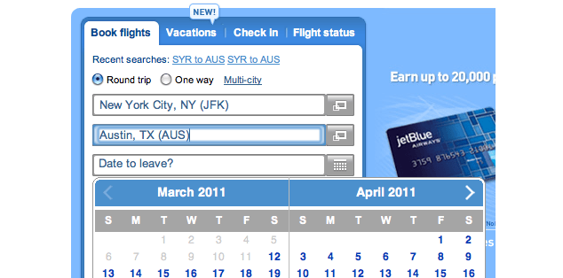
Take a few moments right now to go to jetBlue.com and use only your keyboard to book a flight from New York’s JFK airport to Austin, Texas. Using the Tab key, we advance the cursor until the departure city form field receives the focus. We fill in the departure city and tab again to fill in the destination city. Start typing “Austin”. Once you’ve narrowed down that choice (you can see it is the only one in the list and it is automatically selected for you), hit Tab again to select that city to move to the date field.
What happened? The interface forces you to stay in the field for the destination airport. We’re effectively stuck in the airport.

We can’t continue to tab forward through the interface—JavaScript is preventing us from doing so. The script in minibooker.js is indiscriminately focusing on the “Where to?” form field as we try to leave that field to choose a date. This small oversight in the script left us stuck in a keyboard trap.
We must be able to tab through the entire interface without getting stuck in a form field, or in any similar keyboard loop which prevents certain parts of the interface from being easily reached via the keyboard.
Move in both directions: I need to be able to use the keyboard efficiently
Any interface should allow you to make corrections or change your mind. Here’s another completely plausible scenario: you start using the keyboard to plan a trip from JFK airport to Austin, then realize belatedly that you want to check the price of a multi-city trip. Say, you’d like head straight from Austin to another conference in San Diego before returning to New York. Let’s test this out.
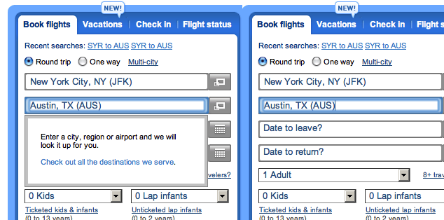
Use the keyboard to tab to the “Where from?” text box. You see a mini dialog appear, showing the instructions: “Enter a city, region or airport and we will look it up for you.” It is followed by a link that reads “Check out all the destinations we serve.”
You change your mind, dismiss that mini dialog with the Escape key and prepare to press Shift+Tab to move backwards to the “Multi-city” or “One way” options. But something happened when you hit Escape. The “Where from?” field no longer has the focus—but wait, can you tell where the focus is? Start pressing the Tab key again and you’ll see that the focus was actually sent back to the top of the page.

When we don’t set an explicit point of focus after an action like showing or hiding some content in a dialog box the browser often sends the focus back to the top of the page by default. Keyboard users then need to tab all the way through the interface again to get back to that “One way” radio button that was just two keystrokes backwards.
This is a completely inefficient process for the keyboard user. As a general rule, if you dismiss a dialog box or some other menu such as we saw here, the focus should stay with the element that opened the dialog in the first place. This allows us to continue our task while keeping our place in the interface. Do this well, and keyboard users will thank you for it. If you don’t do it well, you’ll drive keyboard users absolutely mad.
Going the Extra Mile
There is a lot to full keyboard access. We’ve only just scratched the surface of one site’s homepage. As you think about what you’ve experienced on jetBlue.com, take it one step further. Imagine how confusing it would be if you couldn’t see the screen and you were constantly sent back to the top of the page. Imagine how difficult it would be to use if you were able to type just one character every 3 seconds and, faced with no way to correct your work because of a keyboard trap, you were forced to reload the page, losing all the work you had previously completed.
If we really want to make sure our interfaces are keyboard-friendly, we have lots to think about. All interfaces require potentially complex interaction with a keyboard in order to provide equivalent functionality to a mouse or other pointing device. Take a look at the DHTML Style Guide from AOL. They’ve meticulously outlined the keystrokes that are suggested standards for most complex widgets you’ll see in web-based interfaces.
Pitfalls to Avoid
- If you’re using a reset stylesheet, avoid using
outline:nonewithout replacing it with comparable:focusstyling. - Be very careful when using JavaScript for keyboard shortcuts; we don’t want any keyboard traps.
- Unless you specify a focal point, clicking those
<a href="#">or<a href="javascript:doIt()">links that you’ve been using is very likely to take the focus back to the top of the page. Is that really where you want to be?
Things to Do
- Always test all functionality with a keyboard only.
- Be sure that you can make corrections in the interface using the keyboard.
- Maintain a point of focus when dismissing or closing dialogs to make keyboard usage more efficient.
Further Reading
- a { outline: none; } DON’T DO IT!, OutlineNone.com, 2010
- Web Content Accessibility Guidelines (WCAG) 2.0, W3C, 2008
- “Keyboard Accessibility”, WebAIM, 1 January 2000
How do you test for keyboard usage in your websites and applications?