When we integrate content creation early in our web development processes, we are more effective at orienting our conversations to the end goals for the user and the business. This is a huge win for our users, who are increasingly demanding meaningful content experiences before they engage with our web sites and apps. It’s also vital to businesses, whose success depends on communicating value in ways that convert bystanders to buyers.
Fortunately, prioritizing messaging is just a matter of actually doing it. Indeed, many practitioners already are responding to this call for solid content by writing real text—in place of jumbled Latin—within their wireframes or design comps.
But why not start earlier in the creative process, before a single line is drawn? What if we all start with a set of primary messages that should be conveyed to users, and then create the visual and interactive experience around those?
This is the practice of designing for content using a messaging hierarchy, and, quite awesomely, it’s gaining in popularity as users demand more meat and less marketing.
Storytelling through immersive experiences
When we greet users with succinct messages—organized in a defined hierarchy—we pique their interest through immersive experiences that keep them learning.
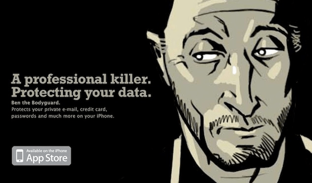
Take benthebodyguard.com or nikebetterworld.com. In each of these examples, users scroll through inherent hierarchical messaging that forms each site’s primary purpose—to engage and to educate—so users will be more likely to buy. Ultimately, the design serves to highlight the content, rather than the other way around.
In fact, the team behind “Ben”—Nerd Communications in Berlin—achieved this hierarchy very purposefully by prioritizing content and then positioning copywriting within the design process itself. Quoting Nerd’s Chris Wilson:
The storytelling aspect, centered on the Ben character, has been absolutely essential to building our buzz and persuading people to ‘hire Ben,’ as we put it. From the very beginning, we gave ourselves the challenge to use this compelling, mysterious personality to get people interested in the theme of personal digital security (not such an interesting topic on its own), and we’ve definitely succeeded in building widespread interest with this method. Even when we first launched the site, there were dozens of tweets out there proclaiming their commitment to buying the app without even knowing exactly what it would offer!
However it should really be noted that, without our unique presentation style of the story on benthebodyguard.com, the story likely wouldn’t have gained as much interest on its own. Nobody wants to read big blocks of text online anymore.
Making the writing happen
A messaging hierarchy can take many forms—one of them is the traditional storyboard, which is the route assumed by the folks behind “Ben.” Good ol’ fashioned colored pencils and some paper can do the job just fine.

Even though content strategists and copywriters specialize in the written word, anyone can create a messaging hierarchy to kick-off a creative process.
An immediate starting point anyone can try is with low-fidelity, black-and-white text in a table or spreadsheet. Here’s how:
1. Capture goals by starting with a spreadsheet that has 3 columns: The left column is the message a user reads; the middle column is the business purpose for that user message; and the right column is the underlying business outcome expected from that message. These three columns will capture the meat of the messages without being distracted by assumptions (what we think users want) or methods we think will achieve those goals, such as implementation-level annotations that are better suited for wireframes. It’s easy to get distracted and want to make things “perfect” from the beginning, so keeping it to three columns—with the goal of capturing basic messaging—will make this exercise easier to complete. Below is a sample table, again using benthebodyguard.com as a case study.
| Message the User Reads | Associated Business Purpose | Underlying Business Outcome |
|---|---|---|
| A frenchman protecting your secrets. Yes, seriously. | Pique interest that our application solves that user’s data privacy problem | Increase downloads: User wants to solve that problem and downloads Ben from the app store |
| Protecting your passwords, photos, contacts and other sensitive stuff on your iPhone® or iPod touch® | Describe the benefits of the app in the context of the associated devices | Increase downloads: State which audiences can download the app (iPhone or iPod touch owners) |
2. Write as many or as few potential primary messages that could capture the voice of the company, align with the business objectives of the project, and resonate with users.
3. Edit or eliminate any messages that seem redundant with one another: pick the best version of those that are similar to each other, but keep the other versions in a separate spreadsheet or tab in the spreadsheet for easy access later. Ideally, you would end up with 3-5 primary messages that should be communicated to a user. Five is the top of that span because of the Magical Number Seven, Plus or Minus Two.. By the way, you may have many supporting messages, but if they can’t stand alone in clearly relating to a user or business goal, then they shouldn’t be considered primary messages. Just move these to another tab in the spreadsheet for future reference.
4. Prioritize the primary messages hierarchically according to your best recommendation for what will be most successful in facilitating a clear, coherent, and goal-oriented user experience—again, that aligns with the business purpose.
Validating the hierarchy and refining the messages
Once you have prioritized the 3-5 messages in the order you see fit—from most important to least important—then ask other key decision-makers to help you validate that ordering. Encourage your team, clients or stakeholders to read through all of the messages first before doing any re-arranging.
Keep in mind that the first goal is just to get the hierarchy right, then to dig into the detailed messages themselves.
When discussing the actual content in the messages themselves, ask anyone raising issues to describe which elements of the top 3-5 messages are “not quite right.” These could be word usage or voice—but if you’ve already done the job of aligning the message with the business purpose and ideal outcome, the feedback from you receive should not actually be substantive changes that would dramatically shift the message itself.
Rather than adding content that may not fully address initial problems in voice or tone, try to make small shifts, paying close attention to which words could actually be eliminated to make shorter, more concise messages.
Keeping the messages a priority
Once everyone has signed off on the primary messages, then it’s time for the UXers or designers to integrate those messages into their wireframes and mock-ups. And, in the ideal scenario, those specialists have been involved with the message hierarchy creation from the beginning.
But in the case that they haven’t been involved, then be sure to describe the purpose and importance of those messages during hand-off. After all, these specialists are responsible for making your primary messages the focus of their designs, layout and interactivity. So it’s imperative that everyone understands the value of persisting those messages through the development process and, ultimately, into the final product.
Throughout the web development process, questions and decisions regarding visual elements, content placement, actions, functionality, or transactions sent from the app or related to the app (e.g., email or Twitter), should be weighted against whether or not they reinforce the top 3-5 messages agreed upon already by the team.
Having a set of succinct messages makes the production process run more efficiently; it consistently serves as a point of orientation to unite user and business goals.
Going the Extra Mile
Try forming a messaging hierarchy during a kick-off call (or in earlier scoping/planning stages) to orient the process from the get-go. This can get everyone involved speaking the same language in reference to user and business goals.
Or, to more thoroughly formalize this process, send along a content questionnaire that asks questions of clients or stakeholders about how they would describe their product or service to a potential customer. Those responses can inform the creative brief and serve as a stakeholder-driven starting point for the messaging hierarchy.
Pitfalls to Avoid
- Refrain from making substantial changes to the messages in the first column without business-level discussions—the goal is to resolve an imperfect union between what the user needs and what the business needs.
- Don’t modify primary messages once in wireframing, visual design or thereafter—this would put the integrity of what we’re communicating at risk!
Things to Do
- Start thinking about a messaging hierarchy as early as your kickoff meeting.
- Try to get stakeholders and team members involved in creating the message hierarchy.
- Make it happen!
Further Reading
- “Stop obsessing about typos—your users need help!”, Prose Kiln, 22 April 2011
- Don’t Make Me Think, New Riders, 2005
- “When Words Fail”, Brain Traffic, 2 June 2011
- Letting Go of the Words: Writing Web Content that Works, Morgan Kaufmann, 2007
- The Elements of Content Strategy, A Book Apart, 2011
What processes have you implemented to prioritize content? Which websites out there seem to have created a clear message hierarchy?
Discussion
, Melanie Seibert said:
said:
, Shane Guymon said:
said:
Share Your Thoughts
Please Log in or Sign up to share your thoughts.