There is too much content to consume.
Every advertising agency, television network, newspaper, magazine, and web site faces this problem at some point. A news(paper) site like The New York Times must find creative solutions to it all year, every day, many times per-hour.
On most news sites, headlines are the gateway to an article’s content, but for many readers they can be the story: a snippet by which to quickly judge the current state of affairs without dedicating time to the entire article.
We call this quick judgement “scanning”, and it relies on our ability to subconsciously separate, group, and prioritize elements living within the layout. Most people don’t read every word on the web, or, for that matter, in a printed newspaper. Instead, we scan for words or phrases that are of interest.
Scanning is a fundamental aspect of how people interact with your content. Through a combination of writing, typography, and visual design, we can affect its ease or difficulty. Let’s examine the NYTimes.com homepage and see how well its headlines perform, and how we might make them easier to scan. Though we’re using a news site as our example, these techniques will allow you to evaluate and improve any content-heavy site.
On purpose
The headline plays a slightly different role on the web than it does in print. The printed newspaper headline acts as an attention-grabber, a flag sitting atop or adjacent to its story, whereas a web headline is often a link floating in a sea of equal hierarchal value—a line in a dynamic list of this hour’s most-popular stories fighting for attention amidst the din, not to mention the noise generated by the surrounding advertising.
In both cases, however, headlines exist to add hierarchy and structure to our content. In spite of the differences between print and web, how we approach designing—and writing—headlines is similar and based largely on their context.
Styling headlines
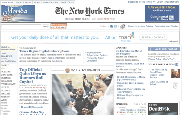
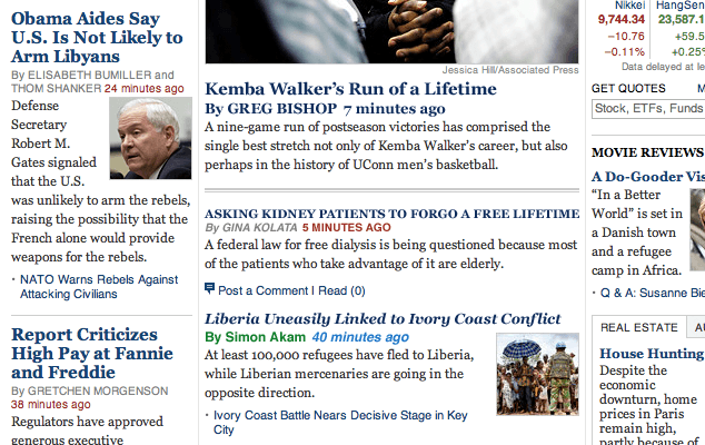
Figure 1 shows the homepage of NYTimes.com contained no fewer than 16 different headline variants based on 3 type sizes, using 2 weights of 1 typeface to communicate hierarchy. This was not a day of special features or breaking news, so we can assume this is an accurate estimate of the average number of headline styles used on the homepage.
These 16 can be grouped into 5 basic categories:
- Large (bold)
- Large (regular)
- Medium (bold)
- Small (bold)
- Small (regular)
These are then modified by the addition of a byline, timestamp, list bullet or number, image, or a combination thereof.
These styles are already applied consistently, and though I don’t know the exact editorial rules used, I can tell at a glance that the hierarchy is intentional and different treatments are grouped together, typically decreasing in weight and number of modifiers as we travel further down the homepage.
This consistent application gives structure to the content, and helps readers scan by establishing simple hierarchal patterns so that headlines and other markers can be easily recognized without conscious effort. Bear in mind when designing your headline typography that larger type will likely be easier to scan.
A simple test
Let’s test the visual hierarchy created by this system of headlines. This is a quick and dirty way to gauge how well the headlines separate themselves from the surrounding content—an important aspect of how easy they are to scan—and can be useful when balancing any design.
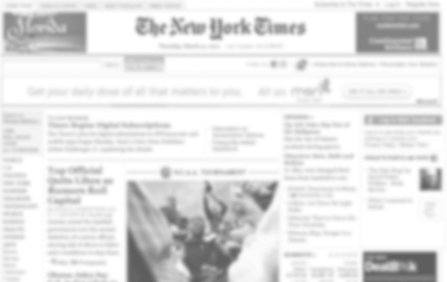
In Figure 4, I’ve applied a Gaussian blur in Photoshop to decrease the fidelity of the layout. You can also squint at a design on your screen, or zoom out in your graphics editor to achieve a similar result:

This gives us a good idea of the density of our content, and how well various headlines are working: We can see blocks of blue headlines and a few dashes of red where time stamps are used. but the overall effect feels a bit claustrophobic—some of the headlines seem to bleed into the summaries below, and headlines in lists are barely distinguishable from each other.
If we take it one step further and remove color, we get an even more basic view of the relationship between key elements:
Now there is even less separation of elements, and we begin to see how easy (or difficult) the content is to scan. Without color, the only headline that clearly stands out as a unique, scannable object is the large, bold headline just left of center—the rest blend into nearby blocks of text, forming indistinguishable chunks. This indicates we have a problem to address in the visual design.
Better design
There are a few ways we can adjust type to affect the attention it deserves, and they all rely on context:
- Typeface
- Size
- Weight
- Style
- Color
All of these are valid ways to set type apart—we can use one at a time until we find the right balance. However, apply too many and we call too much attention, distracting from the surrounding content rather than building a meaningful hierarchy; use too few and everything blends together to form an un-scannable mass. In Figure 5, I’ve altered a few headlines in the center column to show the cumulative effect of using too few styles, or too many:
Thankfully, The New York Times already does a fantastic job of constraining typography throughout the site, and their headlines are no exception.
Breathing room
From our blur test above (Figure 4) we can see that some of the headlines are positioned too closely to other content for quick separation. This is a common problem with visual design, not just for headlines and text but for all types of content. Although easy to correct, the claustrophobic layout somehow continues to manifest itself. After years of teaching and working with designers and non-designers alike, I’ve decided the problem may simply be a lack of conceptual understanding:
The importance of passive and active space around type and other elements increases—perhaps exponentially—along with the volume and density of information.
The more elements vying for the reader’s attention, the more valuable the space around them becomes. It may help to think of your layout as a neighborhood: Section or column headings are the street signs, columns are the streets, paragraphs are the houses, lists are like apartment buildings, images provide the landscaping, borders and rules are fences, and headlines tell us who lives where. The stories then become the living, breathing inhabitants.
In this construct, space is what affords each element its own identity: the path down the side of the house, the garden in front, the sidewalk or driveway. To suit the design constraints of an ever-changing daily news site, this space allows just enough separation that readers can clearly recognize each home (story) as its own entity.
The biggest single improvement we can make to the NYTimes.com homepage is to give its elements—and therefore its headlines—more separation from their neighbors. In Figure 6, I’ve adjusted small amounts of vertical space (and gently lightened the horizontal and vertical rules) around some headlines to allow each type of headline to thrive in its tiny plot of land:
-
Before

-
After
The effect is subtle, but that’s the goal: we want our content to command more attention without complicating the typography or adding visual noise.
Design from experience, for experience
As with any functional design, it’s important to test your solutions with real users, but before we reach that point, we must do the best we can based on knowledge, experience, and prior research.
We live in an age of scanning, casually speed-reading while enjoying our morning coffee, catching up during our lunch break, or waiting on the subway platform. Designing to more easily afford this behavior, especially on sites with a lot of information, will help visitors spend less time understanding our content and more time consuming it.
Going the Extra Mile
When we’re scanning with a specific topic or subject in mind, we look (often subconsciously) for “trigger words” (see Trigger Words under Further Reading, below). If the content of your site is less news-oriented, consider creating an editorial style for headline writing that focuses on these important words—rather than summarizing an entire story into a short sentence—and test how well they perform compared to your normal headlines.
Pitfalls to Avoid
- Don’t use too many styles at once on your headline type—focus on the smallest effective change from your body text.
- Avoid writing headlines for search engines—write them for your readers.
Things to Do
- Be consistent when creating and applying headline styles.
- Use the “blur test” to help improve your site’s visual hierarchy.
- Be conscious of the space surrounding your headlines and other elements.
Further Reading
- “Whitespace”, A List Apart, 9 January 2007
- “Boring Headlines or Great Links?”, User Interface Engineering Blog, 11 April 2006
- “The Right Trigger Words”, User Interface Engineering, 15 November 2004
- Designing for the Scent of Information, User Interface Engineering, 2004
- “Is This Headline Clear? Learning About Ambiguity and Clarity From Headlines”, New York Times, 4 February 2010
- The Visual Display of Quantitative Information, Graphics Press, 2001
- “Today’s Headline Styles”, Poynter, 14 January 2005
How easily can you scan the headlines on your favorite daily news site?
Discussion
, marberglund said:
said:
, gigawatt said:
said:
, dresswhat said:
said:
, Pedro Pereira said:
said:
, Martin Berglund said:
said:
, Jussi Pasanen said:
said:
Share Your Thoughts
Please Log in or Sign up to share your thoughts.