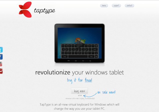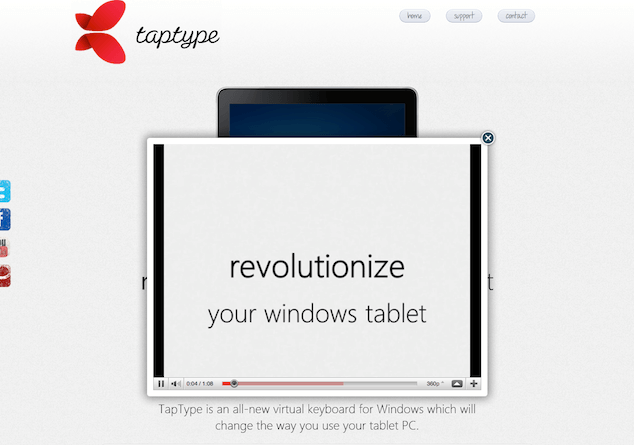
TapType is a virtual keyboard for Windows-based tablets. We were asked by TapType to take a look at a few different aspects of their site. In particular, they were interested in how well the design pushed people towards purchasing and how effectively the promotional video works when presented in a lightbox, or overlay.
We’ll use the lens of accessibility and usability to examine these aspects in a bit more detail, including the accessibility of the overlay as it relates to the user experience.
The Overlay is everywhere
Overlays are common on the web today. Any lightbox/overlay solution presents accessibility challenges, but these can be addressed. The question is, in this scenario, should we use an overlay at all?
Let’s remember that the top priority of the page is to sell. However, when the lightbox is launched, it immediately obscures the “Buy now” button. Combine that with the technical issues this sort of overlay presents, I think we can make a pretty good case that the lightbox-type presentation isn’t really helping to meet the goal of selling more software. The “Buy now” call-to-action should be consistently visible and accessible to all users—including keyboard users—all the time.

There are a few other aspects of the site that are a bit confusing:
- There seems to be a “free” trial, but no means to get to it. The only action that you can really take is to purchase.
- The social media connection links are partially obscured along the left side of the page; if we want to encourage connection, those items should be featured more prominently.
- The copy on the site clearly discusses the “features” of the keyboard, but doesn’t seem to spell out the benefits to someone using a Windows 7 tablet.
With that big picture in mind, let’s take a look at the accessibility of the interface.
In Curing the JetBlues I noted that one of the most critical pieces of accessibility is keyboard access: We need to be able to use the keyboard to complete all tasks on the page efficiently, and we need to be able to see where keyboard focus is at all times.
The TapType.me site is missing that visible focus outline that is so critical to a sighted keyboard user. The lightbox itself exhibits significant keyboard issues as implemented on the site. Think of it this way: by using the lightbox, you’re visually drawing attention to one particular part of the page. You need to draw equivalent attention to that part of the page for the keyboard user too.
What are our requirements for accessibility in terms of using a lightbox or overlay?
- We must be able to launch the lightbox or overlay with the keyboard.
- Overlay content should be immediately accessible with a keystroke when it is visible, and inaccessible when it is not visible.
- We must be able to close the overlay with the keyboard.
Start me up
Launching the video with the keyboard was quite simple because TapType.me has already employed some fairly straightforward Progressive Enhancement: a simple link with some JavaScript that intercepts the click. Instead of taking us to the Youtube video page, it displays the video on the current page. Plain old links work well with the keyboard, so this mechanism is quite accessible.
The code used for the video is very straightforward:
<a rel="#voverlay" href="http://www.youtube.com/…" title="TapType">
  <img src="…/Thumbnail2.png" alt="TapType">
</a>
Inspect the code and you’ll see a simple link to a YouTube video. Clicking the link executes some JavaScript to load the video in the overlay: a simple hijax approach that is well-known and technically sound. We use this approach to “hijack” the link’s default behavior with Ajax (hence “hijax”). In the absence of JavaScript, the link simply takes the user to the video on YouTube. With JavaScript and Ajax capabilities present, the link loads the YouTube video in the overlay.
One area for improvement is the alternative text on the image that is contained in the link:
<img src="…/Thumbnail2.png" alt="TapType">This alt text just doesn’t give enough context about what someone should expect when they click that link. A more appropriate alt text might be:
<img src="…/Thumbnail2.png" alt="Video: Features of the TapType keyboard" />Focus and Flow
Once the overlay is open and has drawn the attention of the user, we need to ensure that a keyboard user can continue to interact with the page by navigating with the keyboard: the overlay content is next in the desired tab order. Watch what happens when you use the keyboard to launch the movie. Can you see where the focus is? It stays on the original link that launched the movie.
What we’d really like to do is to move the focus to the overlay. This can be fixed with some relatively simple JavaScripting. We can simply give the overlay div a tabindex="-1" and then use a .focus() method on it to give it programmatic focus. Once we do that, it is now the next item we interact with when using the keyboard.
The site uses jQuery, so this can be performed with a very simple piece of code:
$('#voverlay').attr('tabIndex',-1).focus();Adding the tabindex value of -1 to the div makes that div programmatically focusable, allowing it to take the focus when the .focus() method is used.
Shut me down
Once the overlay is open, the user would also need to be able to close it with the keyboard. The script that is used includes a keyboard listener that will close the overlay when the Escape key is pressed. This is an excellent touch, and it works even when the movie is active. This convention is used in many dynamic web applications: any interface element/widget that opens like this—whether it be a lightbox, a menu, or some kind of dialog—should close when escape is pressed. This additional keystroke provides a consistent and easy way to stop a video playing without having to hunt for the pause or stop control that accompanies most videos.
The Esc key gives us one way to close the video, but we also have an explicit “close” control in the upper right corner of the overlay. Users should be able to click on this or use the keyboard to activate that link to dismiss the video as well.
However, that “close” link isn’t actually a link. It’s a div with a background image with no content, CSS that turns the cursor into a pointer, and some JavaScript that listens for clicks.
<div class="close" style="z-index: 10000;"></div>div#voverlay div.close {
background-image: url(…/close.png);
position: absolute;
right: 5px;
top: 5px;
cursor: pointer;
height: 35px;
width: 35px;
}Ideally, we’d use something that is natively focusable for this—say, a button or a link. I’d prefer something like this:
<a class="close" href="#voverlay" style="z-index: 10000;">
  <img src="…/close.png" alt="Close video" />
</a>
div#voverlay a.close {
position: absolute;
right: 5px;
top: 5px;
display: block;
height: 35px;
width: 35px;
}This allows a keyboard user to focus on the close button. If for some reason you can’t use a link or a button, then we can get around this by making the div itself focusable through adding a tabindex of 0 to the div. We don’t usually recommend this solution, since native controls tend to be more predictable and easily understood. If absolutely necessary, we can modify the tabindex to make the div focusable. You would also need to modify the JavaScript to handle keyboard events—another reason that a link or a button would be a better choice. Click events are registered and handled on links and buttons by default so there is less JavaScript required to handle those events in the code.
We should also ensure that when the overlay closes, we place the focus back where it belongs: on the item that launched the overlay in the first place.
Again, using jQuery, we could simply return the focus to the image of the movie. There is only one link that launches the overlay and it is identified by rel="#voverlay", we can use that attribute to find the link in the page:
$('a.close').click(function(e){
  // Prevents default link action
  e.preventDefault();
  // Places focus on the link that opened the video
  $('a[rel='+$(this).attr('href')+']').focus();
});
Note that when we changed the close control to be a link we gave it href="#voverlay". You could just as easily give it an id and use that to find the appropriate link and give it focus. In this case, we chose to stay closer to the original markup used for the link that launches the overlay.
Wrapping it up
As was the case with Curing the jetBlues, keyboard access is quite often neglected in interfaces. It isn’t so much that it is done on purpose either—often it’s simply a case of someone finding a script that “looked” like the effect that they wanted, and copying it wholesale into their application without knowing the full impact that the script might have on accessibility.
All things considered, I’d suggest that using an overlay isn’t the best way to present this information. The YouTube video is being used as the primary means to sell the TapType.me virtual keyboard; given the keyboard problems that the overlay causes and that it completely obscures the “Buy now” call-to-action, I’d suggest that the best way to avoid these accessibility issues is to completely abandon the overlay for this interface. Instead, make the video available all the time rather than in the overlay only. Clearly spell out the benefits of the virtual keyboard. Lastly, definitely keep that “Buy now” button prominently displayed all the time.
Going the Extra Mile
YouTube videos (and Flash in general) have some interesting quirks when embedded into pages and viewed in the FireFox browser. In fact, keyboard access to Flash content in the FireFox browser has been a significant issue for approximately 10 years. If you’re not familiar with this issue, here it is in a nutshell: in FireFox you must click on Flash Content in order to be able to navigate with the keyboard within the embedded Flash itself. So, even if you have perfect keyboard access within your Flash file, you need to get the focus into the embedded Flash first. And the only way to do that is with the mouse. See the problem?
When we use YouTube videos, we always use a custom set of controls that exist outside the YouTube video to replicate the internal play, pause and volume controls via the YouTube API. This allows a keyboard user to manipulate the controls easily and doesn’t require them to physically focus on the Flash content with the mouse first.
For more on how we use this technique, see Keyboard Accessible YouTube Controls.
Pitfalls to Avoid
- If you’re using a reset stylesheet, avoid using
outline:nonewithout replacing it with comparable:focusstyling. - Don’t hide your main call-to-action—keep it prominently displayed at all times.
- Don’t use an overlay or lightbox just because you can—make sure it makes sense to do so in the interface.
Things to Do
- Employ tactics like Hijax to help ensure your websites and applications are interoperable regardless if JavaScript is on or off.
- Use natively focusable controls like links and buttons in your interfaces instead of
divs with CSS background images - Return the focus to the point that launched an overlay or dialog when that overlay or dialog is dismissed.
Further Reading
- “Curing the JetBlues”, Web Standards Sherpa, 24 March 2011
- “Hijax”, DOM Scripting, 1 January 2006
- “Keyboard Accessible YouTube Controls”, Simply Accessible, 17 May 2011
How do you cater for keyboard users when you use overlays?