Design is a universal concept. As the act of “form[ing] a plan or scheme of [some thing]… for later execution,” (Oxford English Dictionary) design is the common thread that weaves together art, architecture, hardware and more. Software design, specifically the subcategory of API design, is no different. Yet API design is often given little attention in the world of software development, because the exercise of writing code for other developers often seems far less important than the design of application UI and end-user experiences.
But API design—the public interfaces we provide in the libraries we create, with the express intent of exposing features and functionality to developers who call our code—is just as important as UI design. In fact, both are the primary mode of creating user experiences for a segment of an application’s audience. Where application UI is a large part of end-user UX, an application’s API is developer UX. As such, it should be designed with the same level of care and attention to detail that we provide to user interfaces. Just as we pay attention to the utility, simplicity and elegance of a UI, we should similarly evaluate the utility, simplicity and elegance of an API.
API design, and in the context of this article JavaScript API design, presents a unique challenge for all developers, whether you’re building a public library or an internal one. The dynamic nature of JavaScript, the anonymity of library consumers and ambiguity in requirements presents a daunting set of challenges for the API designer. While there are no quick shortcuts to good API design, it is possible to distill a handful of design principles that hold up when applied to some of the popular JavaScript libraries of today.
API Design: A Struggle of Good vs. Evil
Poor design in JavaScript APIs is costly, both to the developers consuming your API and to you. In both cases, a poor design generates waste: wasted time for developers as they struggle to make sense of an interface, and wasted time for the API author as she deals with the increased load of support and rework brought about by developer confusion. Considering that nearly all APIs are created with the goal of abstracting common functionality for easy consumption and thus, saving time, a poor API leaves both you and your users wondering if this little library of yours was such a good idea after all.
Good API design, on the other hand, accomplishes the goal of abstraction, while being self-describing. When an API is well-designed, users can leverage your work quickly and intuitively, without the constant reference of a manual, documentation or frequent visits to support and Q&A sites. You’ve also saved another developer time by packaging up some feature that would have taken much longer to create on their own. And not only does good design save developers time, it makes them look smart and responsible. Helping your users look smart and capable makes them feel awesome, which makes you look pretty awesome, too.
In JavaScript, API Design is Especially Important
While API design is important regardless of programming language or framework, the stakes of API design are much higher for JavaScript than for many other languages. To begin with, as a dynamic, late-bound programing language, JavaScript has no compiler to serve as a safety net or first unit test to point out mistakes in your code. Linting or verification frameworks like JSLint and JSHint help somewhat. These utilities are useful in pointing out common mistakes in JavaScript code, but they do nothing to catch the errors a developer might make when using your API.
It’s up to you, then, to build an API with a design that helps users of your library fall into the proverbial “pit of success.” This means that your library feels comfortable and familiar to the developer, while also providing positive reinforcement and building the developer’s confidence as she interacts with your code.
One of the best examples of “falling into the pit of success” is jQuery’s use of CSS selector syntax for fetching DOM elements. For example, if I want to select all article elements with the class blogPost, I can do the following in jQuery:
$("article.blogPost").fadeIn();It’s no coincidence that the selector article.blogPost uses the exact same syntax as the following:
article.blogPost {
  border-radius: 10px;
  background-color: salmon;
  box-shadow: 0px 0px 10px 2px #ccc;
}
jQuery’s selector engine was designed to enable me, the developer, to map my existing understanding of CSS selectors onto basic interactions with its engine. As a result, I’m instantly and measurably more productive than if jQuery required me to use a new, purpose-built syntax.
It’s possible to take inspiration from libraries like jQuery and others, and to apply these our own designs. However, inspiration by itself is a degree removed from copying, and anyone who’s ever designed an API based solely on the inspiration of another knows that he will inherit both good and bad. Instead, if we map examples of good JavaScript API design to proven principles found in other fields, we can build a framework of good API design that can be applied in any context.
Secrets of Awesome JavaScript APIs
While it’s true that software doesn’t have the same visual qualities as a painting or a building, we tend to use the same adjectives to describe software as we do for physical media. It’s not uncommon to hear someone refer to an API as “elegant” or “beautiful.” If it’s valid to describe APIs in terms we use for visual media, it’s equally valid to use the principles of those media to inform our software designs.
In this section, I’m going to introduce four popular design principles from the art world and apply these to API design:
- Unity and Harmony
- Balance
- Proportionality
- Emphasis
For each of these, I’ll point to one or more examples of the principle as leveraged in the API of a popular JavaScript library.
Principle 1: Unity & Harmony
In art, unity is the concept behind a work, or how the composer brings everything together into a coherent whole. Harmony, on the other hand, is the placement of similar elements throughout a work, which yields an uncomplicated and simple feel when considered in its entirety.
For the API designer, these principles can be applied through the use of similar and/or unifying elements in a library. Take, for instance, Kendo UI, a JavaScript framework for building rich web applications. One of Kendo UI’s offerings is a set of UI controls and widgets, all of which can be initialized using a similar syntax. For example, if I wanted to create a TreeView control from an unordered list, I need only call the following:
$("ul.tree").kendoTreeView({ /* Configuration goes here */ });
If, on the other hand, I wanted to create a PanelBar from a list, I’ll make a slightly different call.
$("ul.panel").kendoPanelBar({ /* Configuration goes here */ });
Kendo UI promotes unity and harmony by using this consistent kendoX syntax for all of it’s widgets. What’s more, its dependency on jQuery objects for obtaining DOM elements adds an additional layer of harmony that any developer already familiar with jQuery will benefit from. By using a “local dialect” of JavaScript that millions of developers are familiar with, Kendo UI promotes harmony across libraries.
Another example of harmony in action is Backbone’s [object].extend syntax to create objects that inherit and extend the functionality of Backbone Models, Views, Collections and Routers. To create a new Backbone model, I can do something like the following, and I’ll get a model object that’s fully-supported by Backbone, while being customized to my application’s needs:
var Book = Backbone.Model.extend({
  initialize: function() { ... },
  author: function() { ... },
  pubDate: function() { ... },
});
The goals of unity and harmony are to convey familiarity and comfort to developers new to your API. By leveraging identical or similar idioms for related but different actions, an API can convey familiarity and comfort which can greatly ease a developer’s adoption of a new tool.
Principle 2: Balance
The next principle is balance, an arrangement of elements to ensure that no one part of the work overpowers other parts or causes the work to feel unstable. In art, balance is about visual weight. Even when asymmetrical, a work can feel balanced because its asymmetry follows a pattern. In the context of API design, I interpret balance to mean both the visual weight of the code and its predictability.
A balanced API is one whose component parts feel as though they belong together, because they behave the same or aid the consumer in accomplishing a complementary goal. By extension, these APIs also feel balanced because they allow the consumer to extrapolate usage from a small sample. Consider Modernizr’s property tests. These achieve balance by a) using property names that match HTML5 and CSS concepts and APIs; and b) by consistently returning a truthy or falsy value for every single test:
// All of these properties will be 'true' or 'false' for a given browser
  Modernizr.geolocation
  Modernizr.localstorage
  Modernizr.webworkers
  Modernizr.canvas
  Modernizr.borderradius
  Modernizr.boxshadow
Modernizr.flexbox 
Accessing a single property tells the developer everything he or she needs to know in order to access every other property, a quality that’s powerful in its simplicity. It also ensures that the code I write to interact with Modernizr has the same visual weight each time I write or read it. How I use and access the API looks and feels the same, regardless of my usage. If, on the other hand, Modernizr were to add an API to polyfill Canvas, imbalance would take hold. Not only is the visual weight of the library affected by this new API, but the scope and purpose of Modernizr has grown greatly, and my ability to predict how to interact with the API is hampered.
Another way to achieve balance through predictability is to rely on concepts already familiar to developers. A notable example is jQuery’s selector syntax, which maps CSS1–3 selectors into its own DOM selector engine:
$("#grid") // Selects by ID
$("ul.nav > li") // All LIs for the UL with class "nav"
$("ul li:nth-child(2)") // Second item in each list
By using a familiar concept and mapping it to its own library, jQuery is able to avoid creating a new selector syntax, while also creating a mechanism that makes new users of the library instantly productive with a predictable API.
Principle 3: Proportion
The next principle is proportion, which is a measurement of the size and quantity of elements within a work. Rather than stating that a good API is a small API, proportion is about size relative to purpose. A proportional API is one whose API surface matches its scope of capability.
For instance, Moment.js, a popular date parsing and formatting library, can be considered proportional because it’s API surface is compact, which matches the straightforward purpose of the library. Moment.js is for working with dates and, as such, its API is filled with convenience functions designed to make the JavaScript Date object tolerable to work with:
moment().format('dddd');
moment().startOf('hour').fromNow();
For libraries with a targeted purpose, like Moment.js, keeping the API focused and small is important. For larger, more expansive libraries, the size of the API should reflect the capabilities of the library itself.
Take Underscore. As a general-purpose utility library, Underscore provides a large number of convenience functions designed to help developers work with JavaScript collections, arrays, functions and objects. It has a larger API surface than a library like Moment.js, and yet Underscore is proportional because each function aids in the purpose of the library. Consider the following examples, the first two of which illustrate using Underscore to work with Arrays, and the last of which illustrates working with strings:
_.each(["Todd", "Burke", "Derick"], function(name){
  alert(name);
});
_.map([1, 2, 3], function(num){
return num * 3;
});_.isNumber("ten"); // False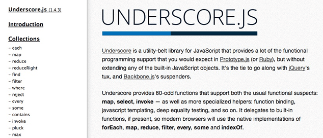
As a library grows, the challenge of maintaining proportion becomes even more critical. Care must be taken to ensure that every feature and function added to a library reinforces the library’s purpose. For a large offering like Kendo UI, an expansive purpose doesn’t mean we need to add every feature under the sun. For a library as large as Kendo, even utility objects and features should prove their worth to be included. Take for example, Kendo UI’s JavaScript based DataSource, which can be used to query and work with remote data:
var dataSource = new kendo.data.DataSource({
  transport: {
    read: {
      url: "http://search.twitter.com/search.json",
        dataType: "jsonp",
        data: { q: "API Design" }
      }
    },
  schema: { data: "results" }
});
At first glance, it might seem like a custom DataSource falls outside of the primary purpose of the library. However, many of today’s web widgets assume the existence of dynamic data, and the inclusion of a DataSource allows Kendo UI to use a consistent—and thus, comfortable—paradigm for working with remote data across the entire library.
Allowing an API to turn into a veritable JavaScript junk drawer is a danger of library growth, but it is not the only danger. Of equal risk is falling in the trap not allowing your API to grow along with a library; constraining the surface area of your library for artificial reasons.
A good example of how not to handle API growth, is jQuery’s jQuery or $ function. As much as I and millions of others love jQuery, the library’s gateway method is a bit of a mess, providing no less than eleven separate overloads for everything from DOM selection to the ability to wrap DOM elements in a jQuery object.
For the most part, these are loosely related features that have been stuffed into one API. Taken on the whole, jQuery is a large library and can be considered reasonably proportional. The jQuery method, on the other hand, represents what can happen when we attempt to force functionality into a single interface, without care for proportion.
If you find yourself stuffing tangential features into existing methods, or rationalizing the addition of function overloads that don’t feel natural to the API, chances are you need to loosen the belt and let that library breathe. Your users will have an easier time adapting to a new function with a self-describing name than they will yet another overload on an existing method.
Principle 4: Emphasis
In art, emphasis is the use of contrast to cause an aspect of the work to stand out and serve as a focal point. In many APIs, the focal point might be a gateway or main method that anchors the library. Another example of emphasis could be a “chained” or fluent API, which adds emphasis to a central object used by the library. jQuery’s tendency to return a jQuery object from many of it’s functions demonstrates this type of emphasis:
$('ul.first').find('.overdue')
  .css('background-color','red')
  .end()
  .find('.due-soon')
  .css('background-color', 'yellow');
For many modern libraries, another excellent example of emphasis is extensibility: that part of the library where the creators embrace what’s missing from the library by giving you a vehicle to add functionality yourself.
A classic example is jQuery’s fn (pronounced “effin”) namespace, the general extensibility point from which countless plugins and complementary libraries have been launched:
(function($) {
  $.fn.kittehfy = function() {
    return this.each(function(idx, el) {
      var width = el.width,
        height = el.height;
      var src= "http://placekitten.com/";
      el.src= src + width + "/" + height;
    });
  };
})(jQuery);
Another example of extensibility is Backbone’s “extend” function, which we’ve looked at already in this article:
var DocumentRow = Backbone.View.extend({
  tagName: "li",
  className: "row",
  events: {
    "click .icon": "open",
    "click .button.edit": "openEditDialog"
  },
  render: function() { ... }
});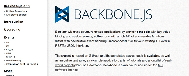
Adding extensibility exhibits emphasis because it calls attention to the fact that a given library wasn’t meant to be the end–all–be–all, while at the same time encouraging you to add to the capabilities of the library as you see fit. When libraries encourage extensibility, they unlock not only new specialized uses, but additional general uses that might benefit countless other developers. One great example is the Backbone.Marionette framework, a extension library for Backbone that aims to “…simplify the construction of large scale JavaScript applications.” Were it not for the extensibility of a library like Backbone, libraries like Marionette would be much more difficult, if not impossible, to deliver.
API Design: Not Just For Library Authors
If you’re not a JavaScript library author, but consider yourself a JavaScript app developer and library implementer, you might be tempted to think that the principles in this article don’t apply to you. After all, most of us often think of third-party libraries, like those I’ve used for the samples in this article, when we hear the term “API.”
The truth is that an API, by definition, is nothing more than a segregated piece of functionality that provides an interface for others to leverage. I’m using general terms here to underscore an important point: modular JavaScript code is written to be consumed; the number of consumers is irrelevant.
Your own JavaScript code exposes interfaces for others, just as the libraries referenced in this article do. Even if the consumers of your code are a small, internal team—or even if you’re building a library for private use—you don’t have to be a public library author to think about API design and apply the principles covered in this article. The benefits of leveraging intentional API design pay off for an audience of one, just as they do for an audience of one million.
Because API design represents UX for developers, it is just as important as UI design for end-users. Just as we can learn to develop a sense for UI design by studying principles and examples of good and bad interfaces, we can learn much about good API design by doing the same. Applying the four principles from this article, as well as others you discover on your own, can result in awesome APIs that delight your users and help them build amazing experiences for others.
Going the Extra Mile
The principles in this list are meant to be a jumping off point for your own study into API design. There are many other principles and practices in the world of physical media that can inform the API designs we create, and I encourage you to study these principles and look for examples on display in popular JavaScript libraries, like those mentioned in this article.
Pitfalls to Avoid
- Don’t make the mistake of designing your API with only your needs in mind. The best way to design for other developers is to design with those developers. Get your work out in the open early and iterate often based on feedback from others.
- When considering new interfaces for your library, be on the lookout for interfaces that create imbalance because their behavior is inconsistent with other interfaces, or because the goal of that interface extends beyond the purpose of the library.
- Interfaces with too many overloads are the quickest way to introduce disproportion. Be on the lookout for gateway methods or other interfaces that hide functionality behind method overloads.
Things to Do
- To foster unity and harmony and provide familiarity and comfort for your users, consider placing similar and/or unifying elements throughout your API.
- To maintain balance, ensure that each interface of your library exhibits consistent behavior, or aids in meeting a complimentary goal.
- Keep an eye of the proportion of your API by ensuring that every interface of the library matches its intended purpose, and that no extraneous elements exist.
- Consider using (properly-scoped) gateway methods, chained or fluent APIs and extensibility hooks to create a focal point of emphasis in your library.
Further Reading
- The Design of Design: Essays from a Computer Scientist, Addison-Wesley Professional, 2010
- Universal Principles of Design, Rockport Publishers, 2009
- “JavaScript API Design”, Eli Perelman, 11 December 2011
What are some other examples of good (or bad) API designs that you’ve seen?